Quote:
Originally Posted by Chronamut

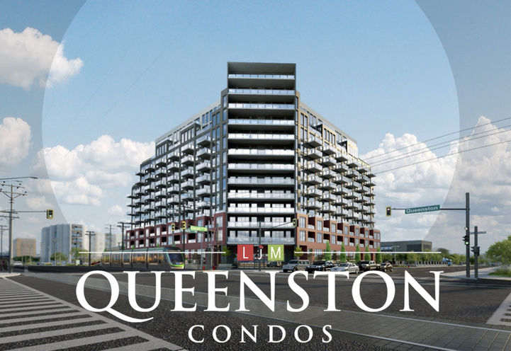
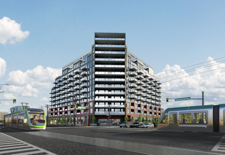
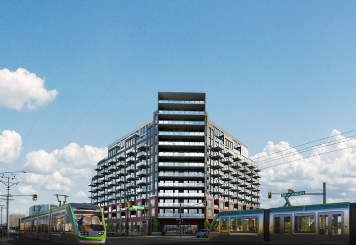
To be honest the bookshelf is the only thing separating this from just being a jumble of uninteresting architecture like everything else. That brick first/second floor area looks awful. Clinical and ellen faircloud-esque. The black and white part doesn't look too bad.
Also if I lived there id make giant novelty books out of foam and put them in the front balconies  |
To me it makes this more of a jumble.
If they designed that angled corner to be more complementary to the upper floors on each side (doesn't have to be the same, but not
that different either), and less imposing, I'd like it better.
I'm a little puzzled by the fenced patios (if that's what they are) at street level. Who would want to use those, except maybe for a small garden? This is at Queenston and Nash!
I hope the brick will look better too. The renderings don't look like they're high quality so maybe that's an issue here.


 Prev
Prev


 Linear Mode
