1) No outdoor space from units
2) Units seem overall small
3) Some units don't have true bedroom doors
Will this be condos or rentals? I sure hope its not going to be condos :/
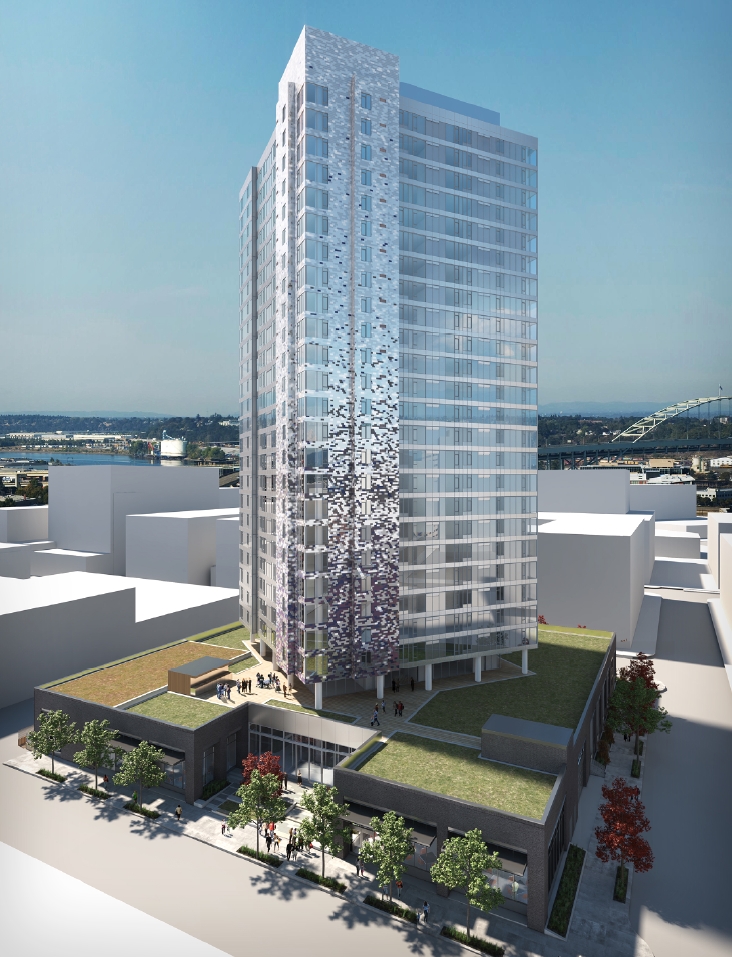
Curious what is sexy about the tower? I like how the tower is rotated to be square to the river but the tower is pretty dull in composition. My opinion but it seems like the area should be ready for something a little more edgy. It may be a sign of the times to get cost down to work with rents.
It is good to see ZGF having a bigger roll with downtown Portland architecture. I like the work that comes out of that firm and I think they do a good job reflecting Portland architecture.
Curious what is sexy about the tower? I like how the tower is rotated to be square to the river but the tower is pretty dull in composition. My opinion but it seems like the area should be ready for something a little more edgy. It may be a sign of the times to get cost down to work with rents.
I agree. I downloaded a friggin' 57 meg pdf in search of sexy but only found nice... but, it is nice.
Okay perhaps that was a bit of an overstatement, but I am just tying to be realistic. We're not going to see mind-blowing, and I think you guys know that? Bottom line: apparently my expectations are lower.
Does anyone know if the Design Commission reviewed this project last night or was it delayed due to weather? If it was heard, how did it go?
The design is improved, the ground level courtyard is more pedestrian and the cars are in the basement where they belong, and there are enough ground floor active uses to make this a good addition to the neighborhood.
The towers small footprint and rotated geometry is a plus, allowing more light and view for adjacent buildings.
Other than the tower shape and geometry, the building seems very average and developer driven. The lack of balconies and decks will detract from the livability of the units and make the tower clean looking yet stark and less residential than most.
The architecture is pretty ordinary and I think will make this a good fabric or back ground building and not a memorable one.
That base looks terrible. Holy cow. It looks like they're stacking a tower on the roof of a rehabbed warehouse. Assuming the light to dark gray bits of tile (is it tile?) doesn't end up looking cheap, the tower itself looks great.
I wish the tower weren't gray. I'm not sure they're familiar with Portland enough to know that, uhm, it's very gray here for much of the year. That tower will look great in summer, but it will disappear during the rest of the year. Gray is Portland-camo.
I think the tower looks great. It will be interesting to have a cluster of three towers (at least in the short term with Park Central's 28-story tower and Block 17's 18-story tower) all with varying heights and colors in that area. Excited to see that area of the Pearl in 2-3 years.
I like the cladding to the tower portion, love the use of bricking from dark to light. The base is mediocre, but at least they got rid of that driveway entrance and could potentially use the first floor for commercial space on all four sides.
Why spend the money to build a large building, for a minimal profit from both the ground floors and the upper stories. A three-four story podium would offer greater opportunities for office/ retail, have greater interface with the street, and it wouldn't affect the housing above. Right now, it looks like the underground parking structure is trying to escape.
However, I like it 10% more in the latest rendering now that it appears metallic. I'm a sucker for shiny things.
I have to assume the podium is an attempt to recreate a warehouse look, and that it's intended as a feature, not a flaw. Either that, or it's supposed to be a giant FU to anyone who balked at the previous design.
I have to assume the podium is an attempt to recreate a warehouse look, and that it's intended as a feature, not a flaw. Either that, or it's supposed to be a giant FU to anyone who balked at the previous design.
That's how I took it. They're trying to make it blend in at street level, and only stand out if you look up. Or something like that.
It's certainly better than the rounded-corner 1970's version that was posted originally. I kind of like the tower portion, although the solid element, which goes from goes from solid to lighter as it rises, looks like it was totally ripped off from the Burnside Bridgehead project.
It really bugs me that there is no attempt at even creating some sort of a dialogue between the tower and the base. Especially with the tower turned at an angle, it seems like there could be some really cool interplay between the two elements. Hopefully it will continue to evolve and turn into something nice.
I can't imagine the design will change much more because the design commission stated that "[the design] was on the right track to receive their approval during a design review meeting set for April 17." The PDC liked the podium but was skeptical of the colored shingles. My sense is that if there are any further "drastic" changes to this design, they will come in the form of the shingles and/or colors of the tower, and not the podium. But we will see in a couple weeks.
Looks like this is under review for permit at the moment. They've applied for separate permits for the excavation and shoring, so it seems like they want to get building soon. The permit for the demolition of the Cash & Carry warehouse has been issued.
__________________
"Maybe to an architect, they might look suspicious, but to me, they just look like rocks"


 Prev
Prev


 Linear Mode
