HomeDiagramsDatabaseMapsForum About
     

Go Back   SkyscraperPage Forum > Regional Sections > United States > Pacific West > Portland > Downtown & City of Portland


Reply

 
Thread Tools Display Modes
     
     
  #241  
Old Posted Aug 11, 2016, 8:10 PM
Leo Leo is offline
Registered User
 
Join Date: Jan 2005
Posts: 389
The “NV” signs are turning out surprisingly tasteful (you can just see the “N” part of one of the signs on the right side of the last photo). Also, the podium entrance looks great. There are not many residential buildings in this neighborhood provide a nice sense of entrance.

Inexcplicably, though, they chose to plant trees in front of the building that were obviously dead even before they the dug holes in the ground ...
Reply With Quote
     
     
  #242  
Old Posted Aug 11, 2016, 10:26 PM
Tykendo Tykendo is offline
Registered User
 
Join Date: Sep 2008
Posts: 372
Agree, those tiles "POP!" Nice looking building.
Reply With Quote
     
     
  #243  
Old Posted Aug 12, 2016, 12:45 AM
MOPIdaho's Avatar
MOPIdaho MOPIdaho is offline
Registered User
 
Join Date: Mar 2006
Location: portland oregon
Posts: 211
In the original rendering the metal shingles go from dark to light. They seem to be randomly placed in these pictures...
Reply With Quote
     
     
  #244  
Old Posted Aug 12, 2016, 12:48 AM
maccoinnich maccoinnich is online now
Moderator
 
Join Date: Jan 2009
Location: Portland
Posts: 7,405
Quote:
Originally Posted by MOPIdaho View Post
In the original rendering the metal shingles go from dark to light. They seem to be randomly placed in these pictures...
Those are probably renderings from early iterations of the design. These are the renderings that were approved through Design Review:

Quote:
Originally Posted by maccoinnich View Post
These aren't new images, but I noticed they haven't been posted on here before. There was some slight evolution in the design from the images up-thread.


There's also floor plans on my site.
__________________
"Maybe to an architect, they might look suspicious, but to me, they just look like rocks"

www.twitter.com/maccoinnich
Reply With Quote
     
     
  #245  
Old Posted Aug 12, 2016, 1:00 AM
MOPIdaho's Avatar
MOPIdaho MOPIdaho is offline
Registered User
 
Join Date: Mar 2006
Location: portland oregon
Posts: 211
It's a good thing I don't work for the design commission.
Reply With Quote
     
     
  #246  
Old Posted Aug 12, 2016, 3:41 AM
cailes cailes is offline
Registered User
 
Join Date: Apr 2014
Location: Seattle
Posts: 314
Id say that the actual product is pretty darn close to those renderings. Possibly some minor color differences on the tiles but even the streetscape and that wood shed on the top look close (at least from street level)
Reply With Quote
     
     
  #247  
Old Posted Aug 12, 2016, 4:48 AM
MOPIdaho's Avatar
MOPIdaho MOPIdaho is offline
Registered User
 
Join Date: Mar 2006
Location: portland oregon
Posts: 211
Quote:
Originally Posted by Sioux612 View Post
This is the rendering I remembered.
Reply With Quote
     
     
  #248  
Old Posted Aug 12, 2016, 6:47 AM
tworivers's Avatar
tworivers tworivers is offline
Registered User
 
Join Date: Feb 2006
Location: Portland/Cascadia
Posts: 2,598
^^^ This earlier rendering that MOPIdaho just re-posted is pretty handsome. From what I've seen of the built product itself, it looks much more opaque and considerably less reflective and light than the picture these renderings paint.

IMO the first iteration of the art/bling tiles would have been a better choice. Hindsight is 20/20, of course, but having them interspersed in a repeating pattern sort of sucks the life out of the whole project and reinforces the lackluster/monotonous qualities of the rest of the tower. I think the tiles-getting-lighter-going-up motif would have suggested a more intentional, less perfunctory, artfulness/playfulness on the part of the designers. The tiles also wrap around the corner of the building in this rendering, whereas in later renderings and on the built version they're more like stripes.

Thumbs up for what I've seen of the street level, though.
Reply With Quote
     
     
  #249  
Old Posted Aug 15, 2016, 4:40 AM
maccoinnich maccoinnich is online now
Moderator
 
Join Date: Jan 2009
Location: Portland
Posts: 7,405


__________________
"Maybe to an architect, they might look suspicious, but to me, they just look like rocks"

www.twitter.com/maccoinnich
Reply With Quote
     
     
  #250  
Old Posted Aug 15, 2016, 7:43 PM
AcmeGreg AcmeGreg is offline
Registered User
 
Join Date: Mar 2014
Posts: 132
Two things that bug me about this building. First that a firm as creative and respected as ZGF would find so little inspiration in such a prominent hometown project, especially given their good work on other recent buildings here. Secondly, the end product has avoided the scrutiny applied (appropriately) to another local project suffering from what appears to be precisely the same issue. Everyone is in an apoplectic hissyfit over the Yard but in my book this result is even more egregious since expectations were set so low to begin with. Maybe I need a new book, but we were all gobsmacked with Skylab's initial design for the Yard – while the NV has been a snoozefest from the get-go. Skylab was at least being bold and adventurous with their conceptual approach, now denigrated for their inexperience. Well, what's ZGF's excuse?

The only thing NV had going for it conceptually was its light and airy, almost retro appearance. Dull opaque gray spandrel (?) glass has almost completely muted that visual effect, and also has disrupted the strong horizontal lines evident in the renderings by creating more prominent vertical swaths that now confuse the overall composition. Distinct horizontal and vertical volumes have now been reduced to mishmash leaving us with only those strips of bling – eyeballs drawn to them like moths to a bare lightbulb. They are of course the saving grace, the one thing everyone will talk about in relation to this building. Perhaps a perfect example of ZGF's experience coming into play on a project where I can only imagine that circumstances prevented them from pursuing a more architecturally interesting solution.
Reply With Quote
     
     
  #251  
Old Posted Aug 15, 2016, 11:56 PM
urbanlife's Avatar
urbanlife urbanlife is offline
A before E
 
Join Date: Aug 2001
Location: Milwaukie, Oregon
Posts: 11,784
Quote:
Originally Posted by AcmeGreg View Post
Two things that bug me about this building. First that a firm as creative and respected as ZGF would find so little inspiration in such a prominent hometown project, especially given their good work on other recent buildings here. Secondly, the end product has avoided the scrutiny applied (appropriately) to another local project suffering from what appears to be precisely the same issue. Everyone is in an apoplectic hissyfit over the Yard but in my book this result is even more egregious since expectations were set so low to begin with. Maybe I need a new book, but we were all gobsmacked with Skylab's initial design for the Yard – while the NV has been a snoozefest from the get-go. Skylab was at least being bold and adventurous with their conceptual approach, now denigrated for their inexperience. Well, what's ZGF's excuse?

The only thing NV had going for it conceptually was its light and airy, almost retro appearance. Dull opaque gray spandrel (?) glass has almost completely muted that visual effect, and also has disrupted the strong horizontal lines evident in the renderings by creating more prominent vertical swaths that now confuse the overall composition. Distinct horizontal and vertical volumes have now been reduced to mishmash leaving us with only those strips of bling – eyeballs drawn to them like moths to a bare lightbulb. They are of course the saving grace, the one thing everyone will talk about in relation to this building. Perhaps a perfect example of ZGF's experience coming into play on a project where I can only imagine that circumstances prevented them from pursuing a more architecturally interesting solution.
The difference is location, the NV, people don't notice as much, yet the Yard sits at a very iconic spot. People expected more from the Yard than the NV. Personally I don't mind it....though it has been a few months since I have been over there to really see it because it is a bit out of my way to see this building, but I have always liked the overall design of the building. It was something different than what was being done throughout much of the Pearl.
Reply With Quote
     
     
  #252  
Old Posted Aug 16, 2016, 10:05 AM
2oh1's Avatar
2oh1 2oh1 is offline
9-7-2oh1-!
 
Join Date: May 2007
Location: downtown Portland
Posts: 2,486
Quote:
Originally Posted by urbanlife View Post
The difference is location, the NV, people don't notice as much, yet the Yard sits at a very iconic spot.
Exactly.

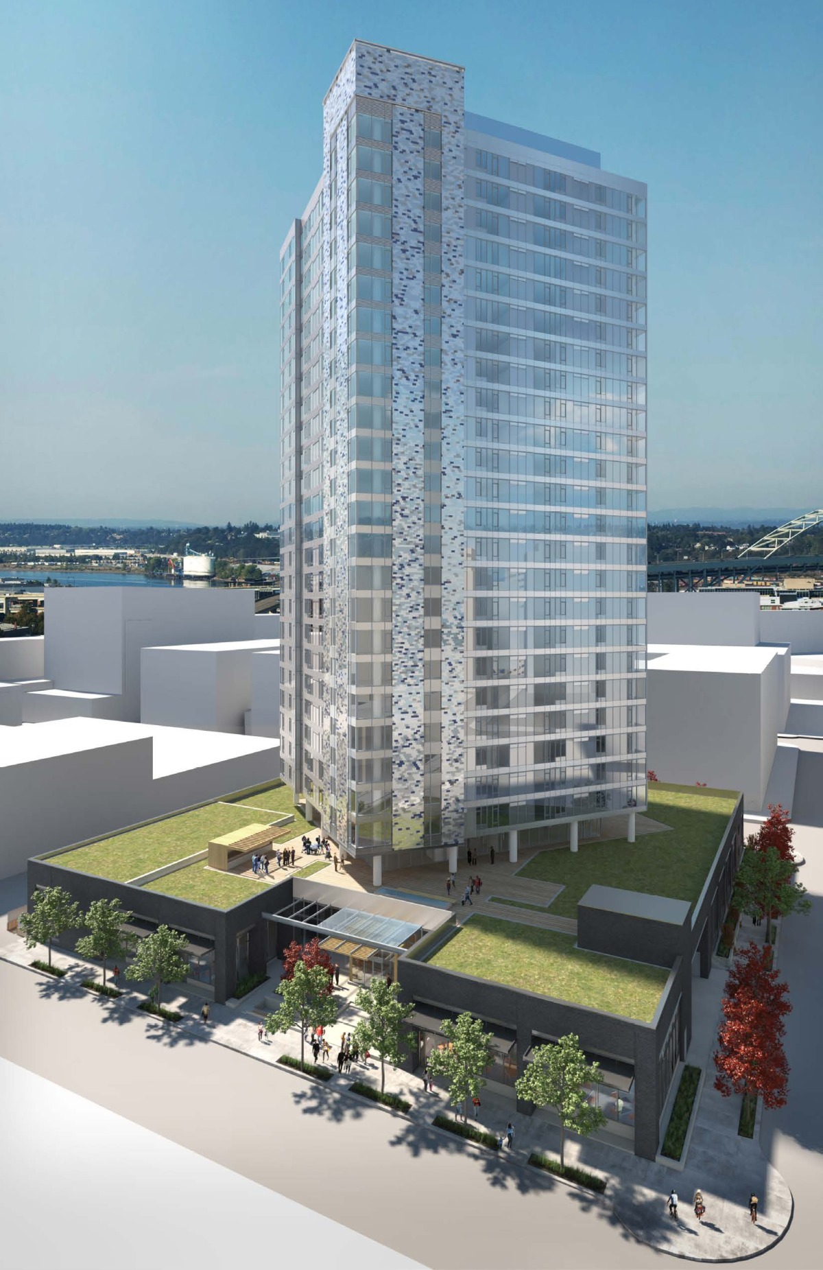
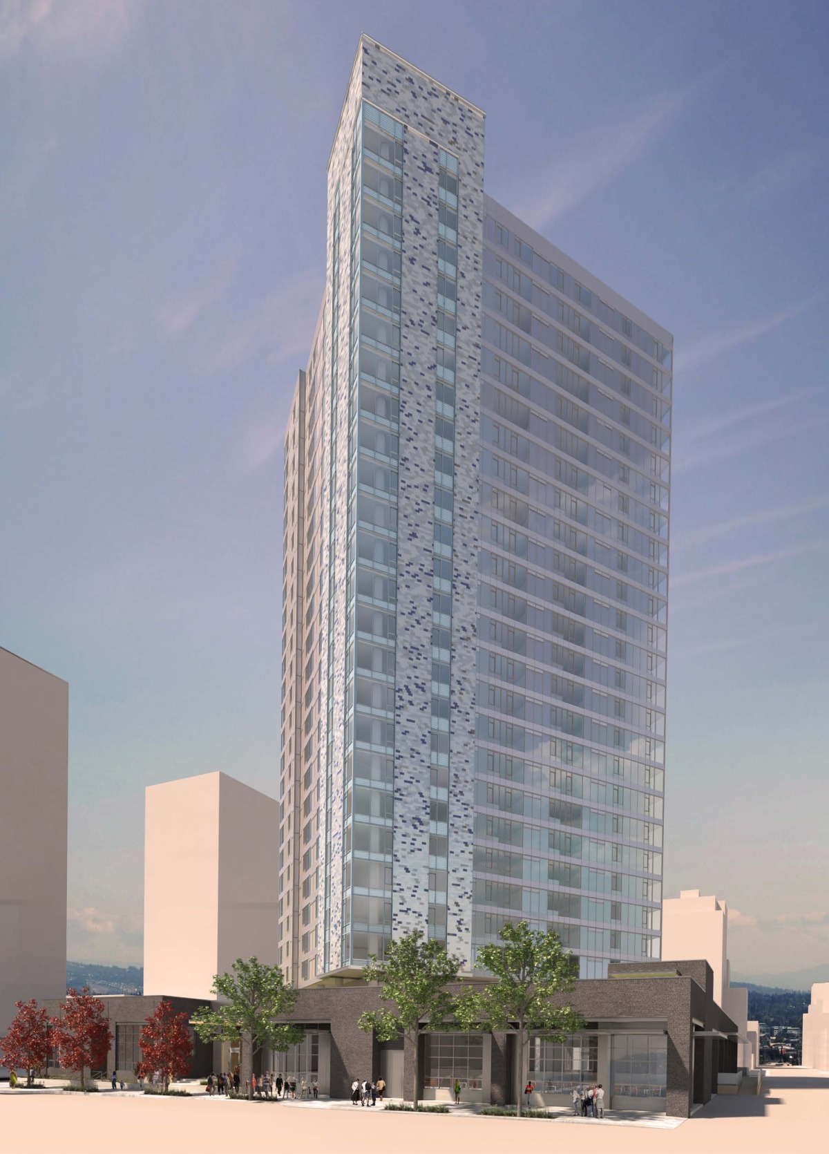
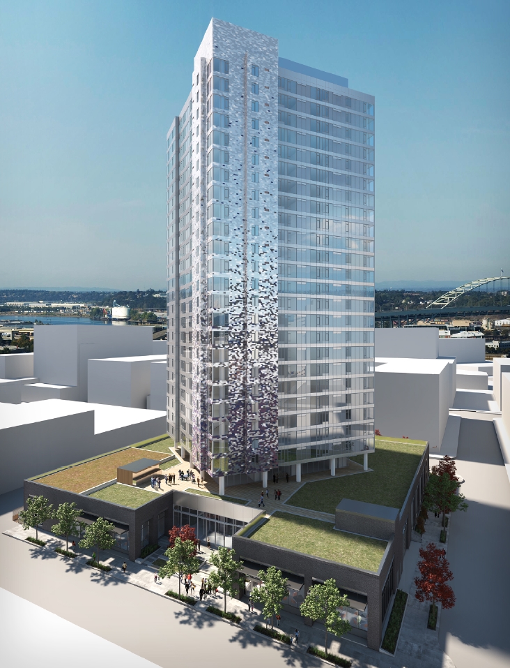
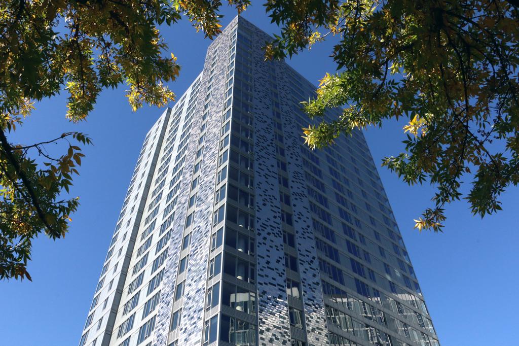
I think the NV is ugly. I don't mind the tiles, but the metal panels just look so very cheap, similar-ish to Benson Tower... but NV wasn't built at a spot that demands attention the way The Yard was. NV is more or less tucked away in the northern Pearl, whereas The Yard is basically a gateway to the east side of the city right in the heart of the city on Burnside - and, by "gateway," I mean an architectural middle finger. Granted, NV has an offensive name, but even there, The Yard one-upped the offensiveness by creating poor-floors and rich-floors, because the new age Thurston Howells with out of state plates shouldn't have to mingle with the non-rich. The poor floors even have less windows, by design, for identical floorplans.

NV is ugly, but The Yard is offensive.
Reply With Quote
     
     
  #253  
Old Posted Sep 29, 2016, 7:33 PM
maccoinnich maccoinnich is online now
Moderator
 
Join Date: Jan 2009
Location: Portland
Posts: 7,405
Quote:
The Pearl's newest residential tower officially opens its doors (Photos)


It's hard to miss Unico Properties' newest residential tower in the Pearl District.

Not only does NV soar 250 feet and 26 stories into the air at 1261 N.W. Overton St., but some unique exterior tiles have a way of making the building stand out even more when the light is just right.Unico celebrated the grand opening of the new tower this week, though its first residents moved in earlier this month. The building, designed by ZGF Architects and built by Andersen Construction, broke ground back in August 2014.

NV includes 284 residential units, including one- and two-bedroom apartments, live-work lofts, two-story townhouse and penthouses on the top floors. Rents start at $1,595 per month. A quick visit to NV's web site found a 650-square-foot, one-bedroom apartment on the fourth floor for $1,880 a month and a 1,260-square-foot penthouse on the top floor for $4,500 a month.
...continues at the Portland Business Journal.
__________________
"Maybe to an architect, they might look suspicious, but to me, they just look like rocks"

www.twitter.com/maccoinnich
Reply With Quote
     
     
End
 
 
Reply

Go Back   SkyscraperPage Forum > Regional Sections > United States > Pacific West > Portland > Downtown & City of Portland
Forum Jump


Forum Jump


All times are GMT. The time now is 5:59 PM.

     
SkyscraperPage.com - Archive - Privacy Statement - Top

Powered by vBulletin® Version 3.8.7
Copyright ©2000 - 2024, vBulletin Solutions, Inc.