HomeDiagramsDatabaseMapsForum About
     

Go Back   SkyscraperPage Forum > Regional Sections > Canada


Reply

 
Thread Tools Display Modes
     
     
  #581  
Old Posted Nov 26, 2020, 3:56 PM
wave46 wave46 is offline
Closed account
 
Join Date: Aug 2016
Posts: 3,875
Quote:
Originally Posted by 🌳🌱🌿🌴🍁 View Post
Not sure if posted before but it is interesting to see this 1959 sketch of the CN logo, which certainly appears to have inspired CNN (with added cable and letter) years later.
https://www.logodesignlove.com/cn-logo-evolution
It reminds me of the NASA worm logo.

Reply With Quote
     
     
  #582  
Old Posted Nov 26, 2020, 5:38 PM
esquire's Avatar
esquire esquire is offline
Registered User
 
Join Date: Oct 2001
Posts: 37,483
CN's logo is as iconic as they come in terms of Canadian graphic design. It has held up very well over the years.
Reply With Quote
     
     
  #583  
Old Posted Nov 26, 2020, 6:08 PM
🌳🌱🌿🌴🍁 🌳🌱🌿🌴🍁 is offline
Registered User
 
Join Date: Jan 2020
Posts: 166
^ that view seems to be shared internationally (I think there is an error with the reference to 1969 here though - will let him know)...
https://imjustcreative.com/cn-logo-d...ing/2019/09/24

+ re worm reference: https://tonimarino.co.uk/canadian-national-logo/
Reply With Quote
     
     
  #584  
Old Posted Nov 26, 2020, 6:39 PM
MolsonExport's Avatar
MolsonExport MolsonExport is offline
The Vomit Bag.
 
Join Date: Oct 2003
Location: Otisburgh
Posts: 44,909
Quote:
Originally Posted by 🌳🌱🌿🌴🍁 View Post
Not sure if posted before but it is interesting to see this 1959 sketch of the CN logo, which certainly appears to have inspired CNN (with added cable and letter) years later.
https://www.logodesignlove.com/cn-logo-evolution
https://www.logodesignlove.com/cnn-logo


Library and Archives Canada
CN
CNN

The contemporary CN logo is the Harvard textbook case of everything that a great logo should be. Let's hope they keep some moronic consultants from "rebranding" or "freshening-up" the logo.

The best logos are the ones that are simple, unique, and attractive.

Simple: you should be able to sketch it from memory without difficulty
Unique: the logo represents one firm/brand, and when encountered it is immediately correctly recalled as such
Attractive: the design is seen as aesthetically pleasing by those (businesses, consumers, institutions, stakeholders) targeted by the logo.

This one has all three:

logodesignlove

So does this one:

food.cloud

And this one:

networkingnerd
__________________
The whole problem with the world is that fools and fanatics are always so certain of themselves, and wiser people so full of doubts. (Bertrand Russell)
Reply With Quote
     
     
  #585  
Old Posted Nov 26, 2020, 6:44 PM
MolsonExport's Avatar
MolsonExport MolsonExport is offline
The Vomit Bag.
 
Join Date: Oct 2003
Location: Otisburgh
Posts: 44,909
terrible logos (c/o business insider)


world's worst redesign


another terrible redesign


absolutely horrible imagery suggested here:
__________________
The whole problem with the world is that fools and fanatics are always so certain of themselves, and wiser people so full of doubts. (Bertrand Russell)
Reply With Quote
     
     
  #586  
Old Posted Nov 26, 2020, 7:01 PM
🌳🌱🌿🌴🍁 🌳🌱🌿🌴🍁 is offline
Registered User
 
Join Date: Jan 2020
Posts: 166
Quote:
Originally Posted by MolsonExport View Post
....
Yes, good points – like Nike, etc. – and some simple ones even manage to hide things subtly.

"In an interview with Fast Company, the logo’s designer, Lindon Leader, said, 'The arrow could connote forward direction, speed and precision, and if it remained hidden, there might be an element of surprise, that aha moment.'"


Or this one with the skyline...


cnbc.com
Reply With Quote
     
     
  #587  
Old Posted Nov 26, 2020, 7:36 PM
megadude megadude is online now
Registered User
 
Join Date: Sep 2017
Location: N. York/Bram/Mark/Sauga/Burl/Oak/DT
Posts: 3,059
Ya I'm a big fan of simplicity and subtle clues.

There are many soccer teams with what resembles crests more than logos. While they are still cool, they seem dated and I am a fan of updating the logo while maintaining key elements of the original like Arsenal did. Everton did it too but there was a backlash from the fans so they went back to the original mostly. Man City changed for the better. I think Man U is due for an update.

What Juventus did I am not a fan. I do think their new logo looks sharp but was a complete departure from their historic and globally recognized logo.


https://www.telegraph.co.uk/sport/20...adge-redesign/


https://www.canny-creative.com/evert...rebrand-twice/


https://www.bbc.com/sport/football/35175829


https://www.famouslogos.net/manchester-united-logo/


https://thisisthetree.com/blog/posts...b-crest-update
Reply With Quote
     
     
  #588  
Old Posted Nov 26, 2020, 7:44 PM
megadude megadude is online now
Registered User
 
Join Date: Sep 2017
Location: N. York/Bram/Mark/Sauga/Burl/Oak/DT
Posts: 3,059
I absolutely hate seeing this when walking around downtown. TD employees that have been branded on their suits.

It's one thing to have a logo on a uniform or say a polo shirt or even on a suit jacket as part of a team like you see on some European soccer clubs, but I hate seeing that pin on a regular suit day in day out.

It's YOUR suit. You bought it. I don't like that they have to wear those pins (I'm assuming it's mandatory). Now, if they provided the suit to you, okay then. Though I personally wouldn't be a fan.

When I worked for TD for 3 years at the admin. centre, they got all hundreds of us employees magnetic name tags. They said they cost like 20 bucks each, which I believe considering that the last two jobs where I had signature stamps made cost $60. By the end of the week we left them in our drawers never to be worn again even though they reminded us that it's now mandatory. Well collectively we said fuck you. We work in an admin centre and don't see clients. It's such a large workplace that we don't need to know the name of every single person we pass by everyday.


https://financialpost.com/news/fp-st...mp-for-bankers
Reply With Quote
     
     
  #589  
Old Posted Nov 26, 2020, 7:51 PM
Djeffery Djeffery is offline
Registered User
 
Join Date: Oct 2017
Location: London
Posts: 4,536
Similar to the FedEx arrow, Amazon also has an arrow that means more than one thing. Denotes "we have everything from A to Z" and also appears as a smile when packages are left upright (and are still there when you get home).


Not really sure what UPS was getting at it with their current logo. Their prior logo had a package on it, so it kind of told you what they did. Maybe it did need a refresher, but the shield they went to, while cleaner and more modern looking, is also more generic.

Reply With Quote
     
     
  #590  
Old Posted Nov 26, 2020, 7:52 PM
Nite's Avatar
Nite Nite is offline
Registered User
 
Join Date: Dec 2007
Location: Toronto
Posts: 2,992
Quote:
Originally Posted by MolsonExport View Post
terrible logos (c/o business insider)
absolutely horrible imagery suggested here:

What was this for?
Reply With Quote
     
     
  #591  
Old Posted Nov 26, 2020, 7:57 PM
Djeffery Djeffery is offline
Registered User
 
Join Date: Oct 2017
Location: London
Posts: 4,536
Quote:
Originally Posted by Nite View Post
What was this for?
Youth For Christ has many logos around the world, some almost have this kind of look. Might be them.
Reply With Quote
     
     
  #592  
Old Posted Nov 26, 2020, 8:07 PM
esquire's Avatar
esquire esquire is offline
Registered User
 
Join Date: Oct 2001
Posts: 37,483
Following the success of the CN noodle logo, CP responded with its own modernist logo, the Multimark (1968). It was kind of interesting how they adapted it to different corporate arms by using different colours for each. It didn't last long though. By the late 80s it was pretty well out of use.


Reply With Quote
     
     
  #593  
Old Posted Nov 26, 2020, 8:30 PM
🌳🌱🌿🌴🍁 🌳🌱🌿🌴🍁 is offline
Registered User
 
Join Date: Jan 2020
Posts: 166
^ It actually looks very good on that train, and that is a nice colour mix...

Denotes "we have everything from A to Z"

Had completely forgotten about that (or maybe never knew) – great reminder...

Yes that would be strange re TD if it's the case; it also seems that political leaders have been wearing flag pins more in recent years, but maybe that is just an impression. A kind of patriotic one-upmanship.

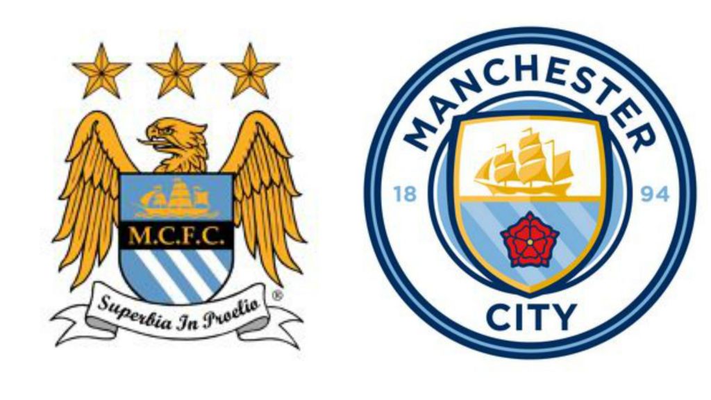
Regarding the club logos, I agree about Manchester City – that is a really nice badge: "A rounded badge depicting a shield containing a ship, the Lancashire Rose, and the three rivers of Manchester." The Juventus update has grown on me a bit, although you have a point about not breaking too much from tradition for such storied teams. I personally like the old Arsenal one.

Originally Posted by Nite View Post
What was this for?


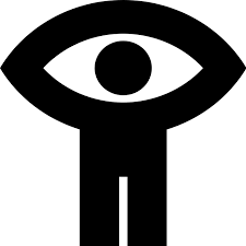
Putting aside the problems with it, the figure with arms brings to mind the famous National Film Board one:

Reply With Quote
     
     
  #594  
Old Posted Nov 26, 2020, 8:34 PM
_Citizen_Dane_'s Avatar
_Citizen_Dane_ _Citizen_Dane_ is offline
Registered User
 
Join Date: May 2019
Location: Edmonton
Posts: 100
Quote:
Originally Posted by esquire View Post
Following the success of the CN noodle logo, CP responded with its own modernist logo, the Multimark (1968). It was kind of interesting how they adapted it to different corporate arms by using different colours for each. It didn't last long though. By the late 80s it was pretty well out of use.
The Multimark's a favourite of mine. Having one unified logo that can be colour swapped depending on the branch of service is a genius idea for a multimodal company — red for railways, green for ships, grey for hotels, etc. Didn't really work too well when only a decade later the C.P.R. was divesting itself of all those other branches, but still a cool idea nonetheless. Especially so when you compare it to all the boring typeface-based logos they've spat out since...

Quote:
Originally Posted by ������������������������������ View Post
...brings to mind the famous National Film Board one.
The N.F.B.'s logo was great. Clean, impactful, and immediately got the point across — a brand known for it's world-class documentaries, represented by the celebration of, and exploration of, humanity shared to the eyes of the world. But then they ruined it...

I don't know who thought it was a good idea to crop the design at the knees. You can't even tell what the logo's supposed to represent now:


Last edited by _Citizen_Dane_; Nov 26, 2020 at 8:50 PM.
Reply With Quote
     
     
  #595  
Old Posted Nov 26, 2020, 9:49 PM
Andy6's Avatar
Andy6 Andy6 is offline
Starring as himself
 
Join Date: Mar 2002
Location: Toronto Yorkville
Posts: 9,739
Then when CP Air was acquired by Pacific Western and turned into Canadian Airlines International, they had a logo that sort of riffed on the CP logo. They stuck it over the second “a” in “Canadian” to make that wordmark “bilingual”. Bilingualism influences Canadian logo design sometimes.
__________________
crispy crunchy light and snappy
Reply With Quote
     
     
  #596  
Old Posted Nov 26, 2020, 10:06 PM
MolsonExport's Avatar
MolsonExport MolsonExport is offline
The Vomit Bag.
 
Join Date: Oct 2003
Location: Otisburgh
Posts: 44,909
I have a soft spot for CP's old Pac man logo. Not as good as CN, but still pretty cool.
__________________
The whole problem with the world is that fools and fanatics are always so certain of themselves, and wiser people so full of doubts. (Bertrand Russell)
Reply With Quote
     
     
  #597  
Old Posted Nov 27, 2020, 3:05 AM
vid's Avatar
vid vid is offline
I am a typical
 
Join Date: Apr 2004
Location: Thunder Bay
Posts: 41,172
Quote:
Originally Posted by Andy6 View Post
Then when CP Air was acquired by Pacific Western and turned into Canadian Airlines International, they had a logo that sort of riffed on the CP logo. They stuck it over the second “a” in “Canadian” to make that wordmark “bilingual”. Bilingualism influences Canadian logo design sometimes.


The goose was really nice too, the way they incorporated it into the livery:


https://en.wikipedia.org/wiki/Canadian_Airlines


Anyway, speaking of railway noodles:


https://en.wikipedia.org/wiki/Comboios_de_Portugal
Reply With Quote
     
     
  #598  
Old Posted Nov 27, 2020, 4:17 AM
manny_santos's Avatar
manny_santos manny_santos is offline
Registered User
 
Join Date: Jul 2006
Location: New Westminster
Posts: 5,012
Surprised I haven’t seen this one yet:


Glacier Media
Reply With Quote
     
     
  #599  
Old Posted Nov 27, 2020, 4:18 AM
manny_santos's Avatar
manny_santos manny_santos is offline
Registered User
 
Join Date: Jul 2006
Location: New Westminster
Posts: 5,012
Quote:
Originally Posted by vid View Post


Wow, really?
I believe that was the logo in the late 80s.
Reply With Quote
     
     
  #600  
Old Posted Nov 27, 2020, 4:20 AM
manny_santos's Avatar
manny_santos manny_santos is offline
Registered User
 
Join Date: Jul 2006
Location: New Westminster
Posts: 5,012
Quote:
Originally Posted by hipster duck View Post
Ha ha. The Sudbury Wolves logo looks like it was designed in 1965 for some Fairy Tale-themed amusement park, or to market a line of juice boxes for kids.

The Soo Greyhounds logo looks like they lifted the same dog straight off the Greyhound bus.

My favourite OHL logo is the Windsor Spitfires.
The London Knights had a God-awful logo in the mid-late 90s. I believe it was nicknamed Spider-Knight:


Sportslogos.net
Reply With Quote
     
     
This discussion thread continues

Use the page links to the lower-right to go to the next page for additional posts
 
 
Reply

Go Back   SkyscraperPage Forum > Regional Sections > Canada
Forum Jump


Forum Jump


All times are GMT. The time now is 11:59 AM.

     
SkyscraperPage.com - Archive - Privacy Statement - Top

Powered by vBulletin® Version 3.8.7
Copyright ©2000 - 2024, vBulletin Solutions, Inc.