I tend to agree that is building is looking rather messy and ad-hoc as it nears completion. Besides what's been discussed, it doesn't blend, in any way with the TD Tower or Cesar Pelli's original vision or design. As much as the Sears version was hated, in it's original, 5 storey Eaton's form, it was rather striking, monolithic and beautiful. The TD Tower was a vertical black slab and Eaton's, a horizontal white slab. They complimented each other beautifully and it was a bold and powerful design in it's day.
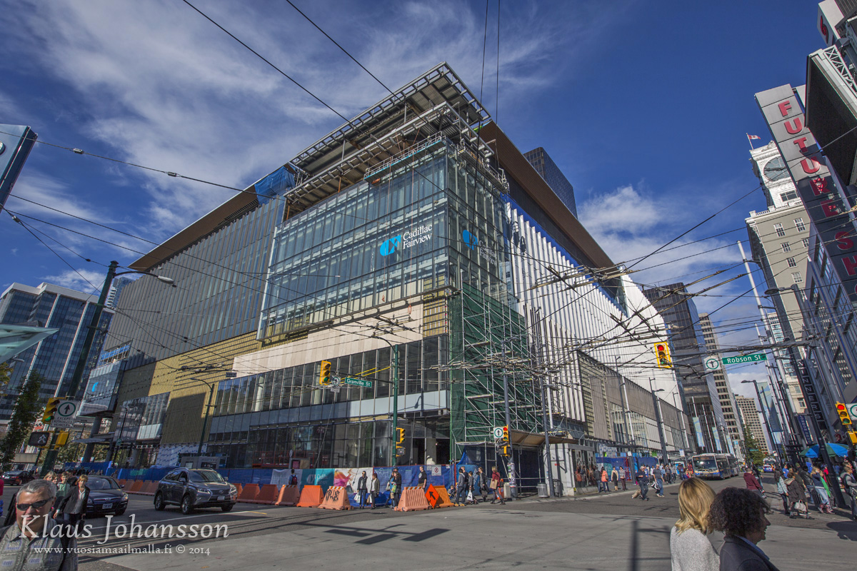
The Nordstom rendition is trendy and poor executed. In some ways similar to Telus Gardens but far less successful. It now clashes terribly with the TD Tower mostly due to the blue glazing. It screams James Cheng mediocre Vancouverism.
They should have kept the monolithic concept and simply glazed it making a a transparent version of the original 5 storey box. It would have been rather timeless and striking as opposed to the current, rather messy rendition.
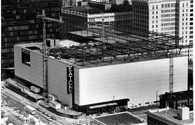
This photo shows the beginning of the destruction of the original boxy design as the 6th and 7th floor 'curvy' addition was being constructed.
Photo : The Vancouver Sun


 Prev
Prev


 Linear Mode
