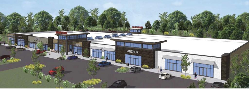
Nice Rendering, but the building still seems like a "hodge-podge" of disconnected elements.
I am not so sure this design will age well given the fact that it's quirky design elements are somewhat structural and not necessarily cosmetic – which is not an easy fix down the road when updates are warranted.
Even though the color scheme may be a nod to Georgia Tech, it would seem like a subtle approach would be in order here so it doesn’t appear so disjointed or haphazard.
I think I would take the design more seriously if they decided on a more refined color scheme.
Just note the existing GaTech buildings in midtown that are a balance of good design with an appropriate hint of school affiliation all presented in a more timeless package.
I am all for pushing the “envelope” of good design [ emphasis on – good ], but I wish it was a facility that looked like it was geared more towards students of higher education and not kindergarteners – especially in midtown.


 Prev
Prev


 Linear Mode
