HomeDiagramsDatabaseMapsForum About
     

Go Back   SkyscraperPage Forum > Regional Sections > Canada > Ontario > Ottawa-Gatineau > Downtown & City of Ottawa


Reply

 
Thread Tools Display Modes
     
     
  #121  
Old Posted Nov 18, 2016, 3:32 AM
rocketphish's Avatar
rocketphish rocketphish is offline
Planet Ottawa and beyond
 
Join Date: Feb 2009
Location: Greater Ottawa
Posts: 12,893
Quote:
Originally Posted by FFX-ME View Post
Updated design for Château Laurier looks awfully familiar
Architect and hotel owner on hand to answer questions about updated design

CBC News, November 17, 2016 @ 10:06pm
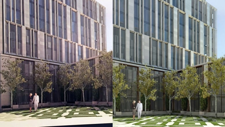


Some of the images presented for the redesigned Château Laurier appeared to be the same as ones earlier presented. On the left, a design presented on Nov. 17. At right, the design presented in September.


Architects and owners of the Fairmont Château Laurier in Ottawa unveiled a series of new design drawings for the expansion of the iconic hotel at a public meeting on Thursday night.

The design team is hoping the updated renderings will be better received by the public.

On the surface, however, they looked very similar to designs that were widely criticized in September.

In September, social media reaction came quickly, with comments suggesting the design looked "like a series of barcodes," and would become "the ugliest building downtown" if plans went ahead.

Even Mayor Jim Watson chimed in, saying he didn't think the modern take of the original design would blend in with the hotel's older features.

New design 8 per cent smaller

The new design for the two-wing addition has been scaled back overall. Setbacks have been increased on both the Mackenzie Avenue and Rideau Canal sides of the building.

The roof on the hotel's east and west wings has also been changed to improve the view.

Design team heard public feedback

Art Phillips, director of development for Vancouver-based Larco Investments, which owns the Château Laurier, and award-winning Toronto architect Peter Clewes were on hand to answer the public's questions and speak about the project.

There was no public presentation following the September reveal.

The design team said it listened to community members and wanted to have a chance to explain the concept better.

"Tonight was really the opportunity for those those that expressed a very passionate position — particularly on social media two months ago — to come out this evening and we can actually have the benefit of a one-on-one conversation," said principal architect Peter Clewes.

The changes are intended to "make the new work physically and visually compatible with, subordinate to and distinguishable from the historic place," Larco Investments said in a media release.

Initial reaction to the redesign suggested the changes may not have been significant enough.

Construction could start next fall

The Château Laurier is formally designated a city heritage building, which means certain restrictions apply to any changes.

Ottawa city council has to approve the design, and because the hotel is on federal land, the National Capital Commission also gets a say.

After Thursday's meeting, Larco Investments will submit an application to the city and the board of the NCC.

Construction could begin in late fall of 2017.


http://www.cbc.ca/beta/news/canada/o...lans-1.3855587
Reply With Quote
     
     
  #122  
Old Posted Nov 18, 2016, 3:47 AM
rocketphish's Avatar
rocketphish rocketphish is offline
Planet Ottawa and beyond
 
Join Date: Feb 2009
Location: Greater Ottawa
Posts: 12,893
PS. There's a survey at the end of the CBC article, if anybody is interested in voting on the latest proposal:

http://www.cbc.ca/beta/news/canada/o...lans-1.3855587
Reply With Quote
     
     
  #123  
Old Posted Nov 18, 2016, 4:11 AM
Harley613's Avatar
Harley613 Harley613 is offline
Registered User
 
Join Date: Jun 2009
Location: Aylmer, QC
Posts: 6,743
It looks 8% less horrific in addition to being 8% smaller, so at least is has that going for it....
Reply With Quote
     
     
  #124  
Old Posted Nov 18, 2016, 4:25 AM
Pelleteh Pelleteh is offline
Pelleteh
 
Join Date: Jul 2015
Location: Ottawa
Posts: 2
They don't get it!!!

Revised or not, this is still ugly. They should perhaps have a look at the Lord Elgin that did manage extensions without loosing the building's caracter.
Reply With Quote
     
     
  #125  
Old Posted Nov 18, 2016, 10:31 AM
Temperance Temperance is offline
Registered User
 
Join Date: Mar 2009
Location: Winnipeg
Posts: 466
They must think the public is pretty dumb - no view from Major's Hill Park - by far the worst angle from which to view the new buildings. I'm not sure how they can fix that view, considering that they have put up two ugly, soon to be dated, boxes between the park and the chateau.
Reply With Quote
     
     
  #126  
Old Posted Nov 18, 2016, 10:58 AM
eemy's Avatar
eemy eemy is offline
Closed account
 
Join Date: Aug 2006
Posts: 4,456
This is an insult to public consultation. They ostensibly can't do a historic-style addition due to some sort of by-law. Get an exemption then, FFS!
Reply With Quote
     
     
  #127  
Old Posted Nov 18, 2016, 11:32 AM
NOWINYOW NOWINYOW is offline
Registered User
 
Join Date: Mar 2013
Location: Ottawa
Posts: 448
Meh, I think it will work out fine. At least it's not like The Louvre with a glass pyramid!

The most disturbing aspect of this whole episode is the number of people that come out to complain about an extension that will really only be seen from Major's Hill Park, meanwhile streets like Rideau, Albert, Slater, Metcalfe, LeBreton Flats etc are littered with monotonous, least-inspired boxes and not a peep of protest.
Reply With Quote
     
     
  #128  
Old Posted Nov 18, 2016, 12:16 PM
Mikeed Mikeed is offline
Registered User
 
Join Date: Jun 2013
Posts: 348
I feel like my biggest issue is with the roof lines, and the rather dated fin design common for our era, as seen on the finance building and the ACCE building at Algonquin, among others. And when I say dated I mean more of it is a fade of our time that while on the finance building I think it looks great, I really don't think it will age well here. Mostly cause I think the fin design on the finance building speaks to a internationalism element while the non-linear design here doesn't work- it creates too much noise.

So the boxy elements of the roof line and the noise inducing fins really creates a design that I think, not an expert, clashes with the rest of the building. I'm not against a modern expansion, but do one that doesn't clash!

Also the lighting vastly over powers the rest of the building and may impact the dominance of the Hill.
__________________
Long time reader.
Seldom post.
Reply With Quote
     
     
  #129  
Old Posted Nov 18, 2016, 1:33 PM
Peter North Peter North is offline
BANNED
 
Join Date: Oct 2016
Posts: 12
Who is this architect clown? Take a hint bro. Everyone hates it.
Reply With Quote
     
     
  #130  
Old Posted Nov 18, 2016, 1:39 PM
ars ars is offline
Registered User
 
Join Date: Feb 2013
Location: Ottawa
Posts: 472
My only response after seeing these new renders:

Hahahaha NOPE

I hope people keep opposing this until they drop this modern glass building bs altogether.

Quote:
Originally Posted by NOWINYOW View Post
Meh, I think it will work out fine. At least it's not like The Louvre with a glass pyramid!

The most disturbing aspect of this whole episode is the number of people that come out to complain about an extension that will really only be seen from Major's Hill Park, meanwhile streets like Rideau, Albert, Slater, Metcalfe, LeBreton Flats etc are littered with monotonous, least-inspired boxes and not a peep of protest.
The glass pyramid at Louvre is definitely not as intrusive to the design of the rest of the historic buildings around it.

This is infinitely worse, in my opinion, and an insult to Ottawa considering that the Chateau is one of the most recognizable buildings in Canada.
Reply With Quote
     
     
  #131  
Old Posted Nov 18, 2016, 3:06 PM
m0nkyman m0nkyman is offline
Registered User
 
Join Date: Oct 2006
Location: Ottawa
Posts: 2,032
Quote:
Originally Posted by J.OT13 View Post
I was actually ok with the design shown in September and I am an advocate of modern additions to historic buildings as opposed to knock-offs and faux-historic, but today, I'm actually insulted. How can they make this presentation telling us they've listened to the community's concerns. It's the same damn design most people hated, only slightly smaller. They could have at least changed the roof-line to match the original.

I'm also insulted with the drop off on Mackenzie Avenue. One is enough.
Agree completely.
Reply With Quote
     
     
  #132  
Old Posted Nov 18, 2016, 3:29 PM
lrt's friend lrt's friend is offline
Registered User
 
Join Date: Dec 2006
Posts: 12,166
What really bothers me are all those vertical lines in the middle floors of the new building. To me, it clashes with the architecture of the old building. But what do I know about architecture.
Reply With Quote
     
     
  #133  
Old Posted Nov 18, 2016, 3:40 PM
Capital Shaun Capital Shaun is offline
Registered User
 
Join Date: May 2012
Location: Ottawa
Posts: 860
As others have stated, the roof line is a major problem. It'll still look boxy and out of place, especially when viewed from Major Hill's Park. It's like the architects were forbidden from using any angles other than 90 degrees.

If it's going to be mostly glass, I can live with a variation of the "barcode" design. It's certainly more original than a standard grid pattern of a typical office tower.

And who ever decided to have all this hoopla for this so-called "update" (after the numerous complaints last time) needs to be shamed big time. It's pretty much the same design with some minor tweaks.

Last edited by Capital Shaun; Nov 18, 2016 at 3:40 PM. Reason: typo
Reply With Quote
     
     
  #134  
Old Posted Nov 18, 2016, 8:25 PM
OTSkyline OTSkyline is offline
Registered User
 
Join Date: Jun 2012
Posts: 2,634
Agreed, this is a joke. A couple of weeks and a re"launch" party just to show the same design at 92% of the old size? Pathetic...

I would like the extension to copy the existing one BUT at the very least, i'd be interested to see what the following revisions would look like:
-Change the windows on first floor so they have the same dome shape at the top to copy the existing ones
-Take out the fins in the middle section and stick to mostly just glass
-Change the roof to copy the existing copper roof line with angles and gables
Reply With Quote
     
     
  #135  
Old Posted Nov 18, 2016, 9:55 PM
daud's Avatar
daud daud is offline
Registered User
 
Join Date: Jun 2012
Location: Ottawa
Posts: 743
Article with the Architects perspective:

http://ottawacitizen.com/news/local-...revised-design

"Q: For people who didn’t like the overall look, that hasn’t change today?

A: No. I would say we’ve refined it. But no, it has not changed in any substantive way.

We’re dealing with what I would call objective criteria and subjective criteria. In the latter, on the continuum of architecture design there are those who believe we ought to do something that is historical, they hate modernism, that’s just the way they feel. They’re just uncomfortable with it, they love a sense of connection to history. And at the other end of that continuum there are modernists, hyper-modernists, who believe you should do buildings of our time."

Correction...

1. there are people who feel you should do something historical HERE, in this circumstance, for a myriad of reasons.

2. They don't hate modernism at all, love it quite frankly, just hate that it is plopped up like lego against a French Chateau backing onto a beautiful urban park, next to gothic parliament buildings.

This architect is coming across as quite the character to put it nicely.
Reply With Quote
     
     
  #136  
Old Posted Nov 19, 2016, 3:09 AM
Kitchissippi's Avatar
Kitchissippi Kitchissippi is offline
Busy Beaver
 
Join Date: Nov 2005
Location: Ottawa
Posts: 4,471
"Châteauesque buildings are typically built on an asymmetrical plan with a roof-line broken in several places and a facade composed of advancing and receding planes."

Even if they used a contemporary style, they should at the very least take some of these principles into consideration.

Plus, the arabesque patterns and tacky surface ornamentation in the rendering are really awful . They could look nice on some other building elsewhere but completely incongruous with the existing Chateau.

Reply With Quote
     
     
  #137  
Old Posted Nov 19, 2016, 5:52 AM
enrigue8's Avatar
enrigue8 enrigue8 is offline
Mr president
 
Join Date: Jan 2016
Location: ottawa
Posts: 158
It very ugly !
Why not make an international competition for a landmark like that ?
Unfortunately, in Ontario there is no international competition because the foreign designs are too pretty and too futuristic for us canadians .It will change our mind and lifestyle and pathetic architects like mr Clewes will be out of job.
It will be the end of pathetic architecture in Canada.
Just watch how ugly Toronto became because of bad developers and architects.
Everywhere in the world,architecture is better than here.
Sorry folks to say that.
__________________
World class architecture for Canada please!
Reply With Quote
     
     
  #138  
Old Posted Nov 19, 2016, 4:24 PM
FFX-ME's Avatar
FFX-ME FFX-ME is offline
Registered User
 
Join Date: Oct 2006
Posts: 1,053
Yea and that Clewes guy is somewhat to blame for Toronto.

You know, Ottawa is known for neo gothic architecture. Why not build more instead of crappy glass boxes. Make the city more interesting and unique.
Reply With Quote
     
     
  #139  
Old Posted Nov 19, 2016, 10:22 PM
citizen j's Avatar
citizen j citizen j is offline
Registered User
 
Join Date: Oct 2005
Location: Ottawa
Posts: 1,029
Hmmm, not a fan.
But here are a few observations.
If they were to propose a more historically sensitive addition, unless they were willing to spend a significant amount on designing and finishing it properly it would likely age poorly -- think bad 80s pomo pastiche.
Second, having recently travelled in the UK and Germany, the juxtaposition of historical and contemporary architectural styles doesn't strike me as particularly heinous. A few things this addition has going for it: it respects the horizontal breaks in the massing of the older additions; it doesn't loom over the older additions (the iconic roofline is still visible from the Alexandra Bridge, for instance); and it isn't attached to the older additions all the way up to the roofline.
Room for improvement? Absolutely. End of the world? meh.
__________________
The world is so full of a number of things
-- Robert Louis Stevenson
Reply With Quote
     
     
  #140  
Old Posted Nov 20, 2016, 1:15 PM
daud's Avatar
daud daud is offline
Registered User
 
Join Date: Jun 2012
Location: Ottawa
Posts: 743
Quote:
Originally Posted by citizen j View Post
Hmmm, not a fan.
But here are a few observations.
If they were to propose a more historically sensitive addition, unless they were willing to spend a significant amount on designing and finishing it properly it would likely age poorly -- think bad 80s pomo pastiche.
Second, having recently travelled in the UK and Germany, the juxtaposition of historical and contemporary architectural styles doesn't strike me as particularly heinous. A few things this addition has going for it: it respects the horizontal breaks in the massing of the older additions; it doesn't loom over the older additions (the iconic roofline is still visible from the Alexandra Bridge, for instance); and it isn't attached to the older additions all the way up to the roofline.
Room for improvement? Absolutely. End of the world? meh.
I get what you are saying. A few observations;

1. I hate it less than I did before but still feel there should be a much more interesting proposal.
2. Building in the same style comes down to $. Of all the variables factoring for and against building in this chateau style, money is the big one. Much of the resulting commentary can come back to dollars. If they are not going to spend the money to do it properly it will look bad. what those of us that support an imitation of the architectural style are suggesting is that the money should be spent to do it properly. respect the building and its style. But I would guess the owners are not willing to spend those dollars. So, in some respects, all this jabber about respecting time periods could be influenced by a lack of will to spend the bucks.

I just feel there has to be a better way than what they've proposed. I fully respect the private property and business that Larco is in. This city needs hotel rooms badly. But, i'm also very concerned about the major hills park view. This is as close to central park as Ottawa can get and the north end of it is graced with a chateau. Now it will be a glass building with a hint of spires behind it. What is the price of that view? This proposal will look bad in 20-30 years, that is certain, so for this reason, I'm really against it.
Reply With Quote
     
     
This discussion thread continues

Use the page links to the lower-right to go to the next page for additional posts
 
 
Reply

Go Back   SkyscraperPage Forum > Regional Sections > Canada > Ontario > Ottawa-Gatineau > Downtown & City of Ottawa
Forum Jump


Forum Jump


All times are GMT. The time now is 1:22 PM.

     
SkyscraperPage.com - Archive - Privacy Statement - Top

Powered by vBulletin® Version 3.8.7
Copyright ©2000 - 2024, vBulletin Solutions, Inc.