Recent photo of the new Air Canada livery in natural light and regular operation.
 Source
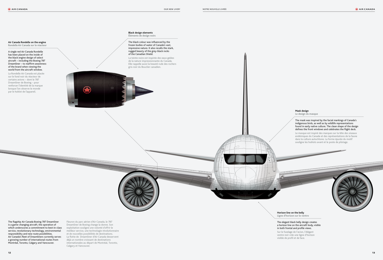
The red on black roundel on the tail is actually far more visible than I expected. I love the look of it. I thought that the contrast would be poorer, but I was wrong.
I'm not loving the black eyeliner. The white/bare metal mullions of the cockpit windows detract from the unified black look that was intended. I think that it looks kind of goofy and could live without it.
I also thought that the roundel at the front of the fuselage would look better above the windows and beside the Air Canada wordmark. But seeing it again, in daylight, I think that it looks fine.
Overall, I like the new livery. I really quite liked the current/old "ice" livery, but I am coming around to this new one.





 Prev
Prev








 Linear Mode
