HomeDiagramsDatabaseMapsForum About
     

Go Back   SkyscraperPage Forum > Regional Sections > Canada > Alberta & British Columbia > Vancouver > Transportation & Infrastructure


Closed Thread

 
Thread Tools Display Modes
     
     
  #11181  
Old Posted Feb 9, 2017, 5:42 PM
Canadian74 Canadian74 is offline
Registered User
 
Join Date: Aug 2007
Location: AB/BC
Posts: 710
Anyone else think red titles would have looked better?
Still pretty elegant
     
     
  #11182  
Old Posted Feb 9, 2017, 6:10 PM
casper's Avatar
casper casper is online now
Registered User
 
Join Date: Nov 2011
Location: Victoria
Posts: 12,725
Quote:
Originally Posted by Canadian74 View Post
Anyone else think red titles would have looked better?
Still pretty elegant
I like it. The old dark green they had in years past would have been better but the black looks good.
     
     
  #11183  
Old Posted Feb 9, 2017, 6:41 PM
trofirhen trofirhen is offline
Registered User
 
Join Date: Oct 2008
Posts: 9,045
Quote:
Originally Posted by Canadian74 View Post
Anyone else think red titles would have looked better?
Still pretty elegant
Quote:
Originally Posted by casper View Post
I like it. The old dark green they had in years past would have been better but the black looks good.
I like it. It has a crisp, rather 'chic' look to it. Much better than just red and white, red and white, red and white, red and .......

Last edited by trofirhen; Feb 9, 2017 at 7:47 PM.
     
     
  #11184  
Old Posted Feb 9, 2017, 8:15 PM
whatnext whatnext is online now
Registered User
 
Join Date: Feb 2009
Location: Vancouver
Posts: 27,630
Quote:
Originally Posted by Canadian74 View Post
Anyone else think red titles would have looked better?
Still pretty elegant
Yes, I really don't like the black, Way too stark, and what is "Canadian" about it? I would rather they go back to the dark green.

AC seems to have locked itself into this weird belief they have to change their livery every decade. This will be the third since WestJet was created, and they still have the original livery! When was the last time Lufthansa changed their livery?
     
     
  #11185  
Old Posted Feb 9, 2017, 8:24 PM
nname nname is offline
Registered User
 
Join Date: Aug 2005
Posts: 5,076
I'm fine with the new livery, but just find the new route map very hard to read...


Quote:
Originally Posted by Johnny Aussie View Post
Finally!

Effective 15 June YVR - TPE is going daily on 77Ws.

Currently at 5 weekly.

http://www.routesonline.com/news/38/airl...h-america-service-changes-as-of-09feb17/
Guess there won't be a 11x weekly seasonal increase from CI from now on.

Last edited by nname; Feb 9, 2017 at 8:35 PM.
     
     
  #11186  
Old Posted Feb 9, 2017, 8:31 PM
osirisboy's Avatar
osirisboy osirisboy is offline
Registered User
 
Join Date: Mar 2006
Location: Vancouver BC
Posts: 6,429
Quote:
Originally Posted by whatnext View Post
Yes, I really don't like the black, Way too stark, and what is "Canadian" about it? I would rather they go back to the dark green.

AC seems to have locked itself into this weird belief they have to change their livery every decade. This will be the third since WestJet was created, and they still have the original livery! When was the last time Lufthansa changed their livery?
What makes dark green "Canadian"?
     
     
  #11187  
Old Posted Feb 9, 2017, 8:44 PM
trofirhen trofirhen is offline
Registered User
 
Join Date: Oct 2008
Posts: 9,045
Quote:
Originally Posted by osirisboy View Post
What makes dark green "Canadian"?
Perhaps the association of Canada and forests?
     
     
  #11188  
Old Posted Feb 9, 2017, 9:06 PM
LeftCoaster's Avatar
LeftCoaster LeftCoaster is offline
Moderator
 
Join Date: Nov 2005
Location: Toroncouver
Posts: 13,131
Quote:
Originally Posted by Johnny Aussie View Post
Finally!

Effective 15 June YVR - TPE is going daily on 77Ws.

Currently at 5 weekly.

http://www.routesonline.com/news/38/airl...h-america-service-changes-as-of-09feb17/
So what does that mean for China airlines. I assume they will be simply daily now, since YYZ went daily on EVA as well.

That would perfectly fit the 11 of China down to 7.

Quote:
Originally Posted by trofirhen View Post
Perhaps the association of Canada and forests?
Ya I would say dark green is much more "Canadian" but who says our livery has to derive all its ques from classic Canada.

I like the new livery, but feel a few more subtle jestures would have moved it from a safe good livery to a more exciting livery. A red cheat line along the black fuselage and a better transtiiton from the black of the tail to the white would have been a difference maker for me.
     
     
  #11189  
Old Posted Feb 9, 2017, 9:39 PM
officedweller officedweller is offline
Registered User
 
Join Date: Jul 2001
Location: Vancouver
Posts: 41,553
It's really pretty bland.

The placement of the logo at the front, below the windows, reminds me of the trademark logo used by the Royal Canadian Mint on coins - like a footnote.
     
     
  #11190  
Old Posted Feb 9, 2017, 10:08 PM
trofirhen trofirhen is offline
Registered User
 
Join Date: Oct 2008
Posts: 9,045
Quote:
Originally Posted by LeftCoaster View Post
Ya I would say dark green is much more "Canadian" but who says our livery has to derive all its ques from classic Canada.

I like the new livery, but feel a few more subtle jestures would have moved it from a safe good livery to a more exciting livery. A red cheat line along the black fuselage and a better transtiiton from the black of the tail to the white would have been a difference maker for me.
Quote:
Originally Posted by officedweller View Post
It's really pretty bland.

The placement of the logo at the front, below the windows, reminds me of the trademark logo used by the Royal Canadian Mint on coins - like a footnote.
I think that much of the problem is that it's derivative of "The Colours of Canada" .... the flag. There isn't a lot of room for creativity with just red and white.
     
     
  #11191  
Old Posted Feb 10, 2017, 2:13 AM
casper's Avatar
casper casper is online now
Registered User
 
Join Date: Nov 2011
Location: Victoria
Posts: 12,725
Quote:
Originally Posted by officedweller View Post
It's really pretty bland.

The placement of the logo at the front, below the windows, reminds me of the trademark logo used by the Royal Canadian Mint on coins - like a footnote.
The black makes it striking. It will stand out. When they had the maple leaf on the dark green tail it was very noticeable at many international airports.
     
     
  #11192  
Old Posted Feb 10, 2017, 6:00 AM
YVR Bruce YVR Bruce is offline
Registered User
 
Join Date: Nov 2011
Posts: 79
AC - New Colours

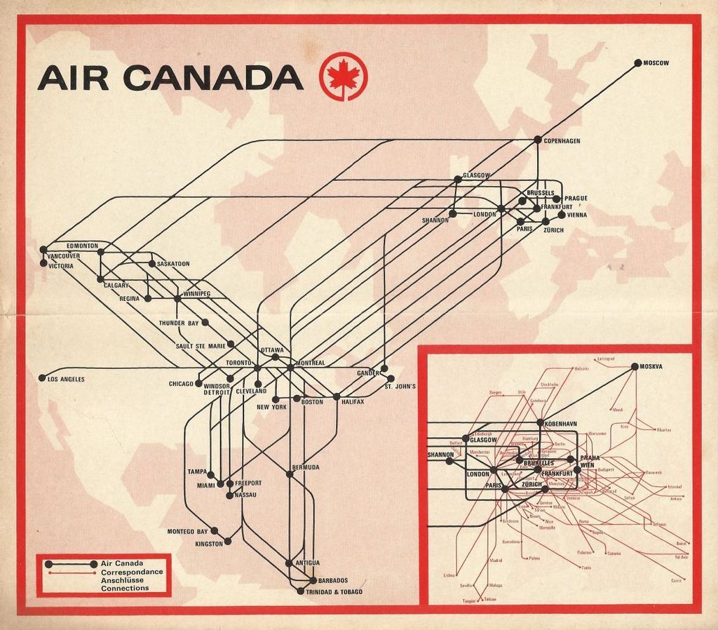
I went to the YVR event this morning, and one of the interesting features was a current system route map in the 1970's format. But of course much more dense and comprehensive given the growth in city pairs.
Hopefully someone can reproduce it for this thread
     
     
  #11193  
Old Posted Feb 10, 2017, 11:25 AM
deasine deasine is offline
Vancouver Moderator
 
Join Date: Mar 2007
Posts: 5,747
I'm torn by the livery. On the one hand I appreciate its simplicity and the black under belly looks quite classic and classy but on the other hand the tail fin does not stand out anymore unlike the old one, and the Euro White body is just like any other airline. I would have appreciated changing the current tail from the teal to black fading to light grey/green (with a very light green tint) and I think it would have stood out much more.
     
     
  #11194  
Old Posted Feb 10, 2017, 11:46 AM
deasine deasine is offline
Vancouver Moderator
 
Join Date: Mar 2007
Posts: 5,747
@YVR Bruce

The route maps I think you are looking at are these ones! I appreciate these in terms of a design, but really for legibility and function, each Canadian city should have used its own colour.


  #11195  
Old Posted Feb 10, 2017, 2:36 PM
LO 044's Avatar
LO 044 LO 044 is offline
Registered User
 
Join Date: Apr 2006
Location: Edmonton
Posts: 1,550
^Anyone over 60 will have an aneurysm looking at the new route map. Everyone else looking at it becomes cross eyed. I can understand the new livery although like i've said on other forums i vote thumbs down on it. But does every part of AC need rebranding like a route map? Did Justin Beiber design the route map so they had to include it in the rebranding?
     
     
  #11196  
Old Posted Feb 10, 2017, 5:04 PM
connect2source's Avatar
connect2source connect2source is offline
life in the present
 
Join Date: Mar 2011
Location: Halifax
Posts: 1,871
The map is a play on their 1970-71 route map. It worked much better when the route system was far smaller.

photo source : http://airline-memorabilia.blogspot.ca
__________________
source | energy
     
     
  #11197  
Old Posted Feb 10, 2017, 7:46 PM
officedweller officedweller is offline
Registered User
 
Join Date: Jul 2001
Location: Vancouver
Posts: 41,553
I saw the big ad in the paper today and realized that the cockpit windshield has a black "mask"
- which is bound to elicit comments of robbery and airline "bandits".

Quote:
Originally Posted by vanlaw View Post


Credit: Air Canada (of course)
     
     
  #11198  
Old Posted Feb 10, 2017, 8:06 PM
trofirhen trofirhen is offline
Registered User
 
Join Date: Oct 2008
Posts: 9,045
Arrow ... any takers? ...

Air Canada's current route map is so extensive, it rivals Delta or British Airways. There are sites on the web where one can see it, but it'd be great if someone could post a link here.
     
     
  #11199  
Old Posted Feb 10, 2017, 10:58 PM
nname nname is offline
Registered User
 
Join Date: Aug 2005
Posts: 5,076
Quote:
Originally Posted by trofirhen View Post
Air Canada's current route map is so extensive, it rivals Delta or British Airways. There are sites on the web where one can see it, but it'd be great if someone could post a link here.
digital copy of inflight magazine would have all the route maps.
     
     
  #11200  
Old Posted Feb 11, 2017, 12:51 AM
Hot Rod's Avatar
Hot Rod Hot Rod is offline
Big City Enthusiast
 
Join Date: Feb 2006
Location: Seattle-Vancouver-Osaka-Chongqing-Chicago-OKC
Posts: 1,187
Exclamation

Quote:
Originally Posted by trofirhen View Post
Look at the busiest international routes from Sea-Tac, and look who's number One!! Gets you thinking ....


Busiest International Routes to and from SEA (2015)[44]
Rank City Passengers Annual Change Carriers

1 Vancouver, Canada 562,594 Increase12.9% Air Canada, Alaska, Delta
2 Seoul, South Korea 396,316 Increase22.1% Asiana, Delta, Korean
3 London, United Kingdom 340,364 Increase6.9% British Airways, Delta
4 Dubai, United Arab Emirates 298,476 Increase32.0% Emirates
5 Tokyo, Japan 271,023 Decrease1.1% ANA, Delta
6 Calgary, Canada 257,791 Increase50.0% Air Canada, Alaska, Delta
7 Amsterdam, Netherlands 253,600 Increase1.9% Delta
8 Beijing, China 232,964 Increase10.0% Delta, Hainan
9 Frankfurt, Germany 223,527 Increase34.4% Condor, Lufthansa
10 Victoria, Canada 196,247 Increase6.8% Alaska, Delta
11 Taipei, Taiwan 161,062 Increase4.5% EVA
12 Shanghai, China 159,230 Increase29.3% Delta, Hainan
13 Paris, France 149,734 Increase31.0% Delta
14 Hong Kong 124,300 Increase72.5% Delta
15 Reykjavik, Iceland 117,716 Increase13.0% Icelandair

https://en.wikipedia.org/wiki/Seattle%E2...tional_Airport#Airlines_and_destinations


what's probably more interesting is that despite Vancouver being Seattle's # 1 by far, Seattle is not Vancouver's top international destination. ...
     
     
This discussion thread continues

Use the page links to the lower-right to go to the next page for additional posts
 
 
Closed Thread

Go Back   SkyscraperPage Forum > Regional Sections > Canada > Alberta & British Columbia > Vancouver > Transportation & Infrastructure
Forum Jump


Forum Jump


All times are GMT. The time now is 6:42 PM.

     
SkyscraperPage.com - Privacy Statement - Top

Powered by vBulletin® Version 3.8.7
Copyright ©2000 - 2026, vBulletin Solutions, Inc.