HomeDiagramsDatabaseMapsForum About
     

Go Back   SkyscraperPage Forum > Regional Sections > Canada


Reply

 
Thread Tools Display Modes
     
     
  #1101  
Old Posted Feb 8, 2019, 6:30 PM
O-tacular's Avatar
O-tacular O-tacular is offline
Fake News
 
Join Date: Jul 2008
Location: Calgary
Posts: 24,354
Quote:
Originally Posted by stevanford1 View Post
Speaking of awful colors I present to you the Max Bell Arena.


I'm lovin' it!
Reply With Quote
     
     
  #1102  
Old Posted Feb 8, 2019, 6:32 PM
stevanford1's Avatar
stevanford1 stevanford1 is offline
Registered User
 
Join Date: Nov 2018
Location: Toronto, Ontario
Posts: 2,366
The Metropolitan in Calgary is cringe worthy.


Reply With Quote
     
     
  #1103  
Old Posted Feb 8, 2019, 6:33 PM
stevanford1's Avatar
stevanford1 stevanford1 is offline
Registered User
 
Join Date: Nov 2018
Location: Toronto, Ontario
Posts: 2,366
Quote:
Originally Posted by O-tacular View Post


I'm lovin' it!
So that's what it reminded me of.
Reply With Quote
     
     
  #1104  
Old Posted Feb 8, 2019, 6:36 PM
MolsonExport's Avatar
MolsonExport MolsonExport is offline
The Vomit Bag.
 
Join Date: Oct 2003
Location: Otisburgh
Posts: 46,647
Quote:
Originally Posted by O-tacular View Post


I'm lovin' it!

66media
__________________
The whole problem with the world is that fools and fanatics are always so certain of themselves, and wiser people so full of doubts. (Bertrand Russell)
Reply With Quote
     
     
  #1105  
Old Posted Feb 8, 2019, 6:43 PM
O-tacular's Avatar
O-tacular O-tacular is offline
Fake News
 
Join Date: Jul 2008
Location: Calgary
Posts: 24,354
Quote:
Originally Posted by MolsonExport View Post

66media


This guy gave me nightmares as a kid:

Reply With Quote
     
     
  #1106  
Old Posted Feb 8, 2019, 6:55 PM
stevanford1's Avatar
stevanford1 stevanford1 is offline
Registered User
 
Join Date: Nov 2018
Location: Toronto, Ontario
Posts: 2,366
Quote:
Originally Posted by O-tacular View Post


This guy gave me nightmares as a kid:

Both of them gave me nightmares as a kid.
Reply With Quote
     
     
  #1107  
Old Posted Feb 8, 2019, 7:01 PM
stevanford1's Avatar
stevanford1 stevanford1 is offline
Registered User
 
Join Date: Nov 2018
Location: Toronto, Ontario
Posts: 2,366
The Clunky duo of Calgary Sasso and Vetro.


Those two buildings are atrocious, simply atrocious. There is nothing redeeming about them in my eyes. The massing sucks, the colors are awful, and the aesthetics are null and void
Reply With Quote
     
     
  #1108  
Old Posted Feb 8, 2019, 7:08 PM
MonkeyRonin's Avatar
MonkeyRonin MonkeyRonin is offline
¥ ¥ ¥
 
Join Date: Sep 2006
Location: Vancouver
Posts: 10,159
Jumpin' Jesus. Talk about a dog's breakfast (of regurgitated vomit, no less).


Quote:
Originally Posted by stevanford1 View Post
I cannot understand how this design of apartments got so popular.
https://www.insauga.com/sites/defaul.../starlight.jpg

The colors never look good together.
https://s3.amazonaws.com/lws_lift/dm...4_Building.png

It would be less offensive if these were not everywhere (I just posted images from 2 cities now)

Those are cheap modern reclads. Original 60s-70s tower blocks (like the "ugly" ones around High Park you posted) perfectly encapsulate the zeitgeist of post-war utilitarian architecture.

Unfortunately a lot of them have become dilapidated and undergone shitty renovations from lazy slumlords.
__________________
Reply With Quote
     
     
  #1109  
Old Posted Feb 8, 2019, 7:09 PM
GeneralLeeTPHLS's Avatar
GeneralLeeTPHLS GeneralLeeTPHLS is online now
Midtowner since 2K
 
Join Date: Aug 2015
Location: Midtown Toronto
Posts: 5,617
That's painful, it looks like a bastardized Vancouver condo....just taller and uglier.
__________________
"Living life on the edge"
Reply With Quote
     
     
  #1110  
Old Posted Feb 8, 2019, 9:01 PM
O-tacular's Avatar
O-tacular O-tacular is offline
Fake News
 
Join Date: Jul 2008
Location: Calgary
Posts: 24,354
Sasso and Vetro get a ton of hate but I personally find their neighbours the Nuera twins even worse.

This is how they were first proposed:


This is what was built:


A spandrel mess with dijon stucco.
Reply With Quote
     
     
  #1111  
Old Posted Feb 8, 2019, 9:07 PM
O-tacular's Avatar
O-tacular O-tacular is offline
Fake News
 
Join Date: Jul 2008
Location: Calgary
Posts: 24,354
Pretty much all of the 00's buildings along Macleod Trail across from the Stampede grounds are ugly and try way too hard.

Behold the Keynote fuglies:


Stampede station was supposed to have a twin but thankfully the economy seems to have killed it.


If you notice a theme with ugly orange brick podiums it's because city council passed a well intentioned but ultimately ill advised bylaw that all the new buildings had to have red brick podiums to "fit it" with the historic red brick warehouses and buildings in the area. This spawned what Calgary forumers have dubbed "Stampitecture". Cheesy, fake historic attempts that fit in more with the image of the Stampede than actual historical architecture.

Last edited by O-tacular; Feb 8, 2019 at 9:17 PM.
Reply With Quote
     
     
  #1112  
Old Posted Feb 8, 2019, 9:14 PM
Echoes's Avatar
Echoes Echoes is offline
Registered User
 
Join Date: Oct 2006
Location: Saskatoon, SK
Posts: 4,305
The Sasso/Vetro/Nuera cluster in Calgary is unbelievably horrid.
__________________
SASKATOON PHOTO TOURS
2013: [Part I] [Part II] | [2014] | [2016] | [2022-23]
Reply With Quote
     
     
  #1113  
Old Posted Feb 8, 2019, 9:16 PM
stevanford1's Avatar
stevanford1 stevanford1 is offline
Registered User
 
Join Date: Nov 2018
Location: Toronto, Ontario
Posts: 2,366
Quote:
Originally Posted by O-tacular View Post
Sasso and Vetro get a ton of hate but I personally find their neighbours the Nuera twins even worse.

This is how they were first proposed:


This is what was built:


A spandrel mess with dijon stucco.

Both are trainwrecks. On the same level for me.
Reply With Quote
     
     
  #1114  
Old Posted Feb 8, 2019, 9:18 PM
stevanford1's Avatar
stevanford1 stevanford1 is offline
Registered User
 
Join Date: Nov 2018
Location: Toronto, Ontario
Posts: 2,366
Quote:
Originally Posted by O-tacular View Post
Pretty much all of the 00's buildings along Macleod Trail across from the Stampede grounds are ugly and try way too hard.

Behold the Keynote fuglies:


Stampede station was supposed to have a twin but thankfully the economy seems to have killed it.

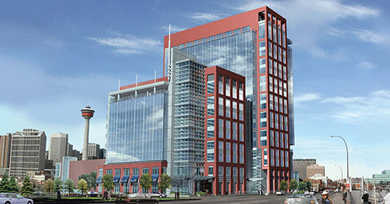


If you notice a theme with ugly orange brick podiums it's because city council passed a well intentioned but ultimately ill advised bylaw that all the new buildings had to have red brick podiums to "fit it" with the historic red brick warehouses and buildings in the area. This spawned what Calgary forumers have dubbed "Stampitecture". Cheesy, fake historic attempts that fit in more with the image of the Stampede than actual historical architecture.
Oof that Stampitecture is awful. The Keynote fuglys are bad but not the worst. That Stampede Station is awful.
Reply With Quote
     
     
  #1115  
Old Posted Feb 8, 2019, 9:19 PM
O-tacular's Avatar
O-tacular O-tacular is offline
Fake News
 
Join Date: Jul 2008
Location: Calgary
Posts: 24,354
Quote:
Originally Posted by Echoes View Post
The Sasso/Vetro/Nuera cluster in Calgary is unbelievably horrid.
Cluster is a good word for it.
Reply With Quote
     
     
  #1116  
Old Posted Feb 8, 2019, 9:22 PM
O-tacular's Avatar
O-tacular O-tacular is offline
Fake News
 
Join Date: Jul 2008
Location: Calgary
Posts: 24,354
Here's another disaster we avoided. Kings on Fourth by Calgary restuaranteurs - err I mean developer Lacaille Group:


Reply With Quote
     
     
  #1117  
Old Posted Feb 8, 2019, 9:23 PM
stevanford1's Avatar
stevanford1 stevanford1 is offline
Registered User
 
Join Date: Nov 2018
Location: Toronto, Ontario
Posts: 2,366
The Vouge Condos in Calgary’s pretty bad.
Reply With Quote
     
     
  #1118  
Old Posted Feb 8, 2019, 9:24 PM
stevanford1's Avatar
stevanford1 stevanford1 is offline
Registered User
 
Join Date: Nov 2018
Location: Toronto, Ontario
Posts: 2,366
Quote:
Originally Posted by O-tacular View Post
Here's another disaster we avoided. Kings on Fourth by Calgary restuaranteurs - err I mean developer Lacaille Group:


That is horrible. Thank god it wasn’t built.
Reply With Quote
     
     
  #1119  
Old Posted Feb 8, 2019, 9:26 PM
O-tacular's Avatar
O-tacular O-tacular is offline
Fake News
 
Join Date: Jul 2008
Location: Calgary
Posts: 24,354
Quote:
Originally Posted by stevanford1 View Post
The Vouge Condos in Calgary’s pretty bad.
Vogue is probably Lacaille's best executed project in Calgary. It obviously won't win any awards but it is a million times better than 5 West or some of their other dreck.
Reply With Quote
     
     
  #1120  
Old Posted Feb 8, 2019, 9:29 PM
stevanford1's Avatar
stevanford1 stevanford1 is offline
Registered User
 
Join Date: Nov 2018
Location: Toronto, Ontario
Posts: 2,366
I googled Lacaille and turns out they are behind a lot of my least favourite buildings in Calgary. Here’s another one of their classics (read: abominations).


Reply With Quote
     
     
This discussion thread continues

Use the page links to the lower-right to go to the next page for additional posts
 
 
Reply

Go Back   SkyscraperPage Forum > Regional Sections > Canada
Forum Jump


Forum Jump


All times are GMT. The time now is 7:28 AM.

     
SkyscraperPage.com - Archive - Privacy Statement - Top

Powered by vBulletin® Version 3.8.7
Copyright ©2000 - 2024, vBulletin Solutions, Inc.