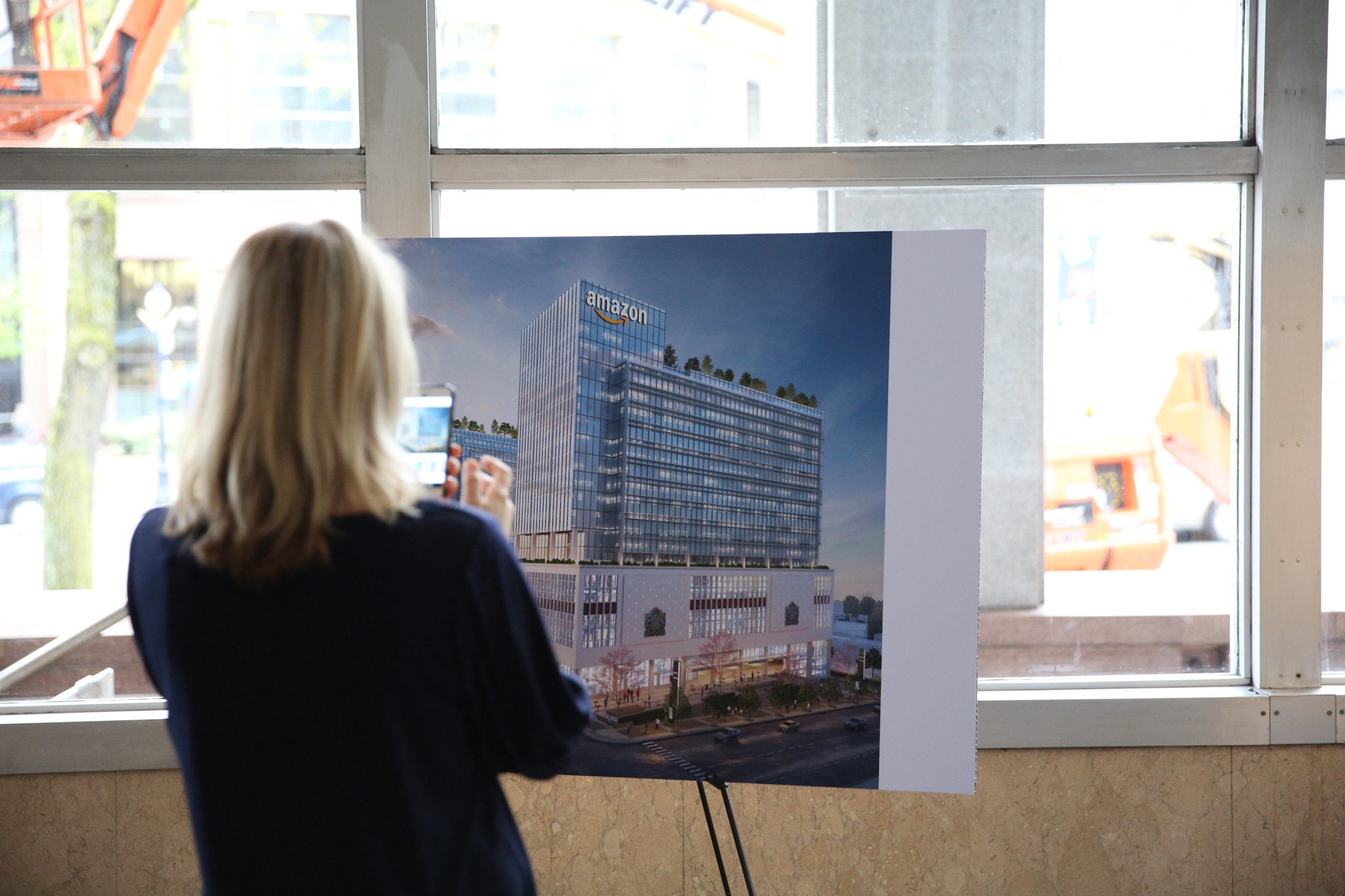
It's interesting that there's a gap in the shades, apparently intentional, running vertically in front of of one of the columns on the tower addition. McMinsen's updated render (that shows the white bands) doesn't illustrate anything there, but I wonder if the intent is to have a vertical feature there; sign? art?
It does. Developments get a separate permit for signage, so you generally don't see any on the DP drawings, although they obviously might show some on renders. Those are not necessarily what they finally apply for. I guess we'll see if the gap is a talking point, (that's working!) or has some practical application.
I remember maybe 10 or more years ago when the paint colour was more yellowish - I liked that shade better than the beiger colour that replaced it (and is used now).


 Prev
Prev


 Linear Mode
