Have there been any updates/progress on what the construction worker has been doing on The One.
__________________
"But a city can be smothered by too much reverence for its past. The skyline must keep acquiring new peaks, because the day we consider it complete and untouchable is the day the city begins to die." - Justin Davidson - May 2010 Issue of New York
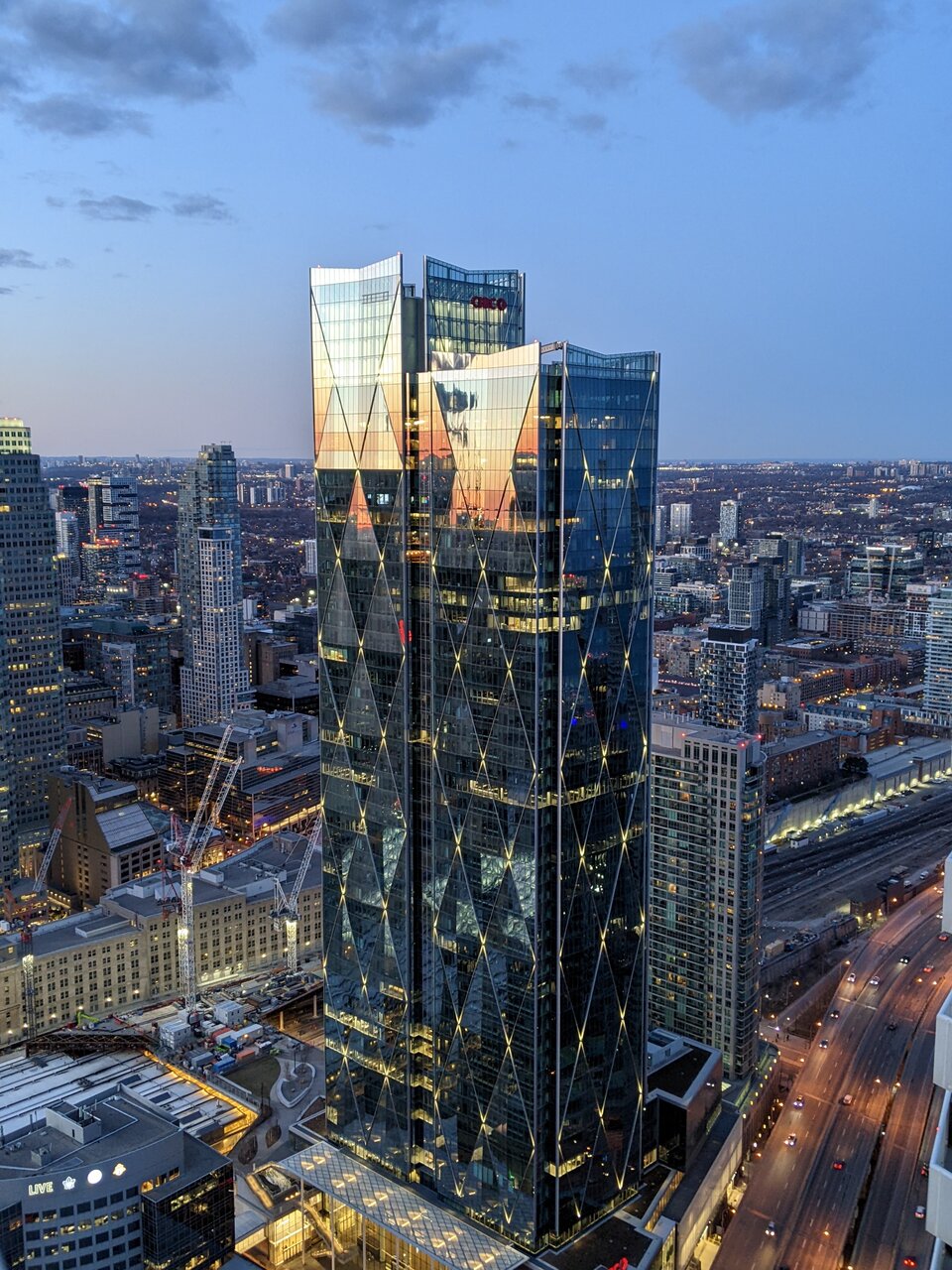
I'm not one for corporate signage. It's standard affair in Toronto that it has become expected/desired within the Toronto community. IMO, It usually cheapens the look. I was expecting much larger signage although the new CIBC red still doesn't blend all that well with the glass facade. This is much better than the photoshopped early renderings with the old logo.
The new CIBC logo and colour can leave one confused that they own Canada Life or vice versa.
I wouldn't mind seeing just the diamond logo in a couple years on those towers, once the branding has more recognition amongst the populace. Of course it's not as impressive of a logo as the old one from the 60's through to the 80's, but it's a step up from that red and yellow swoop.
I doubt they would remove the text from the crown, but it would certainly lok better and less crowded.
Anyways, it'll be really something to see both these phases side by side.
Indeed, This tower turned out great. i'm not sold a twin sister tower will make things even better
One of the rare situations where I am a height booster and believe a taller tower on the north side of the tracks would have been beneficial to create a tapering down towards the water.
__________________
Discontented suburbanite since 1994
One of the rare situations where I am a height booster and believe a taller tower on the north side of the tracks would have been beneficial to create a tapering down towards the water.
I agree. Anoher 40 metres on the north tower would've been a great way to show some ontrast between both buildings.


 Prev
Prev


 Linear Mode
