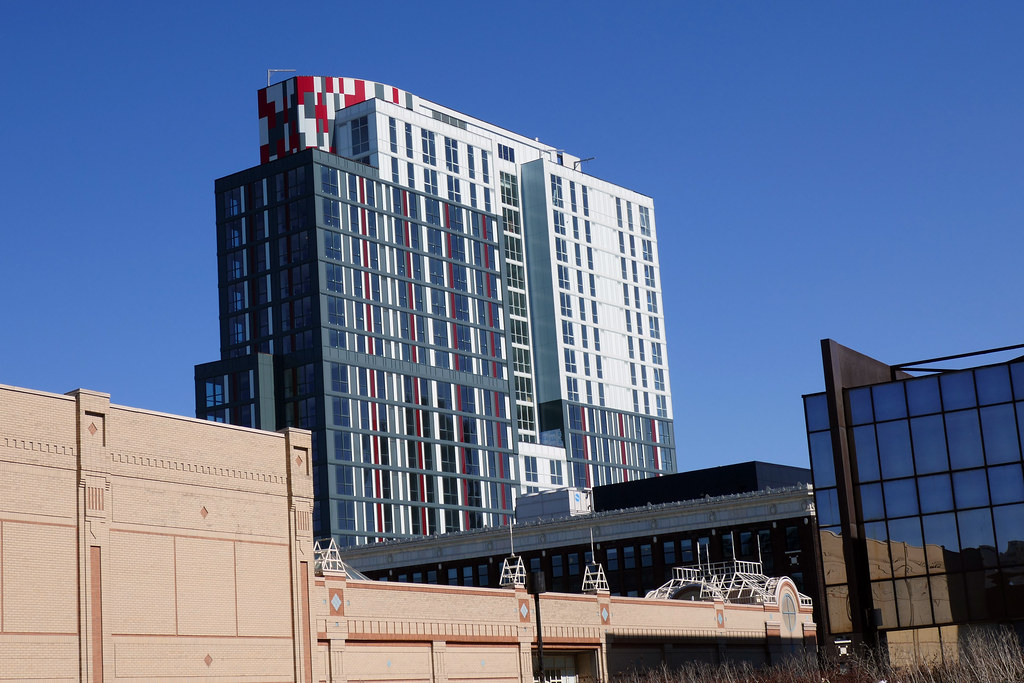
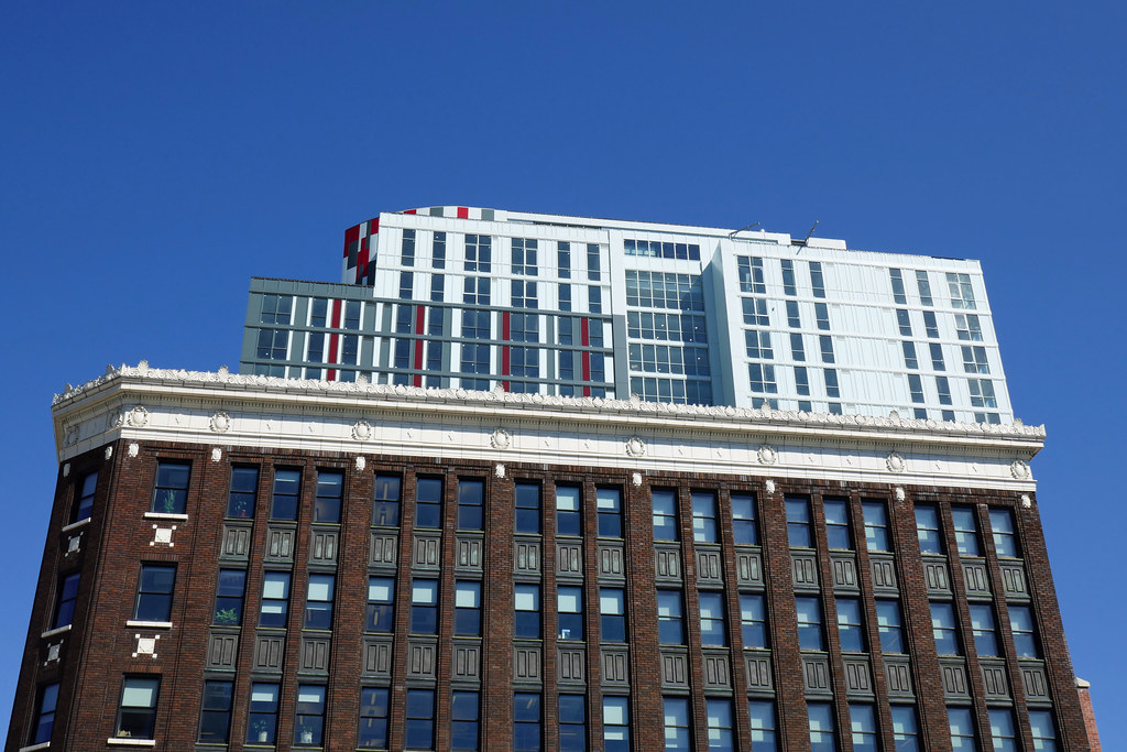
Massing & setbacks are great! Cladding is a little meh. It's just window wall and aluminum panels. Kind of poorly detailed and could be a lot neater around the corners/transitions from the dark/striped areas to the white, but I believe this is the first tower the architect has designed and built, so you've got to give them credit! I think I would have been in favour of eliminating the white sections and carrying the stripes all the way up. I know the city wanted a lighter top to make the tower feel less tall, and this works when there is an actual step back to help the transition, but the areas where the window wall shifts from dark to light with no transition in depth feels really off to me. I honestly feel that it makes the tower feel top heavy despite having a lighter coloured cladding. Perhaps using a silver or lighter grey instead of white could have solved this.
Also f-u LIUNA for only using brick on the weeniest section of this building. It looks weird. If only the offset brick wrapped window pattern was carried all the way up the tower

It's going to feel pretty tiny soon once LIUNA gets started on their King & Hughson project.


 Prev
Prev


 Linear Mode
