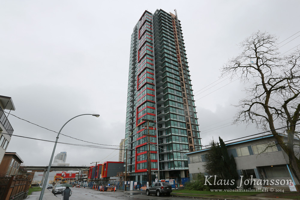
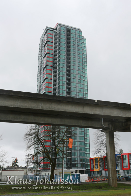
^Thanks for the update. This building went up fast. Don't care for the red paint lining though. But since Metroplace down the road will have similar red paint lining, it would go with the colorful theme.
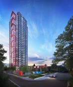
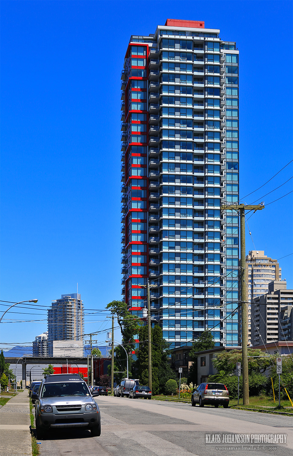
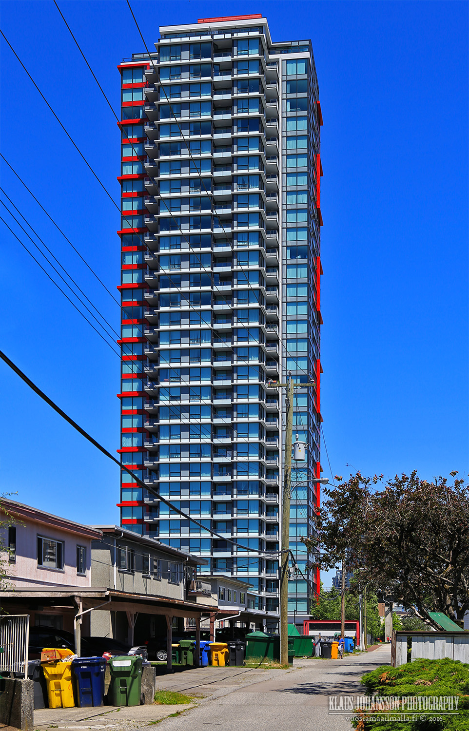
I think the tower looks fantastic. Nothing special, but very clean. This is the model downtown Vancouver infill towers should follow. The glass is a great color, the spandrel red spandrel looks good, the vertical spandrel panels are uniform and of a neutral color.
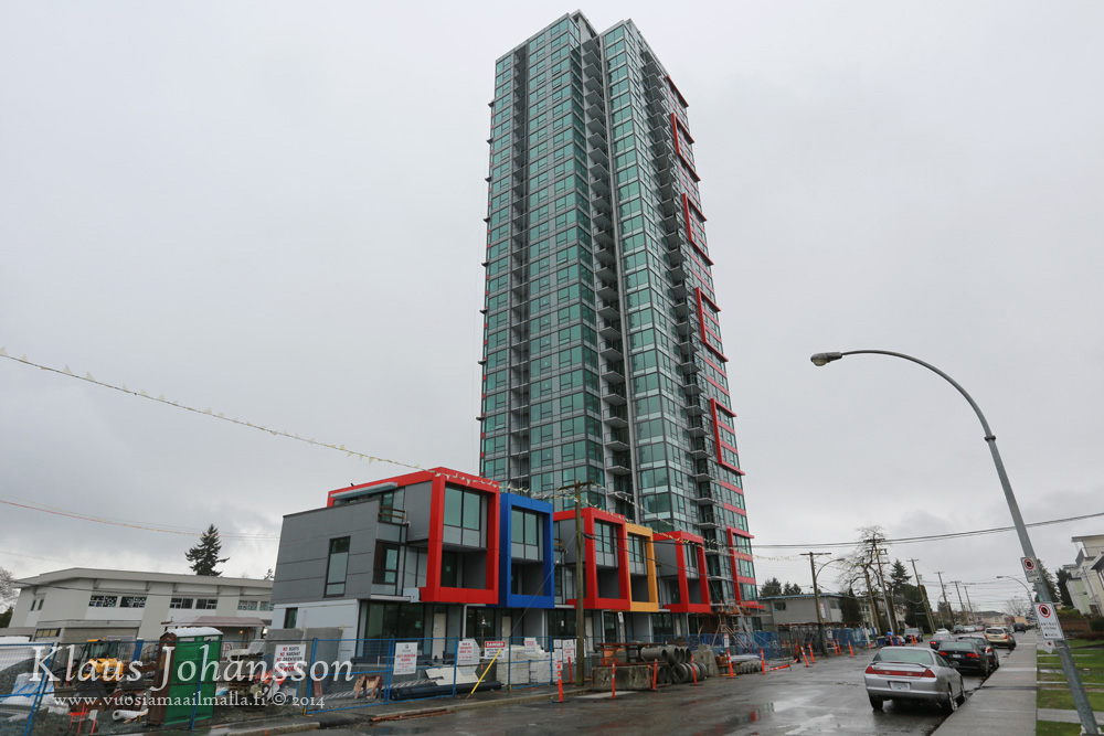
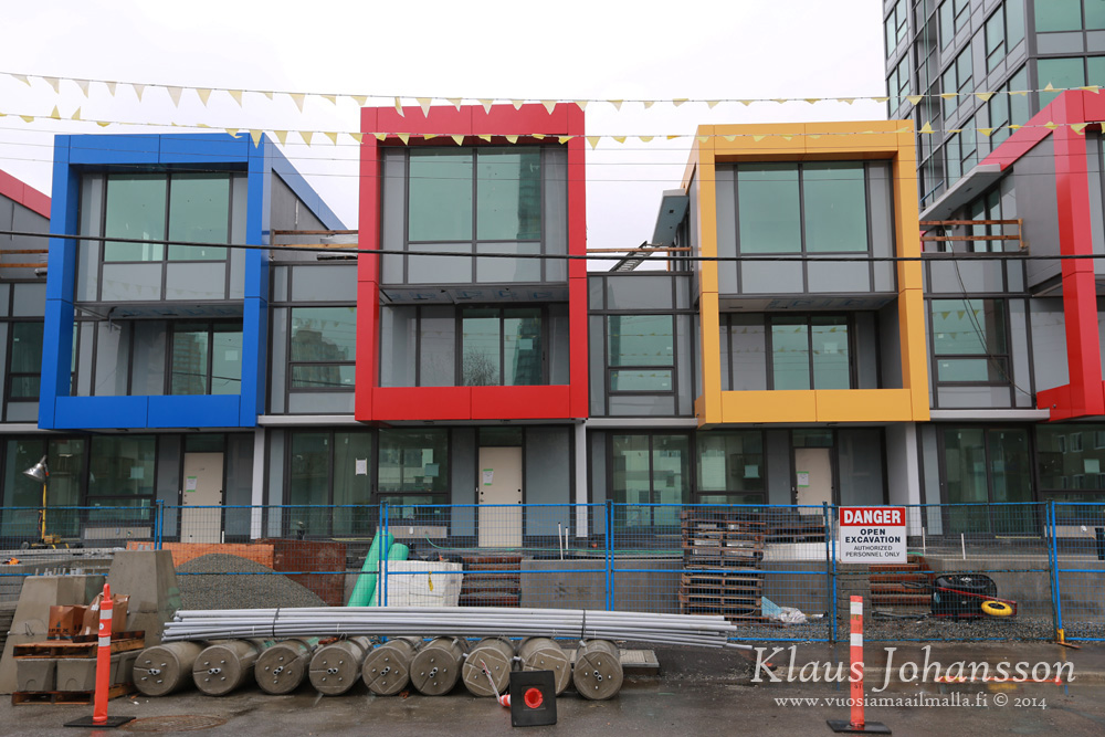
The only complain I have is the paint on the townhouses. I don't like it very much.
Looks great, although I agree about the townhouses colours. Stick to one (red) or use two complementary colours that also harmonize with the green glass.
I like the overall look though.
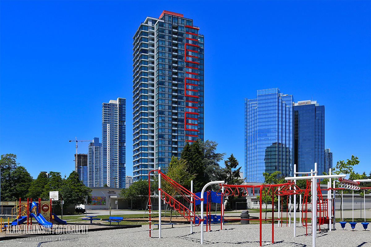
The red really stands out on the tower - Are there any 33 storey towers in [the City of] Vancouver with this much colour?
Spectrum seems subdued in comparison.
It'll be wait and see for the red on MetroPlace.
The non-red sides on this tower look cleaner than those on MetroPlace,
plus this one has 2 opposing feature corners (with red stripes) while MetroPlace only has one feature corner.
Is there an opportunity (empty parcel) for commercial space fronting Central Boulevard under the SkyTrain guideway
(i.e. at the end of the townhouses?)
I like this building, and I like Metroplace. My one problem is the red colored paint on each.
Detracts from the design and looks "gaudy".
The multi-colored townhouses, as Officedweller implied - look like a kindergarten or elementary school.
They really didn't stray from the basic RGB values with the colour choices...
Just like with Spectrum, splashes of cheap primary colours to "brighten" up an otherwise-colourless building, is IMO more depressing than a monochrome building.
I had expected the red stripes to have more depth/reflections and be more subdued, ie: set behind glass as either a spandrel or shadow box. The opacity of the red stripes on the final product stand out far more than the box frames, and makes the latter rather redundant.
I on the other hand think that it's expensive. This is no landmark building, it is only 1100sqft and based on the two photos the kitchen counters are not very high quality (difficult to say). I would not pay more than $2500 for this suite, be it penthouse or not.
I on the other hand think that it's expensive. This is no landmark building, it is only 1100sqft and based on the two photos the kitchen counters are not very high quality (difficult to say). I would not pay more than $2500 for this suite, be it penthouse or not.
I think you're better off renting in Station Square
I on the other hand think that it's expensive. This is no landmark building, it is only 1100sqft and based on the two photos the kitchen counters are not very high quality (difficult to say). I would not pay more than $2500 for this suite, be it penthouse or not.
It should be reasonable, the owner paid more than $700k for the property
As renter I don't care if the owner overpaid for his crappy suite in the burbs. Crap is still crap and only worth a crappy rent.
There are still deals to be found. There was just recently a much larger Tinseltown penthouse being advertized for $3500. Now that sounded like a deal to me!
Yeah, the colors on Moda are not that bad, but the tower itself appears like a stub and has such a basic form. From top of Metrotown Moda appears almost tiny (will post a photo later).


 Prev
Prev


 Linear Mode
