HomeDiagramsDatabaseMapsForum About
     

Go Back   SkyscraperPage Forum > Regional Sections > Canada > Atlantic Provinces > Halifax > Halifax Peninsula & Downtown Dartmouth


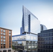
    Sutton Place Nova Centre in the SkyscraperPage Database

Building Data Page   • Halifax Skyscraper Diagram

Map Location

Reply

 
Thread Tools Display Modes
     
     
  #4861  
Old Posted Feb 16, 2016, 2:44 PM
OldDartmouthMark OldDartmouthMark is offline
Registered User
 
Join Date: May 2010
Posts: 10,332
Quote:
Originally Posted by IanWatson View Post
I know I might be crucified for saying it... but the Nova Centre is shaping up to be pretty darn ugly. It looks oooook when viewed from the north or south, but when viewed from the water or citadel hill it is just a big slab of a wall with a mish-mash of glass colours and tones.
I've been thinking it ever since I first saw it topped-out in concrete, but that's just my opinion and I don't want to take away anybody's enthusiasm for the project.

When you think of it, for any type of 1970s-style blockbuster project like this, there will have to be a profile or two that just looks massive and awkward, unless it is designed with a large, low podium and a series of slim towers.
Reply With Quote
     
     
  #4862  
Old Posted Feb 16, 2016, 4:11 PM
eastcoastal eastcoastal is offline
Registered User
 
Join Date: Mar 2009
Posts: 1,404
Quote:
Originally Posted by kwajo View Post
It does look checkered in the renderings, although with not nearly as much contrast between tones as it looks from certain angles.


I will reserve judgement until it is done however, as I still recall how much discussion went on about the glass at the library during installation and it turned out fine.
On the library: the orange is OK, in my opinion. The leaf print is not.

On Nova Centre: I am less a fan of the glazing pattern the more I see it (from a distance)... on the streets a few blocks away, I feel like it's pretty exciting. On the streets adjacent, it feels massive (I'm not decided if massive is good or not yet).
Reply With Quote
     
     
  #4863  
Old Posted Feb 16, 2016, 5:22 PM
Phalanx Phalanx is offline
Registered User
 
Join Date: May 2008
Location: Halifax
Posts: 590
I don't think the mottled effect will be quite so noticeable once the interior structure is in place. Right now everything is dark and cavernous, which makes it stand out against the comparatively light looking spandrels. Once the interior walls (presumably white) are in place, it will lessen the effect.
Reply With Quote
     
     
  #4864  
Old Posted Feb 16, 2016, 5:39 PM
portapetey portapetey is offline
Registered User
 
Join Date: May 2014
Posts: 509
Quote:
Originally Posted by OldDartmouthMark View Post
I've been thinking it ever since I first saw it topped-out in concrete, but that's just my opinion and I don't want to take away anybody's enthusiasm for the project.

When you think of it, for any type of 1970s-style blockbuster project like this, there will have to be a profile or two that just looks massive and awkward, unless it is designed with a large, low podium and a series of slim towers.
I think this has become a pretty common opinion. Many people I know that were enthusiastic supporters (including myself) have come to question what we hath wrought. I recently sat at Lot Six with a few friends, several of whom are development types who were very much in support, and almost unanimously they all looked across the street and wondered aloud just what they had been thinking...

I was going to post a comment reflecting that at the time, but I decided to quiet my fingers :-)

Why this became such a 70s blockbuster is the big question. I saw early in the construction that this had the potential to be another Scotia Square, and I wondered what happened to the idea of three more-or-less separate towers. And I think public input - design-by-committee - might be the answer!!

I think there are going to be a lot of "I told you sos" coming from the "Friends of..." crowd.
Reply With Quote
     
     
  #4865  
Old Posted Feb 16, 2016, 5:44 PM
portapetey portapetey is offline
Registered User
 
Join Date: May 2014
Posts: 509
Quote:
Originally Posted by kph06 View Post
The greenish checkered glass looks pretty bad. I was hoping the webcam wasn't showing it's true colors. I have concerns, hopefully it will all come together.
This is probably a stupid question, but might there be a layer missing? Is there a darker blue that goes outside what's there? I dunno. I really hope this isn't the final finish.
Reply With Quote
     
     
  #4866  
Old Posted Feb 16, 2016, 6:13 PM
someone123's Avatar
someone123 someone123 is offline
hähnchenbrüstfiletstüc
 
Join Date: Nov 2001
Location: Vancouver
Posts: 35,769
I think the "Friends of..." are perhaps the biggest contributing factor to the design flaws of this development. The viewplanes and ramparts bylaw are what shaped the massing of this building. Developers are just going to build what fits, and when it comes to large multi-use complexes like this there aren't many alternatives. The design rules make it hard to build a slender tower downtown with hundreds of thousands of square feet of space.

In this instance I think it would have been a great trade-off to have a slender office tower somewhat visible from inside the Citadel (it would complement the 70's buildings that are already visible). However, I still think this is a positive development for the city and I suspect it will work out a lot better than Scotia Square in terms of its impact on adjacent properties. Its footprint is much smaller and it is much more permeable for pedestrians. If it turns out well the covered street and interior path down to Argyle could be really interesting.
Reply With Quote
     
     
  #4867  
Old Posted Feb 16, 2016, 6:27 PM
Phalanx Phalanx is offline
Registered User
 
Join Date: May 2008
Location: Halifax
Posts: 590
I think the biggest contributing factor to the monolithic 'blockbuster' feel is the relocation of the convention floor from below ground to above ground. It went from light glass arch connecting two blocks to one massive slab making it one huge, effectively unified block.

I definitely preferred the glass arch to what we ended up with, and since that change was largely driven by public input, then I that could be at least partially to blame.

That said, I agree that having 3 towers vs the 2 that we ended up with would have gone a long way toward helping.
Reply With Quote
     
     
  #4868  
Old Posted Feb 16, 2016, 6:34 PM
portapetey portapetey is offline
Registered User
 
Join Date: May 2014
Posts: 509
Quote:
Originally Posted by someone123 View Post
I think the "Friends of..." are perhaps the biggest contributing factor to the design flaws of this development. The viewplanes and ramparts bylaw are what shaped the massing of this building. Developers are just going to build what fits, and when it comes to large multi-use complexes like this there aren't many alternatives. The design rules make it hard to build a slender tower downtown with hundreds of thousands of square feet of space.

In this instance I think it would have been a great trade-off to have a slender office tower somewhat visible from inside the Citadel (it would complement the 70's buildings that are already visible). However, I still think this is a positive development for the city and I suspect it will work out a lot better than Scotia Square in terms of its impact on adjacent properties. Its footprint is much smaller and it is much more permeable for pedestrians. If it turns out well the covered street and interior path down to Argyle could be really interesting.
Agreed on all points. It just looks so monolithic when you're in the historical buildings along Argyle. Oh, well, we'll see how it turns out!
Reply With Quote
     
     
  #4869  
Old Posted Feb 16, 2016, 6:36 PM
portapetey portapetey is offline
Registered User
 
Join Date: May 2014
Posts: 509
Quote:
Originally Posted by Phalanx View Post
I think the biggest contributing factor to the monolithic 'blockbuster' feel is the relocation of the convention floor from below ground to above ground. It went from light glass arch connecting two blocks to one massive slab making it one huge, effectively unified block.

I definitely preferred the glass arch to what we ended up with, and since that change was largely driven by public input, then I that could be at least partially to blame.

That said, I agree that having 3 towers vs the 2 that we ended up with would have gone a long way toward helping.
Yeah, I still don't really get why the supposed two towers along Argyle had to be connected to one another all the way up, making them effectively one large wide facade. Even a gap of a few metres between them would have made the block look more airy.
Reply With Quote
     
     
  #4870  
Old Posted Feb 16, 2016, 9:03 PM
worldlyhaligonian worldlyhaligonian is offline
Registered User
 
Join Date: Jun 2006
Posts: 3,983
In the end, its probably better that the convention space is above ground.

I think its turning out better than expected. The convention space reminds me of the library and the overall form is not 70s in my opinion. The glass might be the most interesting bit and isn't finished.

I like how it ties Halifax's disparate glass aesthetics together and the building itself makes the downtown seem more cohesive (I like how the podium height matches several of the surrounding hotel heights... if there are any bars in the development on the Argyle side, its going to have a very interesting night life scene down in there).
Reply With Quote
     
     
  #4871  
Old Posted Feb 16, 2016, 9:35 PM
Keith P.'s Avatar
Keith P. Keith P. is offline
Registered User
 
Join Date: Mar 2006
Posts: 8,819
I am going to reserve judgement until it is finished. However I have no doubt that the public consultation and design-by-committee features demanded by the "Friends of" obstructionists resulted in a poorly-designed and less aesthetically-pleasing building.
Reply With Quote
     
     
  #4872  
Old Posted Feb 17, 2016, 2:51 AM
lawsond lawsond is offline
Registered User
 
Join Date: Oct 2005
Posts: 554
Quote:
Originally Posted by connect2source View Post
Wow, not liking the glazing at all!! Looks terrible, mismatched and hodgepodge...and somewhat 80's. Hope it will look better once complete.
That is very high quality glazing. Smooth not too much spandrel. There are two tones to he define the separate structures. It will work. At least it's not like the skanky Wall Centre where they literally ran out and used totally different hue.
__________________
lawsond
Reply With Quote
     
     
  #4873  
Old Posted Feb 17, 2016, 5:30 AM
counterfactual counterfactual is offline
Registered User
 
Join Date: Jul 2013
Location: Parts Unknown
Posts: 1,796
From what I've seen, I think it looks good. I think the disparate glass will have a "shimmering" effect once done.
Reply With Quote
     
     
  #4874  
Old Posted Feb 17, 2016, 12:58 PM
IanWatson IanWatson is offline
Registered User
 
Join Date: Feb 2013
Posts: 1,416
Quote:
Originally Posted by someone123 View Post
The viewplanes and ramparts bylaw are what shaped the massing of this building. Developers are just going to build what fits, and when it comes to large multi-use complexes like this there aren't many alternatives.
I think in this case the view planes are responsible for the most redeeming architectural feature of the building, which is the angled corner at Sackville and Argyle.

Quote:
The design rules make it hard to build a slender tower downtown with hundreds of thousands of square feet of space.
The very frustrating thing in this case is that HRMxDesign has design rules to prevent the worst part of this building, which is the monolithic slab along Argyle. If the design rules--or at least those related to maximum tower width--had been followed I think this building would be much improved.
Reply With Quote
     
     
  #4875  
Old Posted Feb 17, 2016, 1:18 PM
Drybrain Drybrain is offline
Registered User
 
Join Date: Sep 2012
Posts: 4,544
I didn't expect to like the building much at all, and generally I'm a big advocate of the much-derided (on here) human scale in architecture. But I am sort of enjoying the massiveness of it, which is amplified by the fact that it is, unquestionably, out of scale for the immediate area, and situated on narrow streets.

It reminds me a bit of the TIFF Lightbox across from Toronto's King West restaurant strip. Though in Halifax's case, the street is narrower and the restaurant strip is more patio-oriented, which changes the dynamic.

Anyway, the effect on Argyle remains to be seen, but I can't imagine it being worse than when the Herald building was there, empty and un-used.

Hopefully we don't have any of the falling panes of window glass that have plagued Toronto window walls.

Reply With Quote
     
     
  #4876  
Old Posted Feb 17, 2016, 2:42 PM
TheGreenBastard's Avatar
TheGreenBastard TheGreenBastard is offline
Registered User
 
Join Date: Nov 2015
Location: Halifax/Toronto
Posts: 178
Quote:
Originally Posted by Drybrain View Post
I didn't expect to like the building much at all, and generally I'm a big advocate of the much-derided (on here) human scale in architecture. But I am sort of enjoying the massiveness of it, which is amplified by the fact that it is, unquestionably, out of scale for the immediate area, and situated on narrow streets.
It seems much taller than it really is on the Argyle side. I really like that effect.
Reply With Quote
     
     
  #4877  
Old Posted Feb 17, 2016, 3:01 PM
counterfactual counterfactual is offline
Registered User
 
Join Date: Jul 2013
Location: Parts Unknown
Posts: 1,796
Quote:
Originally Posted by someone123 View Post
I think the "Friends of..." are perhaps the biggest contributing factor to the design flaws of this development. The viewplanes and ramparts bylaw are what shaped the massing of this building. Developers are just going to build what fits, and when it comes to large multi-use complexes like this there aren't many alternatives. The design rules make it hard to build a slender tower downtown with hundreds of thousands of square feet of space.

In this instance I think it would have been a great trade-off to have a slender office tower somewhat visible from inside the Citadel (it would complement the 70's buildings that are already visible). However, I still think this is a positive development for the city and I suspect it will work out a lot better than Scotia Square in terms of its impact on adjacent properties. Its footprint is much smaller and it is much more permeable for pedestrians. If it turns out well the covered street and interior path down to Argyle could be really interesting.
Very well said, and I agree.
Reply With Quote
     
     
  #4878  
Old Posted Feb 17, 2016, 4:20 PM
connect2source's Avatar
connect2source connect2source is offline
life in the present
 
Join Date: Mar 2011
Location: Halifax
Posts: 1,870
Quote:
Originally Posted by lawsond View Post
That is very high quality glazing. Smooth not too much spandrel. There are two tones to he define the separate structures. It will work. At least it's not like the skanky Wall Centre where they literally ran out and used totally different hue.

Not true about the Wall Centre. in 1999 when One Wall Centre was being built there was a dispute between Busby, the Architects, and Peter Wall, the owner/developer, Busby wanted clear, Wall wanted dark tinted so they compromised , the hotel portion ( lower floors ) would be dark and the condos clear. After 15 years of no tint, and oppressive heat from the sun, the condo voted to re-glaze, as it had been many years, the original manufacturer of the lower portion was no longer in business so they had to settle for a close match, which IMO looks terrible.

Glad to hear the Nova Centre glazing is of high quality but one shade or tone would have looked far more cohesive.
__________________
source | energy
Reply With Quote
     
     
  #4879  
Old Posted Feb 17, 2016, 5:51 PM
eastcoastal eastcoastal is offline
Registered User
 
Join Date: Mar 2009
Posts: 1,404
Quote:
Originally Posted by someone123 View Post
I think the "Friends of..." are perhaps the biggest contributing factor to the design flaws of this development. The viewplanes and ramparts bylaw are what shaped the massing of this building. Developers are just going to build what fits, and when it comes to large multi-use complexes like this there aren't many alternatives. ...
This project was excluded by HRMbyDesign's rules. I'm not saying they would have protected it, but this is still the product of previous rules.

It may very well be that the massing of this thing is driven by the floorplates required for the convention pieces. If this is the case, then perhaps such a large floorplate is inappropriate for smack in the middle of downtown... or would be better below grade - I realize that the convention components were originally below grade, but public consultation decided that conventions were better served with access to views.
Reply With Quote
     
     
  #4880  
Old Posted Feb 17, 2016, 5:53 PM
eastcoastal eastcoastal is offline
Registered User
 
Join Date: Mar 2009
Posts: 1,404
Quote:
Originally Posted by Keith P. View Post
I am going to reserve judgement until it is finished. However I have no doubt that the public consultation and design-by-committee features demanded by the "Friends of" obstructionists resulted in a poorly-designed and less aesthetically-pleasing building.
agreed
Reply With Quote
     
     
This discussion thread continues

Use the page links to the lower-right to go to the next page for additional posts
 
 
Reply

Go Back   SkyscraperPage Forum > Regional Sections > Canada > Atlantic Provinces > Halifax > Halifax Peninsula & Downtown Dartmouth
Forum Jump


Forum Jump


All times are GMT. The time now is 3:11 AM.

     
SkyscraperPage.com - Privacy Statement - Top

Powered by vBulletin® Version 3.8.7
Copyright ©2000 - 2026, vBulletin Solutions, Inc.