Quote:
Originally Posted by megadude

Only 3 logos in MLB aren't based around letters. The Jays, Mariners and Orioles. .
|
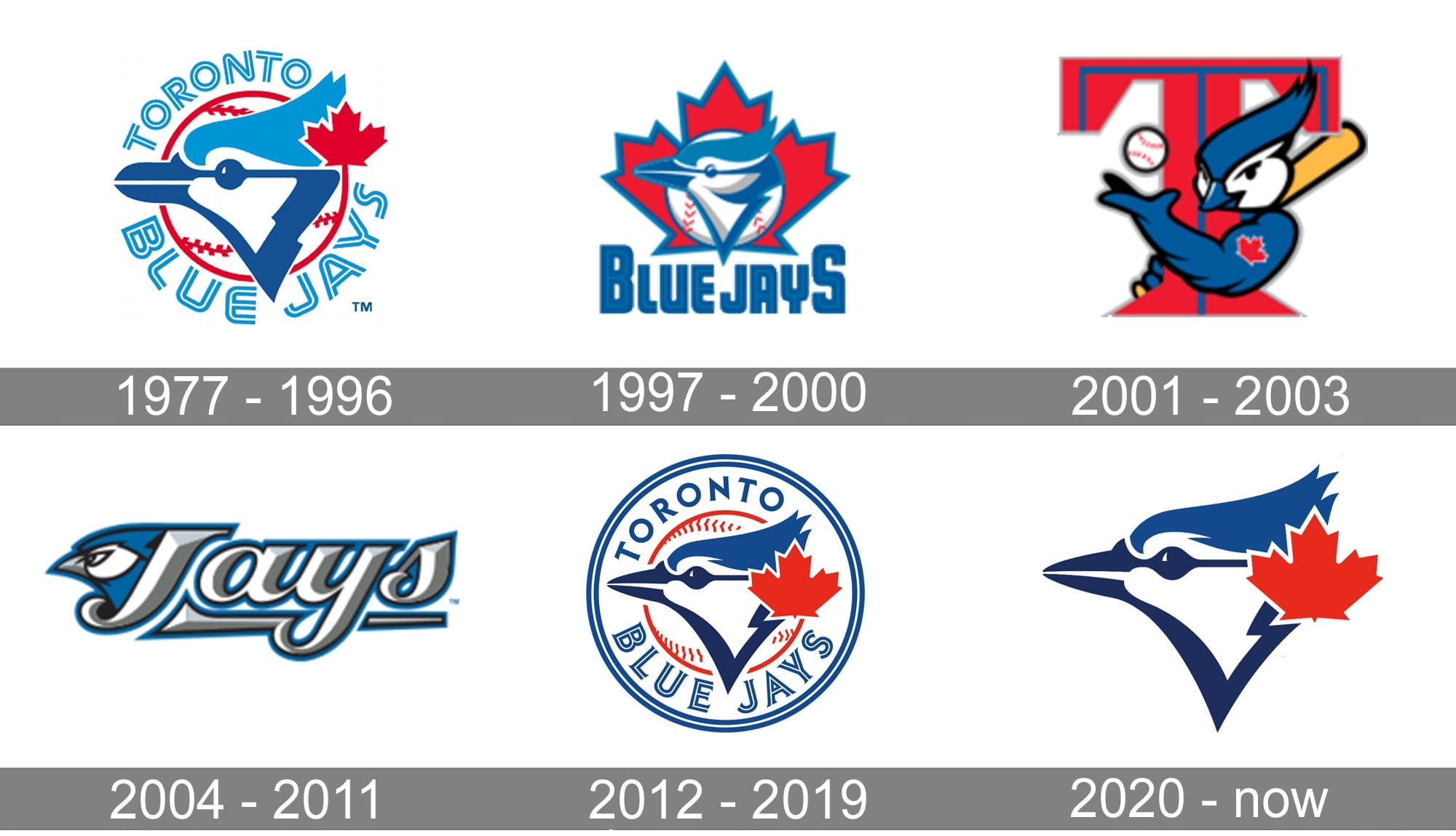
Except for when we had this abomination in 2001, followed by an even worse design. I love the OG, and from 2012 to the present.
Source:
https://1000logos.net
The Expos only changed one time. But both designs were decent with not much change. But their logo was literally M(ontreal) E(xpos) B(aseball)





 Prev
Prev





 Linear Mode
