Let's just hope it doesn't end up another Con Ed level disappointment...
http://ny.curbed.com/archives/2013/0...t_revealed.php
Taller, More Porous Buildings
Quote:
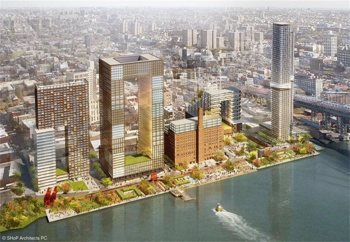
Since SHoP's plan creates more open space, that means that the loss of square feet is made up for in height. But instead of designing bulky, sun-blocking buildings, SHoP created slender, porous buildings that leave waterfront views in tact for the neighborhood behind the development. "We didn't want the project to have a back," said Chakrabarti. One building, which will inevitably become known as the Donut Building, has two 55-foot wide towers set 120-feet apart, joined at the top. Another edifice looks like two stacked Tetris pieces with a gap between them. Two slender 60-story towers, connected by a skybridge, comprise the tallest structure. All allow for light and air to pass through.
Somewhat surprisingly, Two Trees said the community and public officials they shared these plans with were totally happy with taller structures if it meant more open space. "If you're standing next to a 400-foot tall building or a 600-foot tall building, you have no idea," said Chakrabarti. "But if a 600-foot building means that you get a park where your kid can graduate, that means something to you."
Prominence and Contextualization
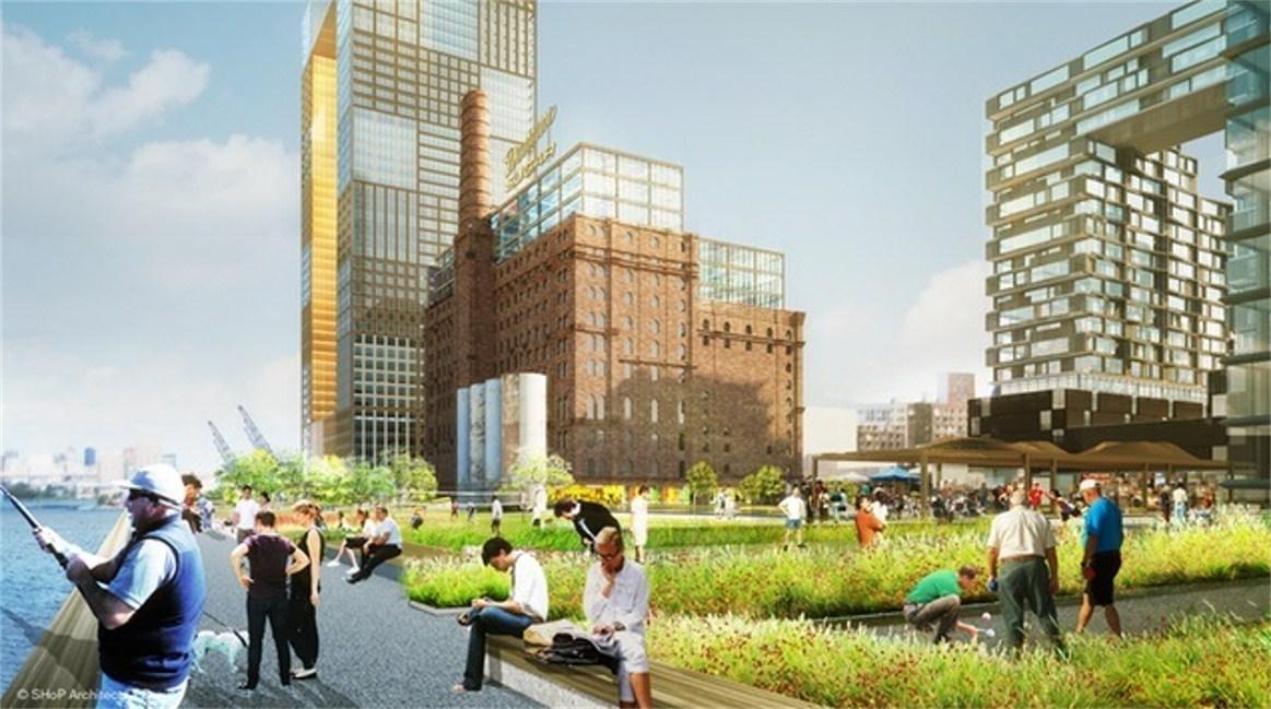
The Domino site is possibly the most prominent piece of real estate in Brooklyn. It sits at the dead center of the Manhattan-facing waterfront, and it's what drivers on the FDR see, whether they are headed north or south. "This has the opportunity to be what new Brooklyn says to the world," said Chakrabarti. As such, SHoP designed the site with exuberance: high points that make a statement on the skyline scale, a mid-range that echoes the Domino refinery building, and low points that speak to the surrounding neighborhood. Every building "meets the ground in a contextual way" in order to connect with the existing streetscape, and all street-level spaces will be filled with small-scale retail. There will be no big box stores.
Locking in the Designs
With big, innovative projects like these, there is always fear that the features that make the architecture interesting could be value-engineered out, but Two Trees doesn't want that to happen. Lombino said the developer is willing to lock in the building envelopes and things like the sky bridges so they can't be worked out of the designs later down the line. SHoP will design two of the five buildings and curate the architects for the others. "They should be different architecturally," said Chakrabarti. It hasn't been decided which structures SHoP will take, but the donut, which will have a school at the base, is "near and dear" to Chakrabarti's heart. SHoP has currently designed it like "a pineapple": textured on the outside, smooth on the inside. The facade is made of multiple different materials, some similar to the weather steel of the Barclay's Center, and inside the donut hole has a glassy surface that plays with the sunlight.
|
__________________________________________________________
http://observer.com/2013/03/jed-wale...-williamsburg/
Jed Walentas Plants a Tree (or Two) in Williamsburg

By Stephen Jacob Smith 3/03/13
Quote:
When Two Trees Management bought the old Domino Sugar site from CPC Resources and a reluctant Katan Group, a local developer told The Observer that Jed Walentas would be “crazy to go back to ULURP” for a rezoning of the site, which had already been approved for thousands of high-rise apartments. But going back to to everyone’s favorite acronym (to pronounce, at least) is exactly what Mr. Walentas intends to do. He and SHoP, the New York-based architecture firm that Bruce Ratner tapped to design the Barclays Center and Atlantic Yards after Frank Gehry proved too expensive, called a group of reporters to SHoP’s offices near City Hall on Friday to show off their plans for the site.
The first thing Mr. Walentas spoke about was Two Trees’ desire to expand the amount of parkland included in the project—adding two new acres—and to make it more accessible to the public. He criticized the open space in the old site plan as something that “felt very much like a privatized front lawn for people who lived there,” and spoke about his desire to pull the buildings back inland to make more space for the quarter-mile-long waterfront park, as well as add a new public street between his buildings and the waterfront.
But the extra park space comes at a price: the towers will have to rise higher to make up for the smaller footprints. The tallest tower on the site would rise to 598 feet, or about 60 stories—much taller than the 340-foot maximum height in the currently approved plan.
Of the project’s height, Mr. Chakrabarti conceded that “there’s no architectural way to hide that” on the edge of a neighborhood that otherwise tops out at around six stories.
Overall built square footage would rise to about 3.4 million, with a full half a million extra square feet of office space, which the developer claims will triple Williamsburg’s existing commercial space. As previously reported, the office space will rent for much less than the apartments—about $25 a square foot, half what Mr. Walentas says he can get for housing—though with so much of it, perhaps he’s hoping he can make up for it on volume.
To accomodate all the extra office space, the site would lose 116 apartments (which should please the community), as well as some of its retail (no two-story big box stores in this plan) and about a third of its parking. In lieu of the Rafael Viñoly masterplan that CPC-Katan wanted to build, Two Trees will be bringing in SHoP to design two of the buildings, with the other sites handed off to other architects.
Vishaan Chakrabarti, the SHoP principal who spoke for the the firm at the meeting, seemed eager to build the taller rectangular tower with the cut-out in the middle, whose rendering bears a faint resemblance to the towers SHoP has planned for Atlantic Yards. The differentiated window framing, featured somewhat haphazardly at Atlantic Yards, will be accentuated and formalized into a “game of squares,” as Mr. Chakrabarti called it, though he downplayed the similarities to SHoP’s work at Atlantic Yards.
The Observer spoke to local councilman Steve Levin, who represents the waterfront neighborhoods from Brooklyn Heights to Greenpoint, and his first observation about the plan was that “from a design and architectural perspective, it’s certainly bold.”
|


__________________
NEW YORK is Back!
“Office buildings are our factories – whether for tech, creative or traditional industries we must continue to grow our modern factories to create new jobs,” said United States Senator Chuck Schumer.
Last edited by NYguy; Mar 4, 2013 at 12:46 PM.
|


