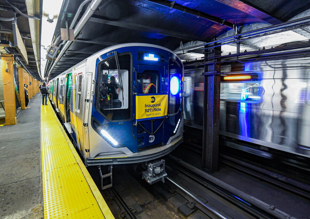
R211's entered revenue service today. I do hope some tweaks are made before the rest of production proceeds. IMO these include: (more of a good design wish list)
- For the love of all things holy please quietly drop the Cuomo stripes. They look stupid and they're tackyy as hell. If you want a splash of blue put it on the doors like the R-32's had when they were new. That said I'd rather the cab bonnet be black instead of thee blue which shows off the window profiles and headlight shoddiness. I think that looks better.
- Tone down the LED's. Between the door markers, the destination boards and the bullet it looks like a bodega. Those elements should glow not punch you in the face with garish light. And the color of the light they emit is cold colored and aesthetically unpleasant. The resolution is also too low to smoothly display the letterforms.
- Redo the destination boards and bullet. The mockup shown before production showed these elements done tastefully in backlit/LCD system standard Helvetica. These bullets and the design standard breaking typography look terrible. A big step back for NYCT design standards. And on top of that the LED's burn your corneas.
The rest is what it is. Its basically like every other B Division car of the last 20 years just with sinister looking headlights and wider doors. No leaps in styling by any means. At least we'll likely get the majority of the order with open gangway as those will prove to be popular.
 ___
___


 Prev
Prev


 Linear Mode
