HomeDiagramsDatabaseMapsForum About
     

Go Back   SkyscraperPage Forum > Regional Sections > Canada > Alberta & British Columbia > Vancouver > Downtown & City of Vancouver


    One Burrard Place in the SkyscraperPage Database

Building Data Page   • Comparison Diagram   • Vancouver Skyscraper Diagram

Map Location

Reply

 
Thread Tools Display Modes
     
     
  #281  
Old Posted Apr 21, 2011, 1:18 AM
SFUVancouver's Avatar
SFUVancouver SFUVancouver is offline
Registered User
 
Join Date: Dec 2006
Location: Hamilton
Posts: 6,413
Photo update | April 20th, 2011

Here are a whole bunch of model shots from the special UDP meeting today. Unfortunately I had to leave before it ended so I don't know what the outcome of the vote was.

The commentary simultaneously commended the project team for undertaking a large mixed-use project that included significant job space; 220,000 square feet of office space is proposed, and commented that the design of the project had not advanced to the point where it was ready to be considered for its development permit. The sticking points were the duplication of the tall tower's design on the second residential tower, the unnecessary use of the white concrete framework, which was selected mostly for its solar shading properties, onto elevations that do not require it. There was also a lot of concern expressed about the ground plane on all sides. There were too many passageways proposed to the central auto-court/pedestrian space and they have the result of creating too many gaps to the retail at grade, especially on Hornby. The grade change on Drake was not satisfactorily handled in the Toyota dealership since the ground floor is still raised up almost a metre from grade and then there is a two and a half metre fall off from Burrard to the lane. The auto-court received a lot of attention and Panellists felt it had a lot of potential but was not there yet. There was almost unanimous support expressed for a grocery store to find a home in the design. The project team have designed the building to incorporate one split over two floors at the northern end of the Hornby street side of the project. The team was waiting for a green light from the City, which is conducting a retail capacity study for grocery stores in the neighbourhood, as it does for every proposed grocery store in a new project. The tower was felt to be the right height, give or take fifty feet, with a few people saying it could go higher still. There was what I felt to be an undue amount of concern about shadowing on the as-yet-theoretical mini-plaza at the northwest corner of Davie and Burrard where the gas station used to be and a temporary community garden currently resides.

One last note, the model maker was not able to convey accurately the transitions of the white concrete (not painted!) lattice. There are five different configurations and the model only illustrates three. Plus the current height is 550 feet, slightly taller than has previously been reported.


Taken by SFUVancouver, April 20th, 2011.


Taken by SFUVancouver, April 20th, 2011.


Taken by SFUVancouver, April 20th, 2011.


Taken by SFUVancouver, April 20th, 2011.


Taken by SFUVancouver, April 20th, 2011.


Taken by SFUVancouver, April 20th, 2011.


Taken by SFUVancouver, April 20th, 2011.


Taken by SFUVancouver, April 20th, 2011.


Taken by SFUVancouver, April 20th, 2011.

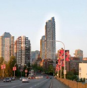
Context model with existing, approved, and in-the-pipeline buildings in the immediate neighbourhood, although the Amacon tower kitty corner to the proposed project across Burrard and Drake is strangely absent.

Taken by SFUVancouver, April 20th, 2011.
__________________
VANCOUVER | Beautiful, Multicultural | Canada's Pacific Metropolis

Last edited by SFUVancouver; Apr 21, 2011 at 2:54 AM.
Reply With Quote
     
     
  #282  
Old Posted Apr 21, 2011, 2:53 AM
Cypherus's Avatar
Cypherus Cypherus is offline
Registered User
 
Join Date: Jan 2007
Location: Surrey
Posts: 1,757
Thanks for the pictures. In my opinion, the honey-comb facade looks terrible as represented in the model. Again we have another tower with one good looking side and the other 3 corners lacking in architectural quality. The model also shows the honey-combs painted white but we all know that exposed concrete could be a real life eventuality...
Reply With Quote
     
     
  #283  
Old Posted Apr 21, 2011, 3:21 AM
ckkelley's Avatar
ckkelley ckkelley is offline
Bridge Walker!
 
Join Date: Feb 2006
Location: The Forest City
Posts: 1,037
Thanks for the pictures SFU.

It's definitely different. I think it's terrific!
__________________
Just chimin' in.
Reply With Quote
     
     
  #284  
Old Posted Apr 21, 2011, 3:23 AM
Metro-One's Avatar
Metro-One Metro-One is offline
Registered User
 
Join Date: Sep 2008
Location: Japan
Posts: 16,990
I really like it as well! Very nice to see something different than the standard condo (especially if that "white" rings true with a finished product). Too bad it seems this design has been rejected, lets hope it get reworked to be even more interesting and unique instead of watered down to another run of the mill condo a la the Gateway tower project.
__________________
Bridging the Gap
Check out my Flickr: https://www.flickr.com/photos/306346...h/29495547810/ and Youtube channel https://www.youtube.com/channel/UCV0...lhxXFxuAey_q6Q
Reply With Quote
     
     
  #285  
Old Posted Apr 21, 2011, 3:36 AM
wrenegade's Avatar
wrenegade wrenegade is offline
ON3P Skis
 
Join Date: Sep 2008
Location: Lower Lonsdale, North Vancouver, BC
Posts: 2,593
Overall I quite like it. With the focus on the white concrete I don't think they could ahead and change it after the fact if it is a big part of the design (when/if it is approved). For anyone that was there, what material is the treatment on the Burrard St side of the office tower? To me it looks like either river rock or leopard print. lol. Not a fan of the Hornby podium though. I'd prefer a podium with heavy material like brick, with the towers/upper levels slightly set back just so it doesn't feel like the building is falling over you on the street. At least if it is not designed that way (unlike 745 Thurlow).

Also, a grocery store is a no brainer to me. I think it's ridiculous the city has to undergo a retail study to see if they think there is a requirement for one. It should be up to the developer/landlord and tenant to see if they can make them work. The residents in the area will tell them if it's needed or not.
__________________
Flickr
Reply With Quote
     
     
  #286  
Old Posted Apr 21, 2011, 3:37 AM
dreambrother808 dreambrother808 is offline
Registered User
 
Join Date: Jan 2008
Location: Vancouver
Posts: 4,047
It's rather garish. A sleeker design and more sophisticated colour palette would appeal to me.
Reply With Quote
     
     
  #287  
Old Posted Apr 21, 2011, 3:43 AM
dleung's Avatar
dleung dleung is online now
Registered User
 
Join Date: Nov 2009
Location: Toronto
Posts: 6,173
Quote:
Originally Posted by Metro-One View Post
it seems this design has been rejected...
Best news I've heard all day... phew, so relieved.

The towers look like any generic condo in Miami or Gold Coast... not exactly 3rd-tallest-in-vancouver material. The podium is unintelligent, the penthouse crowns are ridiculously under proportioned compared to the floorplate, facades are schizophrenic, lazy twin tower attempt, etc... i'm surprised they even bothered to waste money building a physical model of something so ugly.
Reply With Quote
     
     
  #288  
Old Posted Apr 21, 2011, 4:38 AM
trofirhen trofirhen is offline
Registered User
 
Join Date: Oct 2008
Posts: 8,877
Quote:
Originally Posted by dreambrother808 View Post
It's rather garish. A sleeker design and more sophisticated colour palette would appeal to me.
Quote:
Originally Posted by dleung View Post
Best news I've heard all day... phew, so relieved.

The towers look like any generic condo in Miami or Gold Coast... not exactly 3rd-tallest-in-vancouver material. The podium is unintelligent, the penthouse crowns are ridiculously under proportioned compared to the floorplate, facades are schizophrenic, lazy twin tower attempt, etc... i'm surprised they even bothered to waste money building a physical model of something so ugly.

Agreed on both counts.
Such a location in Vancouver merits something sleeker and more elegant.
As Dleung says, it's something out of Miami or the Gold Coast.
It has a "generic" look to it, the honeycomb design is interesting, but IMHO not right for this location (too suburban looking) and we're wasting a super location on mediocrity.
Reply With Quote
     
     
  #289  
Old Posted Apr 21, 2011, 4:38 AM
ckkelley's Avatar
ckkelley ckkelley is offline
Bridge Walker!
 
Join Date: Feb 2006
Location: The Forest City
Posts: 1,037
Quote:
Originally Posted by dleung View Post
Best news I've heard all day... phew, so relieved.

The towers look like any generic condo in Miami or Gold Coast... not exactly 3rd-tallest-in-vancouver material. The podium is unintelligent, the penthouse crowns are ridiculously under proportioned compared to the floorplate, facades are schizophrenic, lazy twin tower attempt, etc... i'm surprised they even bothered to waste money building a physical model of something so ugly.
You didn't like it? What a surprise! Is there a single building in Vancouver you do like?

I will give you credit for putting some thought into your criticism though, I just think you shouldn't pass off opinion as fact is all.
__________________
Just chimin' in.
Reply With Quote
     
     
  #290  
Old Posted Apr 21, 2011, 4:48 AM
dreambrother808 dreambrother808 is offline
Registered User
 
Join Date: Jan 2008
Location: Vancouver
Posts: 4,047
I think it's obvious that most of what anyone posts here is opinion.

As for the design, the word suburban came to my mind as well, particularly Brentwood. I thought of the Holdum towers, in part due to the cheesy colour combo. This design is just a more complicated version of something that would be more acceptable in Burnaby.
Reply With Quote
     
     
  #291  
Old Posted Apr 21, 2011, 4:52 AM
ckkelley's Avatar
ckkelley ckkelley is offline
Bridge Walker!
 
Join Date: Feb 2006
Location: The Forest City
Posts: 1,037
I think what's obvious is that 90% of the negative remarks are driven by envy and jealousy by those that can't afford to live in such towers. Sour grapes, if you will.

In my opinion.
__________________
Just chimin' in.
Reply With Quote
     
     
  #292  
Old Posted Apr 21, 2011, 5:05 AM
Metro-One's Avatar
Metro-One Metro-One is offline
Registered User
 
Join Date: Sep 2008
Location: Japan
Posts: 16,990
I also love the comments saying that it looks like a "suburb" tower. I honestly fail to see the big difference between the average condo being built in Burnaby and the average condo being built in Yaletown (tower portion). If anything I feel the condo towers in Burnaby are a tad better looking than those in Yaletown, at least they are not all the exact same colour.

And what is wrong with having a tower that looks similar to those in Australia? I love the look of Australian skylines and I thought that we wanted to have a bit more of a variety of styles in ours.

Sometimes I feel downtown has an amazingly undeserved snobby attitude, love the "ugh, looks like Burnaby, ugh, looks Australian, ugh looks like Miami" derogatory comments.
__________________
Bridging the Gap
Check out my Flickr: https://www.flickr.com/photos/306346...h/29495547810/ and Youtube channel https://www.youtube.com/channel/UCV0...lhxXFxuAey_q6Q
Reply With Quote
     
     
  #293  
Old Posted Apr 21, 2011, 5:18 AM
dreambrother808 dreambrother808 is offline
Registered User
 
Join Date: Jan 2008
Location: Vancouver
Posts: 4,047
There's no need to attack anyone for not liking this tower... seriously.

Ckkelley, that was one of the most ridiculous comments I've read here in a long time. If you can't handle the fact that someone else disagrees with you about the aesthetics of a development that really has nothing personal to do with anyone's life, you have some issues.

As for Metro-one, I do think there is a difference between most suburban and downtown towers. Some, however, are to a degree interchangeable.
Reply With Quote
     
     
  #294  
Old Posted Apr 21, 2011, 5:24 AM
squeezied's Avatar
squeezied squeezied is offline
Registered User
 
Join Date: Jul 2006
Location: Vancouver, BC
Posts: 1,625
I have to say I'm also glad it was rejected. I don't like the following
-Duplication of the residential tower designs. It just makes it look like the developers are cheaping out.
-Hornby podium. I can't pin-point exactly what it is, just doesn't jive with me.
-White concrete framework. It makes the towers look too tacky, cluttered and busy. It looks too suburban/Brentwood as was mentioned. Attention-grabbing, yes. But that doesn't equate to architectural merit.

I will say that what I did like was that it reminded me of Hotel Georgia (no surprise as it was the same architect who designed it).

Anyways that's my opinion. I'll have my fingures crossed the revised proposal looks much better, although given the subsequent uninspiring revisions of the Marine Gateway development, I wouldn't hold my breath of that one.
Reply With Quote
     
     
  #295  
Old Posted Apr 21, 2011, 5:43 AM
renthefinn's Avatar
renthefinn renthefinn is offline
Registered User
 
Join Date: Feb 2003
Location: Vancouver
Posts: 1,646
I like the models, a lot more than the renderings I've seen. Would be a great contrast to what we have as current stock.
__________________
'I have opinions of my own -- strong opinions -- but I don't always agree with them.'
Reply With Quote
     
     
  #296  
Old Posted Apr 21, 2011, 6:03 AM
jlousa's Avatar
jlousa jlousa is offline
Ferris Wheel Hater
 
Join Date: Jun 2006
Posts: 8,371
Do we know for sure it was rejected or is that just the assumption based on the early commentary? I was out of the loop all day today so I haven't heard officially/
Reply With Quote
     
     
  #297  
Old Posted Apr 21, 2011, 6:08 AM
SFUVancouver's Avatar
SFUVancouver SFUVancouver is offline
Registered User
 
Join Date: Dec 2006
Location: Hamilton
Posts: 6,413
Quote:
Originally Posted by jlousa View Post
Do we know for sure it was rejected or is that just the assumption based on the early commentary? I was out of the loop all day today so I haven't heard officially/
I was told by someone I know who stayed that it came down to a 5-7 vote of non-support.
__________________
VANCOUVER | Beautiful, Multicultural | Canada's Pacific Metropolis
Reply With Quote
     
     
  #298  
Old Posted Apr 21, 2011, 6:12 AM
jlousa's Avatar
jlousa jlousa is offline
Ferris Wheel Hater
 
Join Date: Jun 2006
Posts: 8,371
Guess we'll have to wait for the commentary to be released, it's very possible that the issues amount of just reworking the exisiting design as opposed to a complete revamp.

SFUVancouver, what was your opinion of the models, in my opinion they looked better in person then they appear in the photos.

Wonder if the short tower located on the 7-11 site refers to an actual proposal or just represents a potential future massing.

Last edited by jlousa; Apr 21, 2011 at 6:25 AM.
Reply With Quote
     
     
  #299  
Old Posted Apr 21, 2011, 6:44 AM
hankthetank's Avatar
hankthetank hankthetank is offline
Registered User
 
Join Date: Oct 2008
Location: Vancouver
Posts: 90
I think it looks great! Not like anything else in the city. The only thing that worries me is the actual structure not looking anything like the models...
Reply With Quote
     
     
  #300  
Old Posted Apr 21, 2011, 8:44 AM
trofirhen trofirhen is offline
Registered User
 
Join Date: Oct 2008
Posts: 8,877
... Eureka, I have found it ...

..... the word that, for me, best describes the overall tower design - at least the two major towers .... and that word is BUSY.
There is just too much happening all at once: Squares here, oblongs here, cantilevered design here, coloured stripes here, an "added on" piece to the main tower here.

Frankly, although I will admit the design is interesting in its own way, it has (for me) a tasteless quality about it, almost like something out of Las Vegas (not a city known for elegance or taste)

Yes, trofirhen that snoot, I know. I'm sorry, but I think it's a travesty to put something so sophomric (and tall) in one of the PRIME locations in Vancouver.

White concrete: fine.! The rest: back to the drawing board ... please !!!!!
Reply With Quote
     
     
This discussion thread continues

Use the page links to the lower-right to go to the next page for additional posts
 
 
Reply

Go Back   SkyscraperPage Forum > Regional Sections > Canada > Alberta & British Columbia > Vancouver > Downtown & City of Vancouver
Forum Jump


Forum Jump


All times are GMT. The time now is 8:08 PM.

     
SkyscraperPage.com - Archive - Privacy Statement - Top

Powered by vBulletin® Version 3.8.7
Copyright ©2000 - 2024, vBulletin Solutions, Inc.