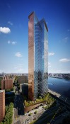
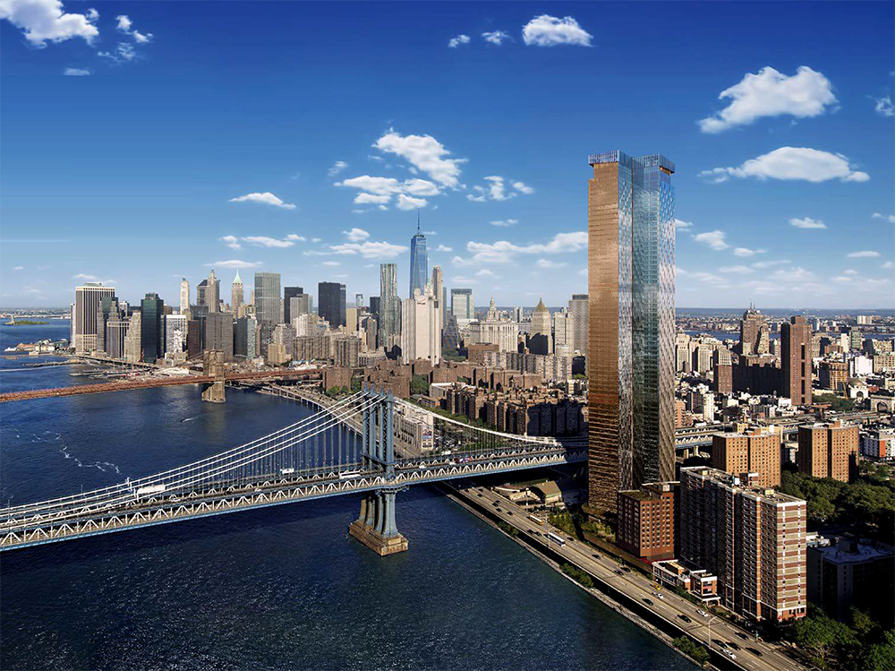
chris's apr 22nd dusk shot rendering, of 227 cherry (above) . .
looks great . . The actual building itself, just looks sorta ok . .
The "reveal", forming a bit of a crown, helps a little . .
But I have a question about this building's glass color . .
It's no biggie, but . . What is it ? . . Anybody else perplexed about this point . .
The illustrator of the dusk shot (above), renders the 2 East-facing vertical planes . .
(separated by a North-face) . . in very different colors . .
when, in fact, 2 planes of the same material, facing the same direction . .
pick up the same aspects of light . .
Is "she" doing this because the actual glass, is differently colored, . .
in each of the 2 East-facing sections ? . . (indicating a bit of expense & effort) . .
Or, is she using "artistic license" . . to trick the mind's eye into a perception . .
that the building is much more interesting, much less bulky, . . and more expensive.
Even in the high-noon-shot renderings of this tower . .
the planes are inexplicably unmatched . .
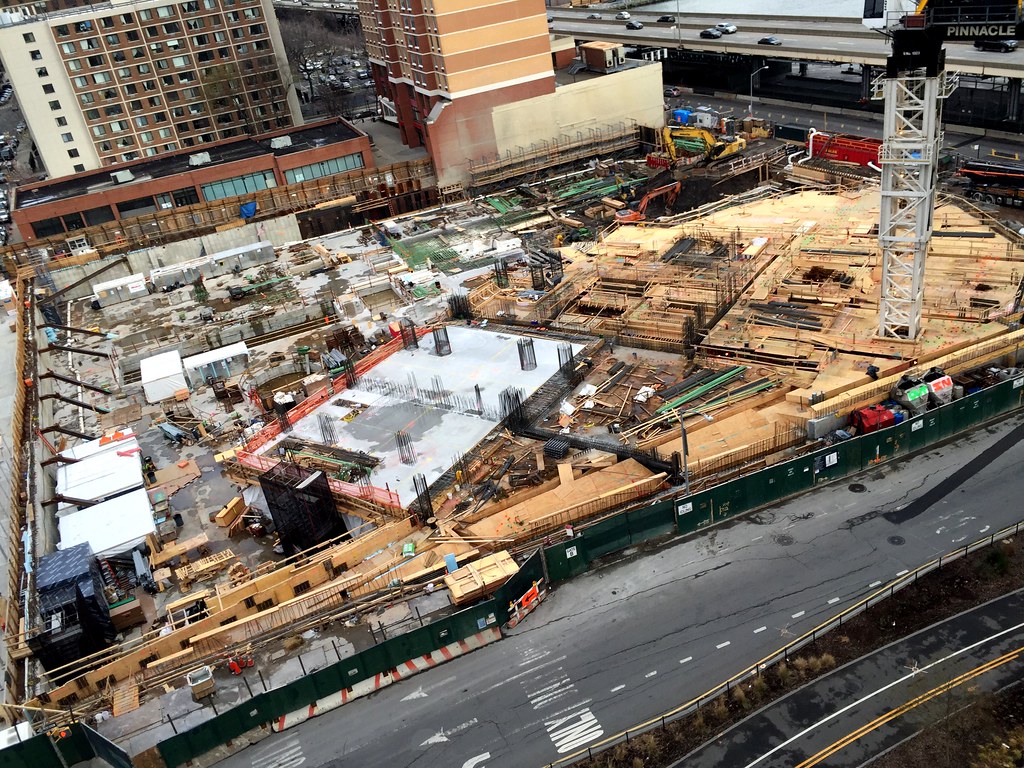
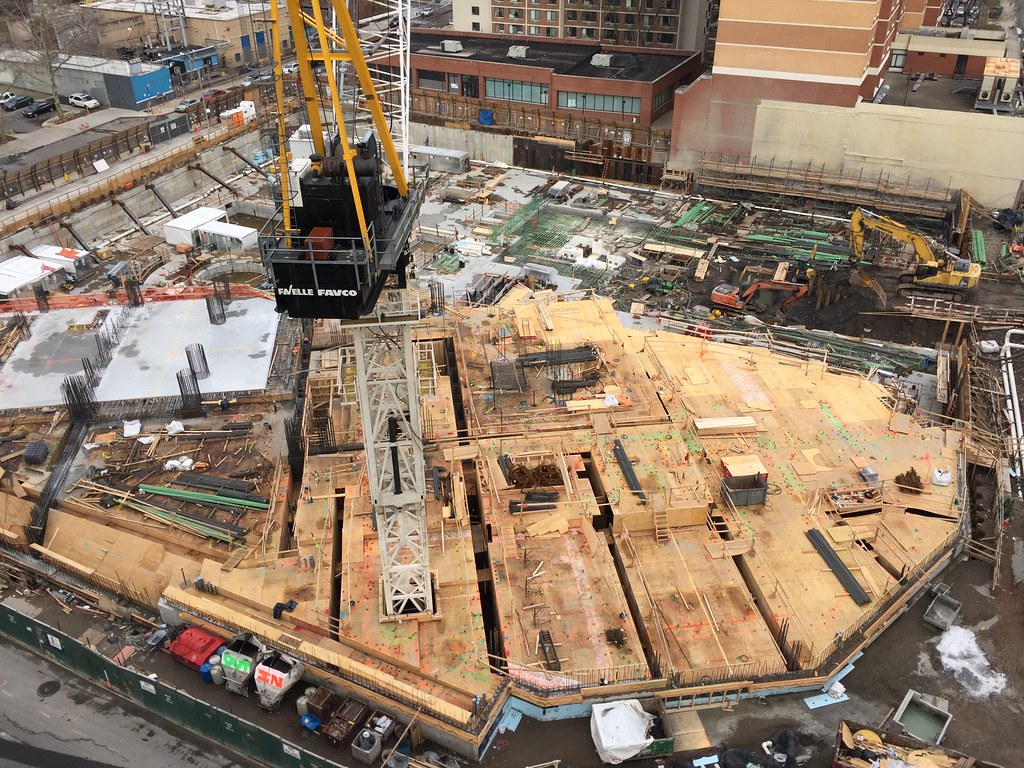
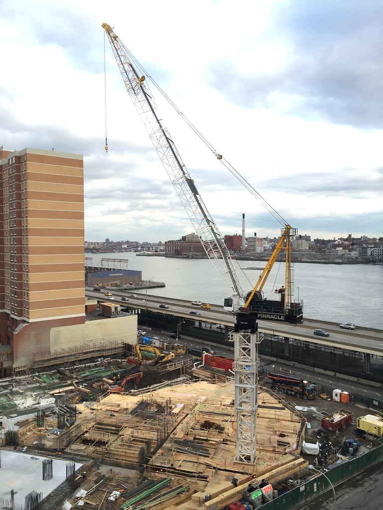
We will, of course, find out soon enough, when the building rises . .
__________________
artSpook
|


 Prev
Prev


 Linear Mode
