Mohkínstsis — 1.6 million people at the Foothills of the Rocky Mountains, 400 high-rises, a 300-metre SE to NW climb, over 1000 kilometres of pathways, with 20% of the urban area as parkland.
also: black and white cookies at cheskies bakery, goat/pumpkin rotis at jardin du cari on st-viateur, coffee at olympico on st-v... god, the list goes on. i miss mile-end.
May I also add Gracias Corazon. The Colombia eatery on st. viateur between clark and st. urbain. Not sure it was there when you were still in town Kool, but it's an authentic taste of that country, i can vouch for that.
Good observation mtlskyline, that seaway looks like bleh)
(and yes, signalhill, try st. viateur bagel instead! Or hell, try both!)
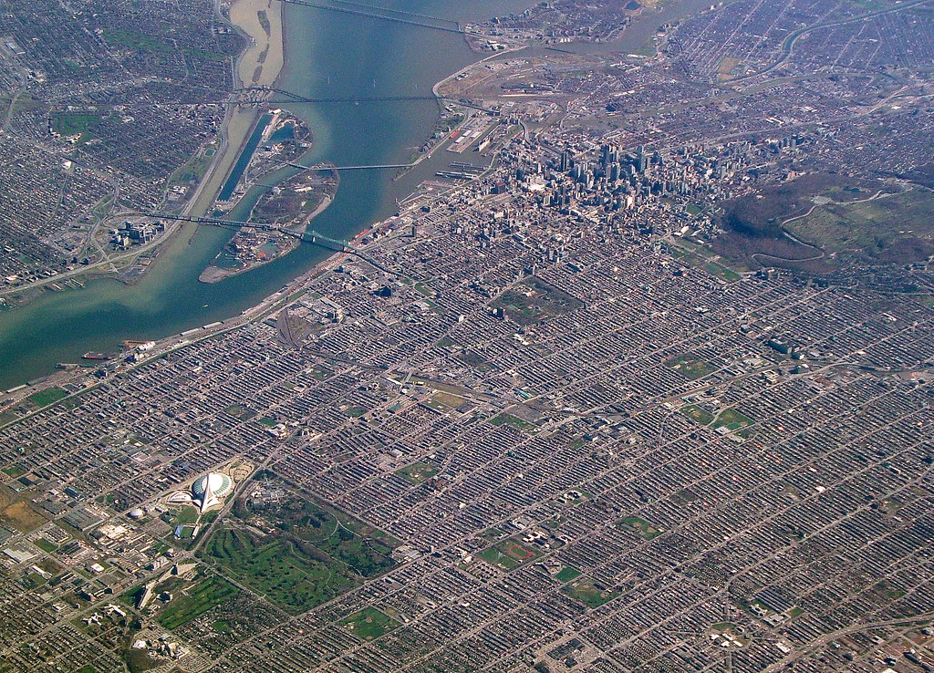
...and, now, I know Mile End is just a little chunk of the three-floor spread, not the works.
Lol. The "three-floor spread" radiates from downtown in basically all directions for a great distance... way beyond what you see in that pic.
If you did want to find a word to refer to the sum of all the neighborhoods covered in "three-floor spread", that word would be "Montreal". (Or maybe "residential Montreal", to exclude the CBD.)
May I ask... you're altering the colors on your shots, right? No way St. John's is naturally THAT colorful. I mean, it is, compared to all other cities out there, at least on this continent... but in your pics, there's something artificial about it. Just asking out of curiosity
May I ask... you're altering the colors on your shots, right? No way St. John's is naturally THAT colorful. I mean, it is, compared to all other cities out there, at least on this continent... but in your pics, there's something artificial about it. Just asking out of curiosity
Yes, but I'm still learning how to do it correctly and often get stuck with the picture being too green or yellow as opposed to way the originals look: too dark and too blue.
Here's my editing process.
I start with this (opening a CR2 file from my camera in SageLight, which is a welfare version of Photoshop that I use for processing):
To give you an idea what SageLight does to start, here is opening the same CR2 file in Windows Photo Gallery and saving it as a JPG:
And if I edited it using that program, I would decrease the brightness, increase the contrast, greatly increase the temperature, and increase the saturation to get this:
For what it's worth, the latter is very close to what you'd actually see. It's certainly not blue like the original.
Then I try to fix the colour cast. I usually do this by brightening it a little and reducing the blue tint of the shadows. I don't usually alter the saturation but I imagine the end result is basically the same as doing so? I'm more concerned about the tint than the strength of the colour.
Then I crop out all the blurry/ugly parts of the city, tweak the brightness, reduce the noise, etc., and I end up with this:
__________________ Note to self: "The plural of anecdote is not evidence."
First time I see Streets in Montréal without cracks and potholes. Congrats !
Saint-Lambert is a relatively affluent suburb from the streetcar era (mostly built between the 1910s and 1950s). I know they completely re-did the street in the pictures less than 5 years ago. The city has a good infrastructure renewal plan in which every year a different street is completely re-done: pipes, lights, landscaping and all. Most of the major ones are done already.
You simply won't find many cracks or potholes in Saint-Lambert. Compared to its neighbours Montreal and Longueuil, it is like night and day.
It may be true, but I'm anything but optimistic.
Our asphalt looks like to be made of Oreo cookies ! ...
__________________
PROVINCE OF QUEBEC ==> 9 050 000
MONTREAL METRO ==> 4 600 000
QUEBEC CITY METRO ==> 900 000
Yes, but I'm still learning how to do it correctly and often get stuck with the picture being too green or yellow as opposed to way the originals look: too dark and too blue.
Here's my editing process.
I start with this (opening a CR2 file from my camera in SageLight, which is a welfare version of Photoshop that I use for processing):
To give you an idea what SageLight does to start, here is opening the same CR2 file in Windows Photo Gallery and saving it as a JPG:
And if I edited it using that program, I would decrease the brightness, increase the contrast, greatly increase the temperature, and increase the saturation to get this:
For what it's worth, the latter is very close to what you'd actually see. It's certainly not blue like the original.
Then I try to fix the colour cast. I usually do this by brightening it a little and reducing the blue tint of the shadows. I don't usually alter the saturation but I imagine the end result is basically the same as doing so? I'm more concerned about the tint than the strength of the colour.
Then I crop out all the blurry/ugly parts of the city, tweak the brightness, reduce the noise, etc., and I end up with this:
Have you considered picking up Lightroom? It's not too expensive and would work wonders on your photos. You'd get the pop and tonality you're probably after without it being so saturated. Just a minor curves adjustment and maybe a bit of split toning. Are you shooting RAW? That makes a huge difference, too. The first photo looks nicer than the last IMO because it isn't so saturated, but I know different people are after different things, so if you're after the saturated look, then good job!
Thanks, Uzi - downloading a trial now to see. I'm hoping I can just figure out how to do it properly in SageLight, but we'll see.
EDIT: O.K., done:
Lightroom gives me this:
Compared to SageLight's this:
Hmm... the reality is somewhere in between the two. It's not as blue as Lightroom, and not as saturated as SageLight. Especially the red hull of the Oceanex vessel. In person, that's just shining in the warmest, golden hue. But with Lightroom, it's still blue. But at least I can see how badly saturated the SageLight one is now!
I'll keep practicing.
Edit 2:
I think I've got it. A mix of both. SageLight to get the tone right, and Lightroom to get the saturation right. This is, I think, almost identical to how it looks in person. Even the wood on Fortis Building looks the right colour, without having the Oceanex vessel looking blue!
*****
LOVE the Plateau... not very fond of Saint-Lambert.
__________________ Note to self: "The plural of anecdote is not evidence."
Last edited by SignalHillHiker; Jul 7, 2014 at 11:50 AM.
Yeah. It's a tribute to Harwood Lumber, which was on that site previously. Hideous old factory, I'm glad it wasn't preserved... but still a very widely-loved local landmark. And quite tall - almost like our equivalent of a prairie town's grain elevator.
And I love that building too. Even the design - it's a post-9/11 two-core design so when you're in the offices in the centre, you can see right through it. Everything - stairs, elevators, bathrooms, etc. are in the wood-lined core sections at either end.
And this angle isn't one of them, but from many angles, it actually looks tall and slender (by our standards), which the architects - LAT49 - did on purpose. From Google Streetview:
__________________ Note to self: "The plural of anecdote is not evidence."
Last edited by SignalHillHiker; Jul 7, 2014 at 12:49 PM.


 Prev
Prev


 I'm hoping I can just figure out how to do it properly in SageLight, but we'll see.


 Linear Mode
