HomeDiagramsDatabaseMapsForum About
     

Go Back   SkyscraperPage Forum > Diagrams & Database > Diagrams


Reply

 
Thread Tools Display Modes
     
     
  #1  
Old Posted May 27, 2024, 11:08 AM
Oberhafenjunge's Avatar
Oberhafenjunge Oberhafenjunge is offline
Illustrator
 
Join Date: Jan 2014
Location: Hamburg/Berlin
Posts: 84
Primary Drawings Change Proposal

Dear moderators, dear Dylan,

over the last few weeks and months some of my drawings have been replaced by drawings from GOOD/CRKMRRMK. There are many instances where he (re-)uploaded drawings of buildings where I had primary drawings and you didn't replace it, which I acknowledged, thank you for that. There are a few Instances where I can clearly see the advantage of GOOD's drawings or you can argue for them as been just another interpretation, which is fine. But there are two cases that have bothered me, because I invested also some time researching not only the absolute height but also other relevant measurements of the buildings I drew, so for these cases I would like to explain and defend my drawings and propose them (again) for primaries.

Case no.1 would be "Torre del Mangia", BuildingID = 36021
https://skyscraperpage.com/diagrams/?buildingID=36021

The absolute height refers to the metal spire and not the stone parts of the tower. The tower is rather skinny, even more than one would maybe percieve from the square in front. Also the building itself is not nearly as high as good draws it (almost 50 meters!). I based my drawing on several building plans, comparing measurements on google earth, aswell as on a study on photogrammetric measurements which you can find here: link to researchgate.net

Case no.2
Vattenfall Power Station, BuildingID = 112421
https://skyscraperpage.com/diagrams/?buildingID=112421

This one is a rather small thermoelectric plant in the middle of Hamburg Hafencity. The height of the building itself does not surpass any of the neighbouring buildings. On Google Earth it measures 23 meters in height (the street being on +7m the roof beint at +30m). Goods drawings suggests it to be over 35m which would surpass most of the neighbouring structures... The rather slender chimneys seem also quite massive and the building is overall two long. (wrong proportions being a general theme througout some illustrator's works but specially GOODs).
I would also propose to rename it to "Heizkraftwerk Hafencity", which is its official name. It is also not run by Vattenfall anymore but by Hamburg Energie.
https://waerme.hamburger-energiewerk...eugungsanlagen

__________________
my SSP Diagram
my churches Diagram
Reply With Quote
     
     
  #2  
Old Posted May 27, 2024, 5:06 PM
Oberhafenjunge's Avatar
Oberhafenjunge Oberhafenjunge is offline
Illustrator
 
Join Date: Jan 2014
Location: Hamburg/Berlin
Posts: 84
Quote:
Originally Posted by CRKMRRMK View Post
well, first of all, you are attacking me personal again, as common european and germans do, mobing. My drawings are accurate better than yours, mainly the ones in Italy and in Hamburg. [...] My diagram was deleted again even complete made by me included the statues. Have thousands issues about that with Dylan and now you complain, for example Florence Tower Palacio Vecchio during my design studies with wife in Milan visited it, my drawing is 3D much better than yours, Cinammon in Hamburg the same, and manyothers see list,but your shitty things got primary even my drawings are more precise and accurate reloaded. [...] As well as here in Hamburg my energypower plant is much better than yours, accurate, precise done, well studied and the most representative as illustration the city can gets. Here is the List those 100 Drawings of me must go primary, but was Dylan impressions only who decides w hat he prefers. Understands your jealousy because am much better designer than you, mainly because made many car projects at GM VW BMW Audi Yachts in CAD and Design Softwares ... so have my good eyes for forms. Your things are flat, mine are 3D anaconic paralel perspective

I did not attack you personally, I just said that your diagrams very often lack proportions. If your diagram just fits into the "absolute height" but other heights or the lenghts of the buildings are completely wrong, then they are unaccurate – that is the definition of being accurate. You mentioned your Palazzo Vecchio: Sorry but you missed the roofline by 10 meters! So that is inaccurate. Your drawings may look more "3d" because you use 3d-models to generate them – that is an artistic decision and I respect that. You now got 9 primaries that I drew – I did complain about two because they are just wrong. The others I don't like but I don't cry about it like you do for every little thing.

And now just a quick reply for some of the buildings you highligthed:

-Energiebunker has a solar roof on top that makes it higher: your diagram doesn't show it, so it's wrong!

-St. Jacobi: It was my first drawing vor SSP, it may not be my best, but your drawing looks hilarious. Your church has an almost 60m high roof and its way over 120m long. St. Jacobi is big, but it is not a gigantic cathedral. And then the tower, the main thing, is like a little pencil. My drawing has completely accurate measurements – call me stiff, call me "german" but that's the point of a diagram, and thats the definition of "accurate".
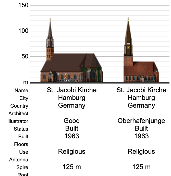
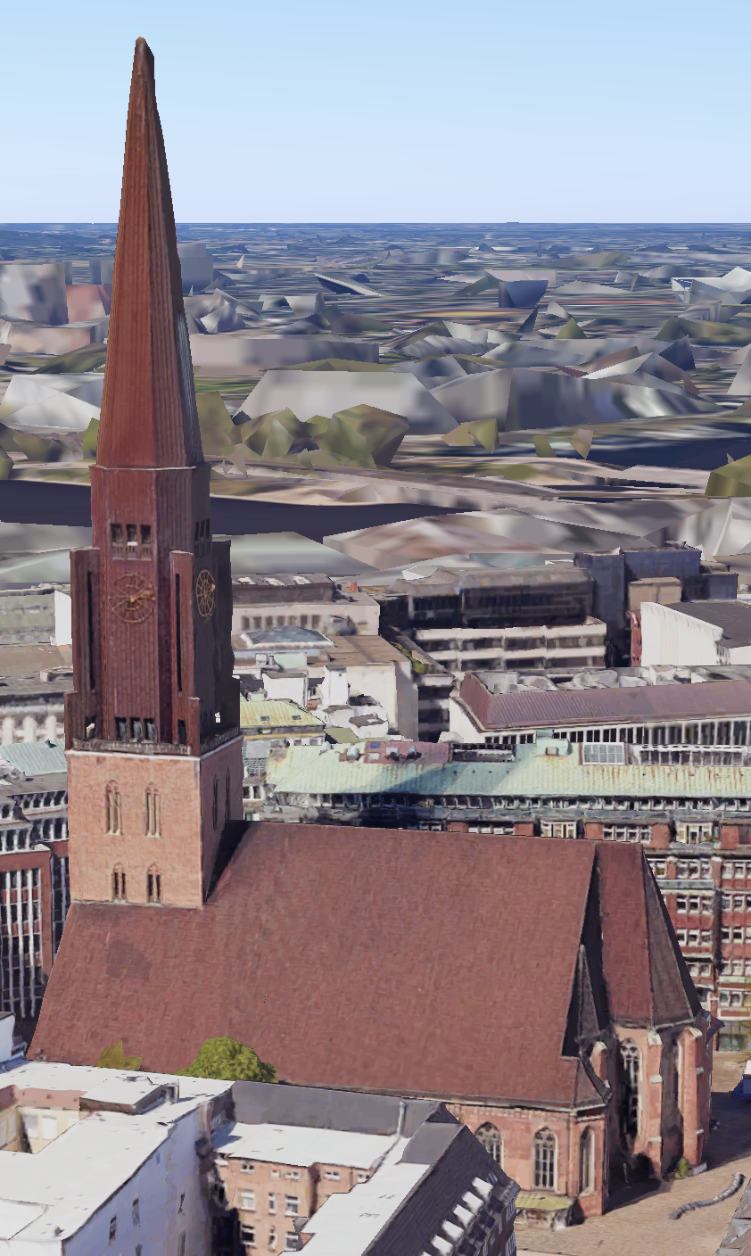


-Lübecker Straße: Your drawing looks fine, but to be honest – you missed some detail and it looks too generic of a building to be recognisable as the building it's supposed to show.

Your Lighthouses are okay – in fact they look quite similar to mines so I don't see your point in calling yours "better".

– at the end Dylan doesn't know all the buildings, and I don't know how he decides which drawing is going to be the primary, but I can see a lot of reasons for most of your secondaries not being primary.

My "style" may look "flat" because they are genuine 2D-drawings – but at the end I have a consistent "style". Your "style" meanwhile is so inconsistent and incoherent that it raises questions about the proveniences of "your" drawings..

I wonder where your astonishingly good drawing of "San Giorgio Maggiore" in Venice comes from.
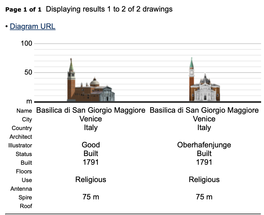
diagram
because it looks surprisingly similar to a Sketchup which you can find at 3D-Warehouse. link
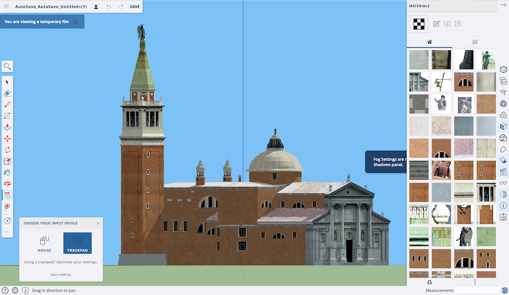

and please don't say that you are "Daniel G." the author of the Sketchup because apparently then you must be also "Emperor Heer99" who drew the Sketchup to your "Reichstag"... link
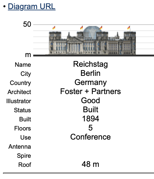

Its funny how square and "flat" your towers look on that building, just like on the skp...
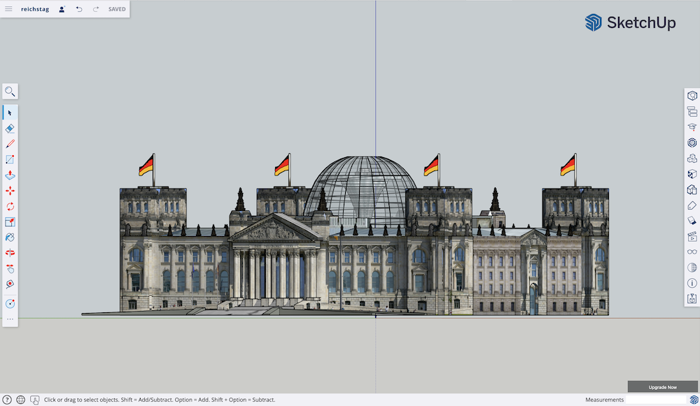

you may have hidden the lines or edited it a little but should we go on for all "your" drawings that look slightly more accurate than average?
I wonder how many cars get designed in Sketchup
__________________
my SSP Diagram
my churches Diagram
Reply With Quote
     
     
  #3  
Old Posted May 27, 2024, 5:33 PM
Oberhafenjunge's Avatar
Oberhafenjunge Oberhafenjunge is offline
Illustrator
 
Join Date: Jan 2014
Location: Hamburg/Berlin
Posts: 84
Quote:
Originally Posted by CRKMRRMK View Post
guy, you are the childish here whinning like an immature. The SSP is not yours and what Dylan decided is final point at all. Make your own database and put your shitty things there. Yes, I do my diagrams with 3D Cad... so am not a baby like you immature complaining those thinny things. fuck yourself and look for something important in life to do. The previous bunker in Vettel is an older version but much better than yours. When was done was without solar panels on roof. Yeah, you are jealous whinning because am much better than you, admit thati f you were a real man with behaviour. I've been in St. Jakobi many times and the ceiling is that high really. Your drawings is child funny, like a baby 3 years old do, amateur, not professional ones. My lighthouses, are my home, was several times on them appreciating ships, know like my hand... it was animated but ... mine came much first than yours. Guy, you know nothing about design, that is sure, maybe you are a müllman to pretend being something.... of course a müll guy is more important than you... but in graphic design you are nothing, it is because that stopped in my 1000, because shit guys like you in SSP-
Again: I did not insult you in my first post, I even acknowledged that some of "your" drawings may have some qualities. I just complained about two that are clearly wrong and where I did exact drawings.

Then after you insisting that "your" work is so super "accurate" and "better" than mine I just pointed out that the examples that you are mentioning are hilarious, because the drawings are wrong. And I dared to mention the funny coincidence that as a matter of fact there are a few drawings of "yours" that are simply someone elses Sketchup-Files. The only thing I made fun of was my last sentence because you keep repeating how experienced you are in Car-Design and CAD or whatever and that I wondered how many cars get designed in Sketchup, because – you may have drawn diagrams of your own in sketchup (many clearly look like it) but also you just use some random sketchup files you find on the internet. You are the one who made this personal, so please stop whining yourself.
__________________
my SSP Diagram
my churches Diagram
Reply With Quote
     
     
  #4  
Old Posted May 28, 2024, 7:35 AM
Quilmeño89's Avatar
Quilmeño89 Quilmeño89 is offline
Illustrator
 
Join Date: Dec 2012
Location: Quilmes
Posts: 851
To be fair, both drawings of the "Torre del Mangia" are imprecise, according to the measurements that can be obtained on Google Earth, which coincide with this plan provided (since Google Earth 3D is also made by photogrammetry, one of the most precise methods for massive scale measurements).

Spire (cross): 96 m
Roof (tower): 87.5 m
Top of the lower building: 41 m (EXACTLY in the middle of both drawings)


If we adjust the scale, we see that Good's drawing has the correct proportions:


Only the crowning with the cross would be missing.


---

In the case of the power station, the actual height is much lower:

Spire (chimneys): 80.5 m
Roof: 22 m

If we adjust the scale, none of them match, so the correct thing to do would be, first, to scale the height of the building to 22 m and then modify the height of the chimneys.


Last edited by Quilmeño89; May 28, 2024 at 7:54 AM.
Reply With Quote
     
     
  #5  
Old Posted May 28, 2024, 1:39 PM
Oberhafenjunge's Avatar
Oberhafenjunge Oberhafenjunge is offline
Illustrator
 
Join Date: Jan 2014
Location: Hamburg/Berlin
Posts: 84
Quote:
Originally Posted by Quilmeño89 View Post
To be fair, both drawings of the "Torre del Mangia" are imprecise, according to the measurements that can be obtained on Google Earth, which coincide with this plan provided (since Google Earth 3D is also made by photogrammetry, one of the most precise methods for massive scale measurements).

Spire (cross): 96 m
Roof (tower): 87.5 m
Top of the lower building: 41 m (EXACTLY in the middle of both drawings)


If we adjust the scale, we see that Good's drawing has the correct proportions:


Only the crowning with the cross would be missing.


---

In the case of the power station, the actual height is much lower:

Spire (chimneys): 80.5 m
Roof: 22 m

If we adjust the scale, none of them match, so the correct thing to do would be, first, to scale the height of the building to 22 m and then modify the height of the chimneys.

Dear Quilmeño,

first of all thanks for bringing back some objectivity into this conversation!
(I doubt that threats of shooting someone on the streets deserve to be called a sane conversation but this is another topic) In some ways you are right, specially regarding the intermediate height of the two ornaments in Siena. The ornaments in my drawing reach the 37m of the lower battlements of the roof – I must have mismeasured that back then. Since I also always measure lenghts on the floor, just scaling buildings to fit certain heights would be still methodically wrong and the point where the building itself connects to the tower is exactly at 24m, just like in the provided measurements. So the middle-part of the lower building is too low on my drawing.

The tower being too high by adopting the official height given by this site is an error I made, similar to not double checking the height of the chimney, which leads us to the next example:

scaling the whole drawing of the power plant would also be methodically wrong because the plant itselft is measured correctly, it is at 23m height (one can argue about it being 22 or 23, but this doesn't matter imo) but the lenghts are all taken from google maps. The only thing I didn't double check when I did my drawing was the chimney height provided by the database here on SSP. Scaling my entire drawing to make the chimney fit doesn't make any sense – I hope you see what I mean and you understand a little how I create my drawings: Usually I take measurements or plans of buildings and create an elevation drawing with the measurements I have and then illustrate the line elevation in Photoshop.

______

I would still argue that if you simply scale GOODs drawing you will end up with other errors, like at least the bell-spire missing, or the façade having possibly a wrong length. Also that other examples he brought up – like the church in Hamburg mentioned above – show clearly that there is no measurable relation to the building what-so-ever. And this ignores still the two elephants in the room: that there is a chunk of "his" drawings (mostly the better proportioned ones) straightly pulled from somewhere in the internet and that he attacked me verbally in unacceptable ways.

still, thanks for taking the time and effort to double check and highlight the errors in the drawings – I wish this thorough analysis and thought could be found applied to more things here...
__________________
my SSP Diagram
my churches Diagram
Reply With Quote
     
     
  #6  
Old Posted May 28, 2024, 2:49 PM
Oberhafenjunge's Avatar
Oberhafenjunge Oberhafenjunge is offline
Illustrator
 
Join Date: Jan 2014
Location: Hamburg/Berlin
Posts: 84
I know this evolved into a whole different thing, but I want to open the case, that also "his" Torre del Mangia is just stolen off SketchUp 3D-Warehouse.
https://3dwarehouse.sketchup.com/mod...el-Campo?hl=de
If you delete all the buildings but the Torre del Mangia and Palazzo Pubblico, you end up with this:


I didn't bother with removing the lines and so on but simply exported the image from the model with no further editing looks like this:


could we please acknowledge that it looks strangely similar to "goods" "illustration", specially regarding the odd white space between the tower battlements or the white background shining through the two ornaments on the lower roof where you should see the roof behind?


I don't feel like further investigation where the graphics for power plant came from, but please look at the inconsistencies in the styles of drawings and vastly different levels of detail uploaded by him. I also don't feel like presenting more examples of oddities in "his" "work" uploaded here – make of this what you want, but I think it is unfair to see my genuine work and the genuine work of other illustrators to be measured to this and to be displayed side by side of these graphics of questionable source, uploaded by a guy who repeatedly insulted or threatened this site, the team running it and anyone who crossed his way.
__________________
my SSP Diagram
my churches Diagram
Reply With Quote
     
     
  #7  
Old Posted May 29, 2024, 4:50 PM
Etesia's Avatar
Etesia Etesia is offline
Illstrator / Editor
 
Join Date: Mar 2010
Location: Seoul
Posts: 165
His flamboyant design history is respected only when he is humble and well-mannered.

We're not wondering about your ''world-spanning résumé, amazing car design, history lectures, the life of a Billionaire on a yacht, your autobiography having a barbecue with Musk.''

Answering people's reasonable questions with aggressive insults all the time is, of course, bound to make enemies...

If there was an implicit consent from Dylan to that
If CRKMRRMK remarks are "admit to theft,"
makes we think a lot.

Obviously, CRKMRRMK is a talented illustrator and produces great diagrams,
Because of his actions, we can't tell which of his works are self-made and which are sketch-up thefts.
This is the biggest problem and it's what makes him lose his credibility.
Reply With Quote
     
     
  #8  
Old Posted May 29, 2024, 5:08 PM
Etesia's Avatar
Etesia Etesia is offline
Illstrator / Editor
 
Join Date: Mar 2010
Location: Seoul
Posts: 165
We just want to talk logically.
What made you angry at everything?
Reply With Quote
     
     
  #9  
Old Posted May 29, 2024, 5:40 PM
Etesia's Avatar
Etesia Etesia is offline
Illstrator / Editor
 
Join Date: Mar 2010
Location: Seoul
Posts: 165
Oh, man, I'm sorry if I said too much.
I was just asking the question.
If what you're saying is true, you just have to prove it.

Well, no matter how much we talk, the owner of SSP is Dylan.

Actually, why don't we stop arguing like this and have a beer together, bro.
Let's talk about architecture together
Reply With Quote
     
     
  #10  
Old Posted Jun 1, 2024, 12:18 PM
Artemco's Avatar
Artemco Artemco is offline
Ukrainian moderator
 
Join Date: Apr 2005
Posts: 4,628
let me fan the flame, MkMillenium's JPEG of Arena Auf Schalke, scaled ×6 bilinear

the vertical perspective distortion is more than one pixel on the edge of roof

Last edited by Artemco; Jun 1, 2024 at 12:34 PM.
Reply With Quote
     
     
End
 
 
Reply

Go Back   SkyscraperPage Forum > Diagrams & Database > Diagrams
Forum Jump


Forum Jump


All times are GMT. The time now is 4:26 AM.

     
SkyscraperPage.com - Archive - Privacy Statement - Top

Powered by vBulletin® Version 3.8.7
Copyright ©2000 - 2024, vBulletin Solutions, Inc.