I loved the design of the old stations. White, red, green, blue. The lettertype they used on everything and the meshing (when it was clean) that under light was semi-transparent but at night you could see straight through. Everything was tubed. The signage (especially the really old stuff) had fine little details which you could see up close but otherwise made sense from a distance. The fluorescent lighting made the open spaces feel warm in almost any weather.
The new stations have too much glass. Too much exposed concrete. The halide lamps add modernism but the platforms feel cold.
I loved the design of the old stations. White, red, green, blue. The lettertype they used on everything and the meshing (when it was clean) that under light was semi-transparent but at night you could see straight through. Everything was tubed. The signage (especially the really old stuff) had fine little details which you could see up close but otherwise made sense from a distance. The fluorescent lighting made the open spaces feel warm in almost any weather.
The new stations have too much glass. Too much exposed concrete. The halide lamps add modernism but the platforms feel cold.
My understanding is glass wall improves visibility leading to safer feeling of the patron in the area. Exposed concrete is probably for lower maintenance.
Great captures of those autumn colours Klaus. The dry October really made it possible to enjoy them this year (and a hell of a lot easier to rake them up!)
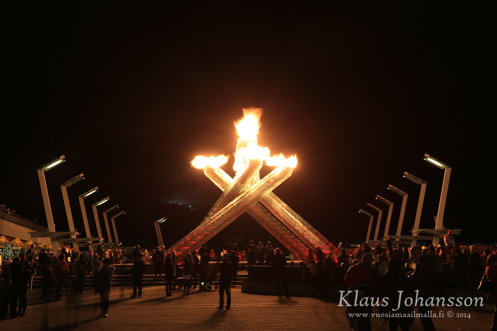
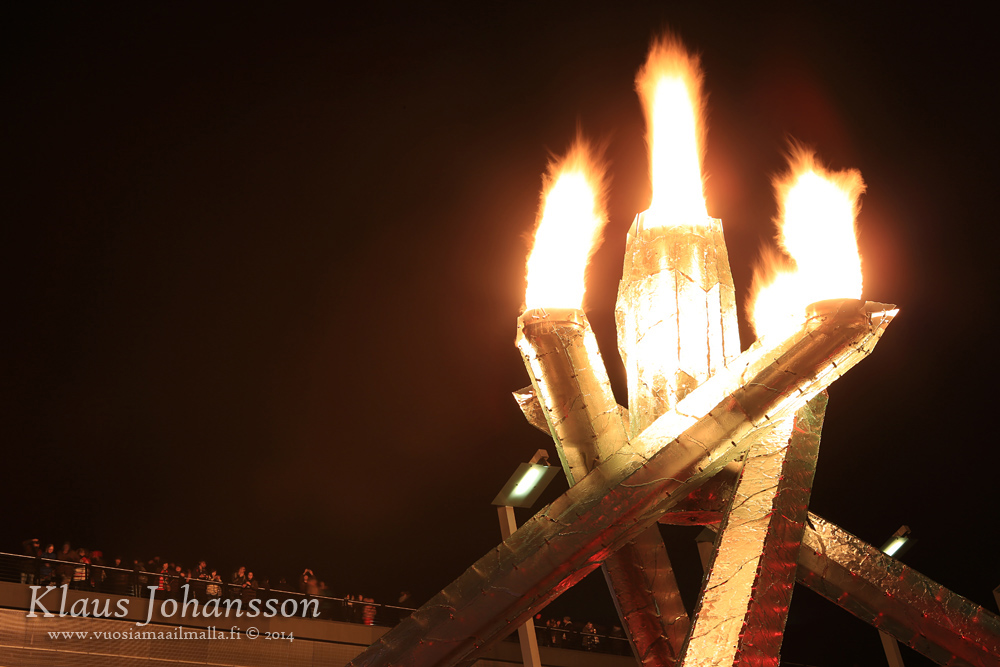
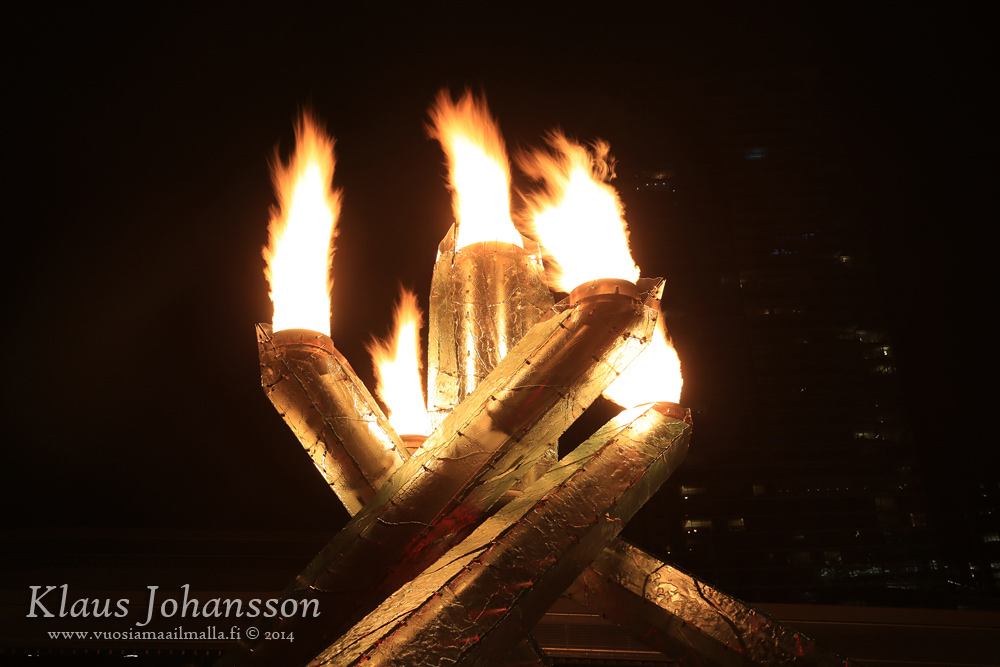
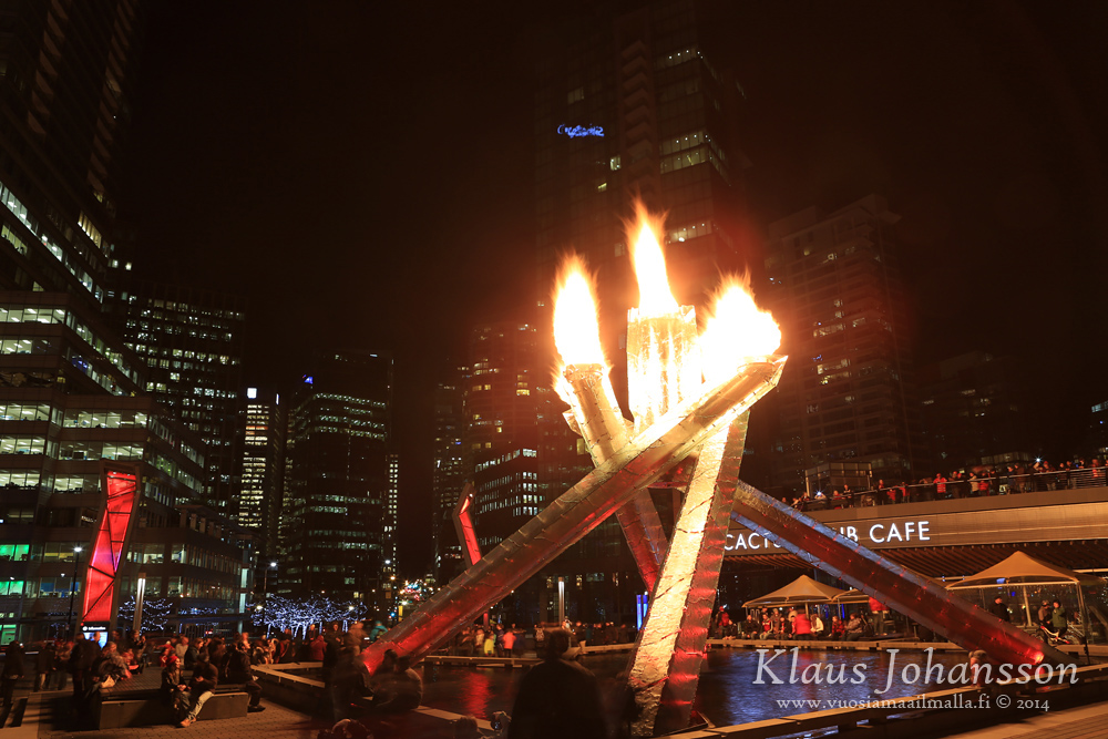
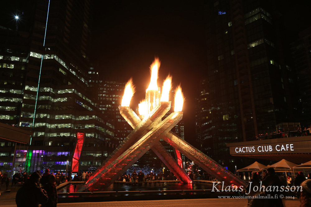
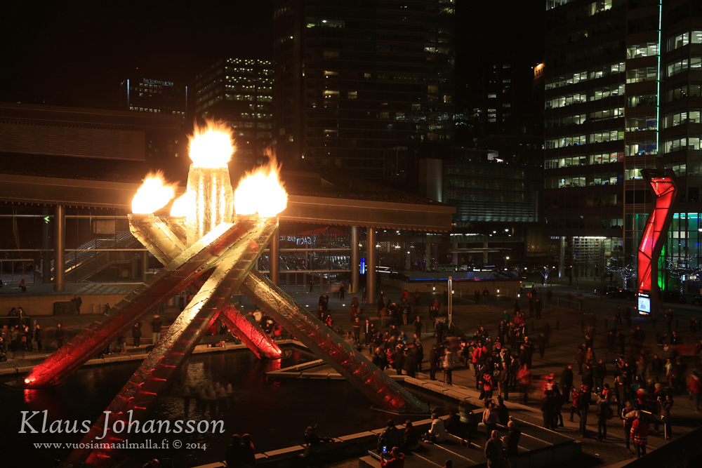
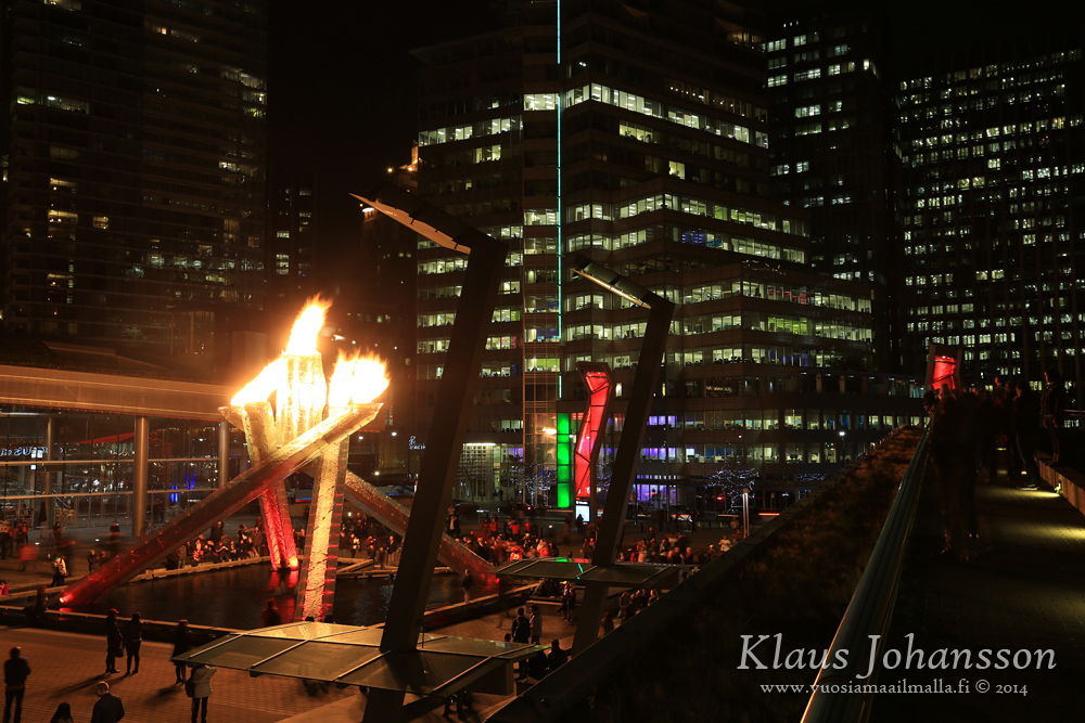
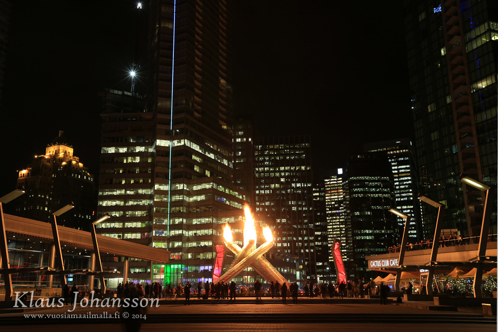
If there is one thing I have been regretting, it is not having lived in Vancouver during the 2010 Winter Olympics. That's why I am so happy that they have been litting the Olympic Cauldron to celebrate gold medals in Sochi. I really like this spectacular structure and seemed to gather a jolly crowd of hundreds.





 Prev
Prev






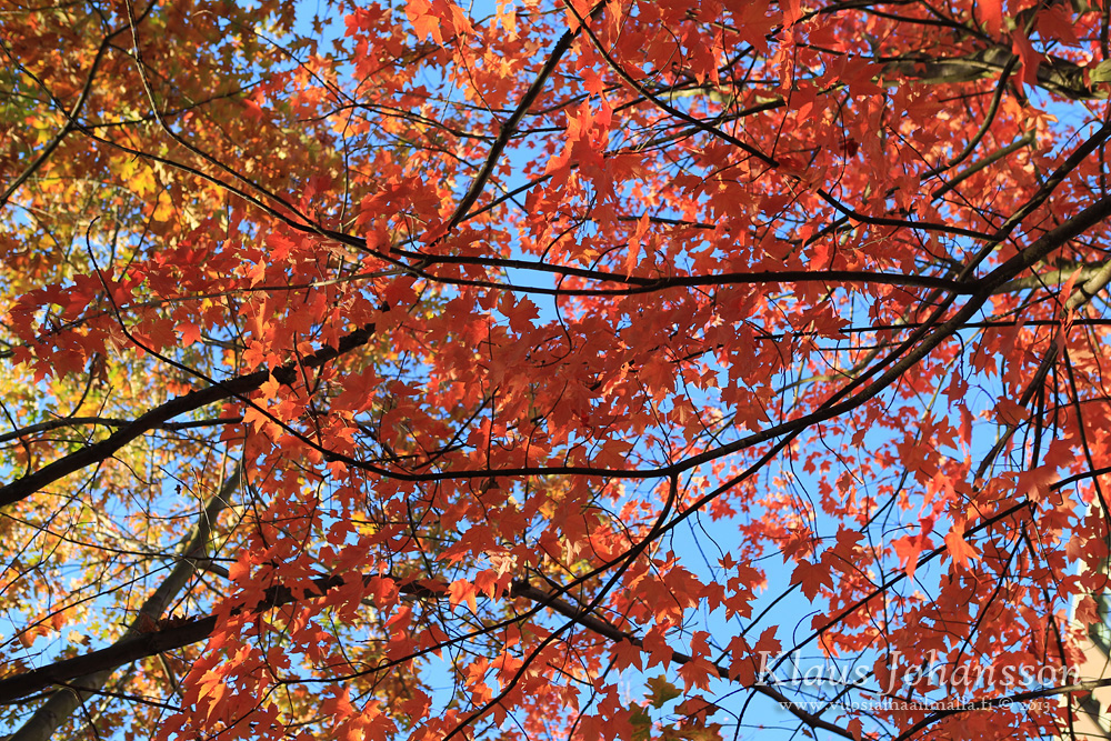

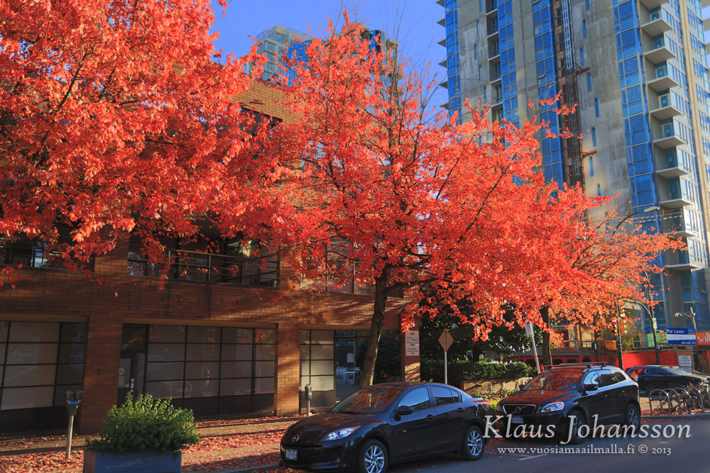
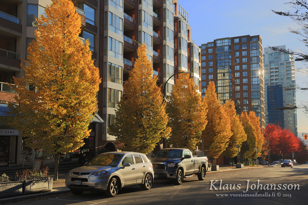


 Great captures of those autumn colours Klaus. The dry October really made it possible to enjoy them this year (and a hell of a lot easier to rake them up!)








 Linear Mode
