I thought we had a thread for this already but can't find it, so time for a new one
Anyway the concept is self explanatory. Two or more pictures of the same subject, from the same angle, and as close to scale as possible from different eras.
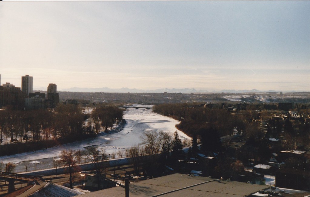
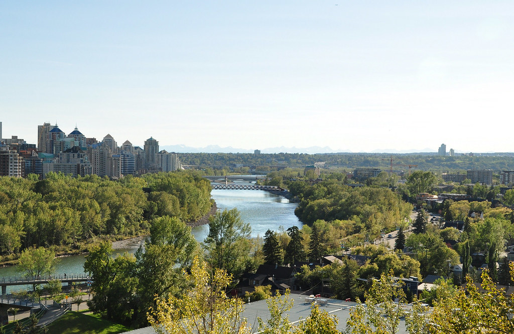
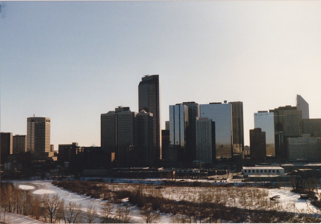
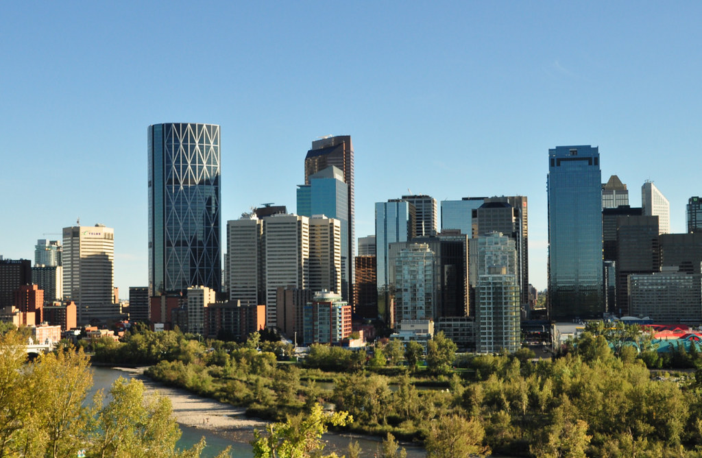
The fact that the 80's shots are in the winter make them especially bleak compared to the modern summertime scape. Love this page, well done Surreal.
Yeah, the brown of the winter doesn't look great at all. I have a few pics of Sunnyside in the 80's and all are winter shots, but boy does Sunnyside and Prince's Island ever look better now.
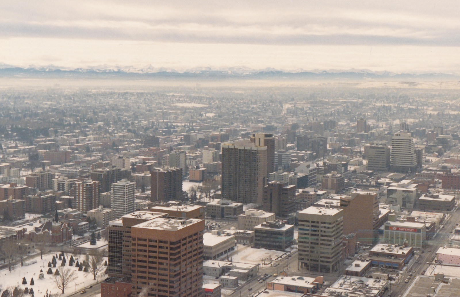
Even though the 1986 pic is taken during winter....things look kinda bleak. Apparently architects back then only had three colors to choose from brown, gray or mirrored glass.
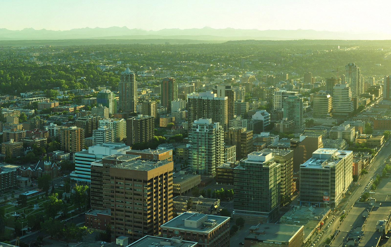
Much better. It's hard to tell from the pics because of the summer vs winter scenario but I find the Beltline is more generally much more green than it was even 15 years ago.


 [
[ [/url]

 Linear Mode
