Coincidentally, I had just watched an old video on a renovated micro apartment:
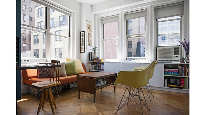
Tiny Origami apartment in Manhattan unfolds into 4 rooms. It's Manhattan, so the space is small and the prices are crazy, but what won me over were the windows. These were not merely cutout holes in a wall, but were defined by the architecture of the building, and in turn defined the room. I know Hemisfair is definitely not the Upper West Side of Manhattan, but the "architecture" of the room actually wasn't necessarily more high-end or especially elaborate as it was just a narrow, rectangular, 1-room efficiency space, not much greater than many dorm rooms. If only my dorm room had this:

(Photo by Rayon Richards on
TimeOut New York)

(Photo by Alan Tansey on
shoebox dwelling)
$235,000 for 450 sq. ft. and still having to hang a window AC unit over the view of the back alley while also folding your bed down into the "living room," but that little corner set of operable windows no bigger than my breakfast nook is beautiful. Hehe, they're even still using plain blinds. I know the renovation project was really about the big blue space organizing cabinet, but it was the windows that made this place livable. Even in its pre-renovation, used-and-grimy state, it offered so much warm potential.
In many quantitative ways the rooms of The '68 are superior in construction, technology, materials, size, amenity, and affordability, but time and circumstances have created design philosophies that are so strikingly different. Maybe in 90 years it will get a comparable renovation and we will shell out a quarter million to marvel at its historic windows.

(Photo by Stephanie Marquez on the
Rivard Report)


