by Kirk Cumming
Welcome everyone.
I am not the most prolific artist for the diagram. However, I have been
using computers to draw pixel art for over 10 years. The following article
will describe a step-by-step process that you can use to draw buildings
for this wonderful diagram we have. It is by no means the only process one
can use, but people looking for advice may be able to find some hints in
here.
First a word on software. There are many different software packages
one can use to draw diagrams. Many use MSPaint because it is easily
accessible and fairly simple. I'm not too familiar with MSPaint, but I
have used several similar programs. Some people use vector software like
Illustrator
or Freehand. I
will not cover those in this article, this one will be about raster
drawings. Personally, I use Paintshop Pro 7.0 for
Windows, which is similar to Adobe
Photoshop. However, Paintshop has all the features that I need,
and it's much cheaper. Anything in this article can also be done in very
similar fashion with Photoshop.
I will assume that you are reasonably proficient in the use of these
programs. I don't have space or time to teach people how to use them, and
there are people much more qualified to do so. Books and the web should
help you out enough.
To illustrate the steps in the process we will be using an example. The
example is the Yebisu Garden Place Tower
in Tokyo, the first diagram I drew that I was
quite proud of, and the first one drawn with the process outlined below.

Here we go!
Step 1 - Research
And you thought this was about drawing, right? Well, the first and most
important thing is that you have sufficient source material for your
diagram. This is difficult. I use Google as my search engine. I use
both the standard search and the image search to build up a collection of
as many pictures of the subject building as I can. Try to find pictures
with a number of different angles and different lighting. The different
angles will allow you to capture all the details possible (and their
dimensions), and the different lighting will help you to understand the
true colouring of the building.

Almost looks like a diagram already, right? As I said, I got really
lucky. You're also lucky if you can see the building in person, because
then you can take all the pictures you want, and you can see the details
up close.
Now that you've got your source pictures, open them all up in Paintshop
and start a new document. Time to start drawing!
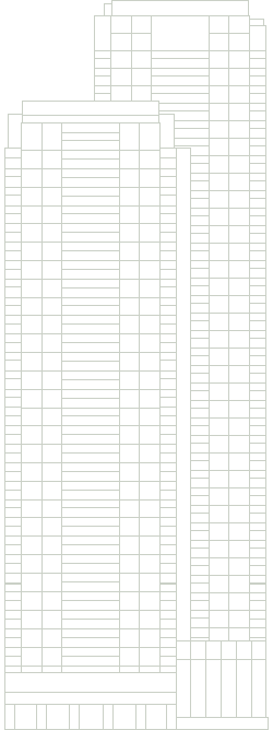
Step 2 - Outline
The outline is probably the most time-consuming step, depending on how
detailed the building is. In this step we will determine the dimensions of
all the elements of the building, and draw an outline. We will not have
the outline in the finished product, but it will guide us in the rest of
the process.
Here is what the outline will look like:
The first step is to select a scale in which to work. Generally,
my scale is either 3 or 4 pixels = 1 metre...in this example I used 3. The
diagram is currently at 1 pixel / metre, but that could change, so you
want to save a higher resolution version of your diagram. As well, drawing
at a larger scale will allow more detail that will still look good when
you scale down.
Create a new document slightly bigger than the dimensions of
your building at your scale, with a white background. The reason for the
white background is that the diagram itself will generally have a white
background (depends on the user's desktop settings) so you want to avoid
antialiasing artifacts with other colours. Next, create two new raster
layers, one named "Colouring" (please use Canadian spelling :p )
and one named "Outline" in that order. Switch to the Outline layer
and start drawing! You'll be using your paintbrush tool for this
step, set to a 1 pixel brush size, 100% hardness and opacity. Remember, to
draw a straight line, click once, hold down shift and click at the
opposite end of the line. You can use the line tool if you want,
but remember to make it not a vector and turn of antialiasing.
Try to measure the proportional size of different elements of
the building. Start with what you know. If you know the building is 160 m
high, and that a certain element is about 20% of the building height, then
you know that it's about 32 m high, and you can then decide, based on your
scale how many pixels high it is. Write down dimensions on a piece of
paper. Count elements like windows and write down those counts too.
One of the first problems you'll probably run into is uneven
division. You've got a segment that's 164 pixels tall, and you need to
put 17 windows in. Each window should be 9.647 pixels tall. Well, that's
impossible, and that's one disadvantage of pixel drawing. With vector
tools you avoid this problem, but oh well. You'll have to make some
windows 9 pixels tall, and some (about half in this case) 10 pixels tall.
Try to spread them out, and don't worry too much. A difference of one
pixel will be hardly noticeable once you scale your drawing.
Use cut and paste to replicate repetitive elements of your
building. If you've got a lot to replicate, do it in multiples, ex: copy
and paste 5 windows at a time. This will save huge amounts of time and
reduce errors.
After a bunch of hard work you should have a complete outline. I know
it seems silly, but this seems like a good place to mention this: save
often!!! I usually save once a minute or so. You don't want to have to
redo these tedious steps.
Step 3 - Colouring
This is one of the easiest steps. In this step, we will fill in the
basic colours of the building, nothing fancy. Look at all your pictures
and try and determine a best guess at the truest possible colours for the
different elements. You can use the dropper tool for this. However,
the dropper only gets one pixel's worth of colour, and our perception of
colour in photographs comes from the average value of several pixels in
close proximity. Look closely and you'll see every pixel is a different
colour. It can be a difficult trial and error process to determine the
right colour.
Here is what the colouring will look like:
As you can see, I made a few changes to the outline during this step,
as I realized I had made some mistakes regarding the shape in some areas.
Switch to the Colouring layer and choose the selection tool.
Make a selection defining the area you want to fill with colour, a window
for instance. Switch to your flood fill tool and select your
colour. You may want to set your match mode to none. This
will allow you to fill the entire extent of your selection regardless of
what was there before. Click inside the selection with the flood fill
tool. The fill will be constrained to the selection. You should be able to
see the colour behind the outline. If you want to see it better, change
the properties of the Outline layer so that the opacity is less than
100%...especially if you drew the outline in black.
Continue to fill the building's colours out, and use the paintbrush
tool to do small touchup work. You can add small details in this step, but
don't do too much lighting or shading work. If there are entire sections
of the building that are darker or lighter than others (those that are at
an angle, for example) this is the appropriate step to select a darker or
lighter colour for those sections and fill them in.
One note about colour selection in this section for glass. Give
the glass a fairly dark colour. We'll be lightening it later. Glass is a
real difficult subject when it comes to picking colour because it not only
has a colour of its own (if it's tinted) but it also reflects colour, so
its resultant colour is entirely dependent upon the angle of viewing, time
of day and weather conditions. Try to find the colour that best indicates
the natural colouring. In this example, I chose a dark green for the
windows except for the lower ones, which are darker.
Once you're done this step, you can turn off your Outline layer's
visibility using its properties page...you probably won't need it again.
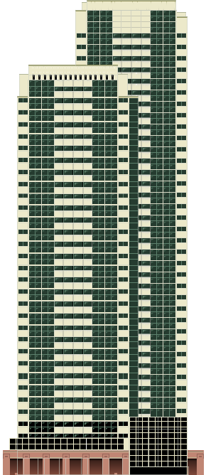
Step 4 - Lighting and Shading
This step is probably the most fun and satisfying, as our building will
now begin to jump out of the page. This step applies very differently to
different types of buildings, so some may not benefit so much.
Here is what the building will look like after shading:

Our four main tools in this section will be the selection tool,
the magic wand, the flood fill tool and the airbrush.
The first thing we're going to do is shading. This will be done by
applying a gradient fill to large areas. Use the magic wand to select
large areas that will have similar shading. In this example, I selected
everything that was not glass. To make this easier, select one section,
and then use Selection -> Modify -> Select Similar to select
areas of similar colour. Now use your flood fill tool, and set it to a
gradient fill. Shading a building darker at the bottom and lighter at the
top usually looks good, but be very subtle with the gradient. Don't make
it too noticeable or it will look very tacky. In Paintshop 7, gradients
can apply to opacity values as well, and this can help you to simply shade
your building without losing the colour you already put down.
Next I worked on the glass. Use the magic wand to select all the glass
and apply some gradient fills to create highlights on the glass in
different places. I can't really give any advice on how to do this
well...I just kind of played around with different opacity values, colours
and gradient settings. With the glass still selected, and a light colour
close to white chosen, switch to the airbrush and start adding random
highlights to the glass. Make sure your opacity is low (<10%)so
that the effects are fairly subtle and you can build them up gradually.
You can also use dark colours with your airbrush to emphasize the
highlights. You can also, if you want, find an image of clouds in the sky,
and use it as a fill texture...but I hesitate to use this method.
Next step is shadows. Not all buildings need them very much, but
this example really did. I chose to light the building from the top left,
so the shadows will be on the right or bottom side of elements "sticking
out" of the building. You want a hard edge where the shadow starts,
gradually fading out. To do this, use the selection tool to select a
rectangular area around where your shadow will be. Make sure the left (or
top) edge of the selection is exactly where the shadow starts, but the
right (or bottom) edge should be fairly far out. Select the airbrush and
make its brush size fairly large (I think I used 15-20) but not too large.
Keep the opacity low and select black or another very dark colour.
Position your airbrush at the left / top edge and make straight strokes
along the edge, gradually building up shadows. This will give you
believable shadows in no time.
You can use the same process with a lighter colour for highlights if
your building needs them. Just remember that the selection tools are
extremely powerful as temporary masks when you're using the flood fill and
airbrush tools.
Step 5 - Formatting for the Diagram
Paintshop makes this step easy for us! To reduce your diagram to a gif
file appropriate for use in the diagram do the following (after saving).
- Layers -> Merge -> Merge all (Flatten)
- Image -> Resize
- Use Pixel Size to set the correct height, 1 pixel = 1 metre. Set
Resize Type to Smart Size.
- Colors -> Decrease Color Depth -> 256 Colors
- I prefer to use Optimized Octree, Nearest color
Your image is now in 256 color indexed mode. One of those colours
should be white. If you had white colours in your building, well, you
shouldn't have. Nothing is pure white in this world...so you should make
those colours slightly off-white. Use the dropper tool with your right
mouse button to set the background colour to white.
- Colors -> Set Palette Transparency
- Set transparency to background color. Use the Proof option to see
if it looks right. Only areas outside of the building should show up
as a grey checkerboard.
- File -> Save As
- Select Compuserve Graphics Interchange Format and that's
it!