That's because Bryson's being an arse and not showing you
context.
This point is the optimal viewing point for the structure in question from any major Philadelphia street (unfortunately this image was clearly taken in 2007, so you'll have to fill in with your mind's eye where it ought to be). Look closely at the back of the PSFS Building--you'll notice that it has the exact same paneling type in the exact same color scheme as Connolly House--what this project is called. The photo in the OP is taken from the foot of the PSFS Building, thereby obscuring the proper context, thereby creating an indefensible bias. From the street, I repeat,
it looks like nothing more, or less, than a wing of the PSFS Building and so, while I do not personally care for the style, this building is
far less worse, to me, than the historicist pastiche of Symphony House or the high-rise blank walls of 101 Walnut.
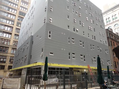
EDIT: #2 most-optimal viewpoint, and right by the so-new-it's-still-shiny Mitchell & Ness flagship store. Note construction site debris. Also note interaction its closest major neighbor has with the street, and the alley. Note, again, the shading of the paneling system used.
This building is effectively indistinguishable from the PSFS Building's backside at almost every viewing angle, and if you weren't clued in that it was there, you'd easily miss a shortcut from here to 1234 Market.


 Prev
Prev


 Linear Mode
