Quote:
Originally Posted by manny_santos

The London Knights had a God-awful logo in the mid-late 90s. I believe it was nicknamed Spider-Knight:

Sportslogos.net |
Hockey logos kind of went off the rails in the 90s and 00s. Almost every new design from about 1995-2005 looks like absolute crap.
Quote:
Originally Posted by vid
|
I love the Canadian Airlines goose. It was nice just on its own, but the fact that it was an homage to some of Canadian Pacific's earlier liveries just made it. It's too bad it was so short lived as it was adopted a short while before Air Canada took them over.
Further on the railway noodles, it's interesting to note that CN adapted its noodle to its Grand Trunk and Central Vermont subsidiaries.
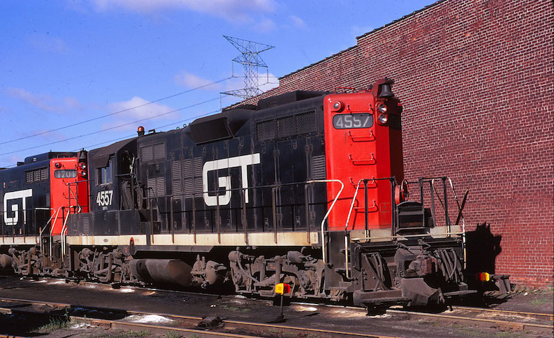
In its later years right before it was shut down, CN also had a distinctive logo for its Newfoundland operations. It wasn't a noodle as such but it kind of complemented the CN noodle:

Quote:
Originally Posted by MolsonExport
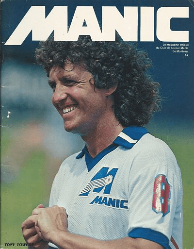
How's this for a so insanely "80's" logo:

wikipedia |
That is such a weird team name... the "Manic". I know it supposedly references the Manicouagan River, but that seems like more of a weak attempt at rationalizing it... why would a team in Montreal name itself after a river up near Baie-Comeau?


 Prev
Prev


 Linear Mode
