Quote:
Originally Posted by sigmius

I do agree with kpexpress concerning the color of tower 1, its mundane, not a fan at all. I thought the color was supposed to be neutral like an antique white
|
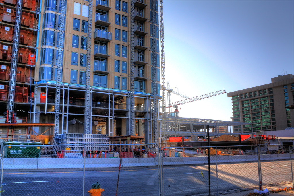
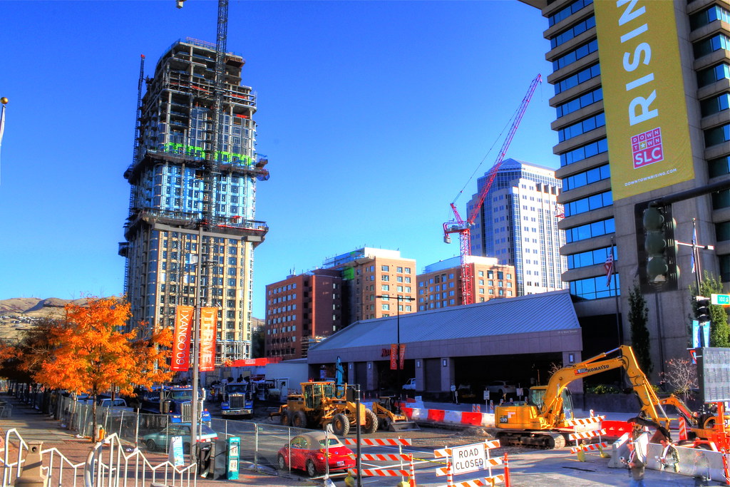
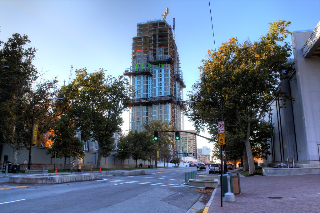
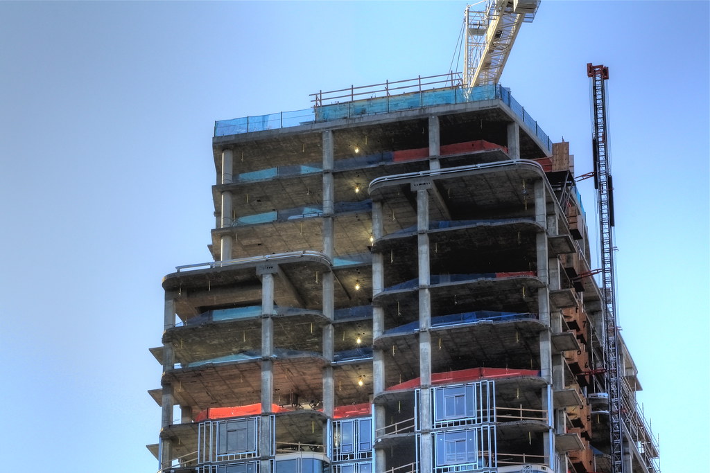
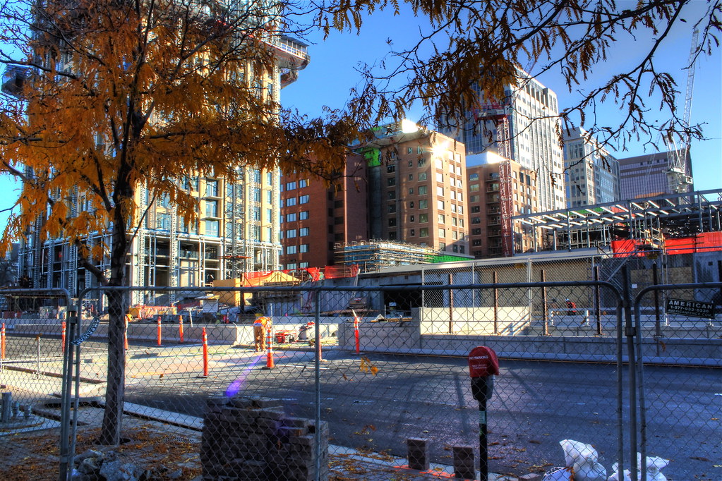
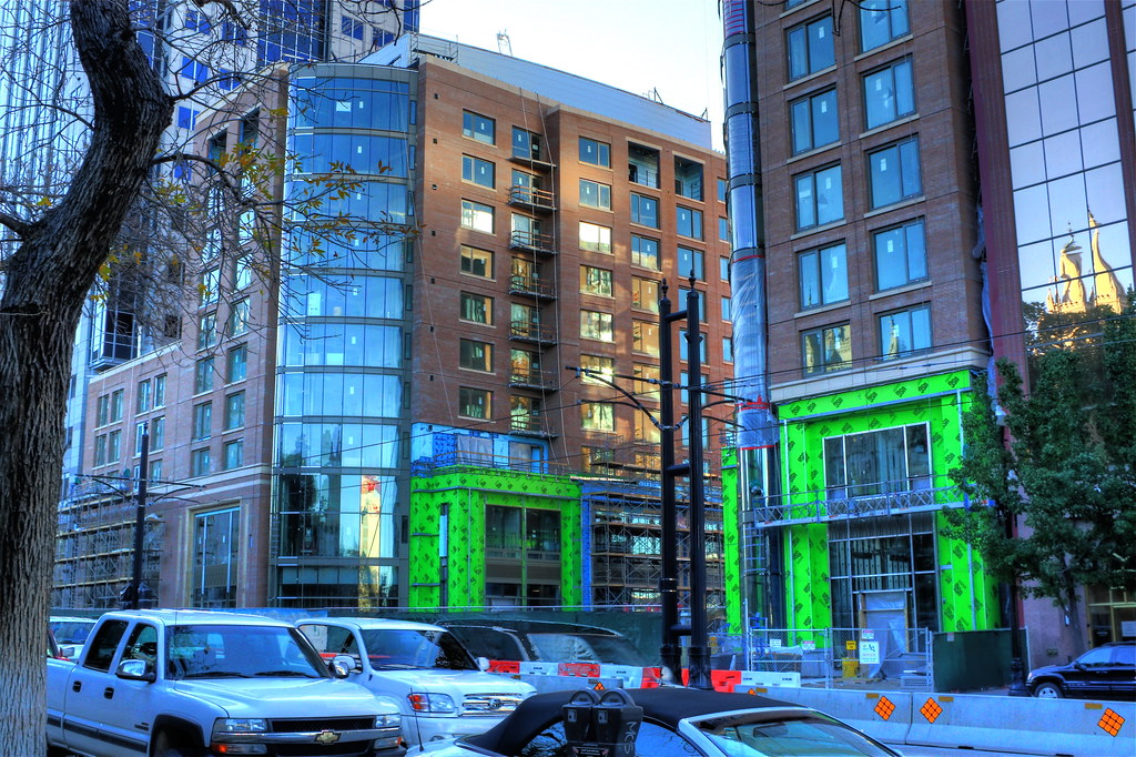
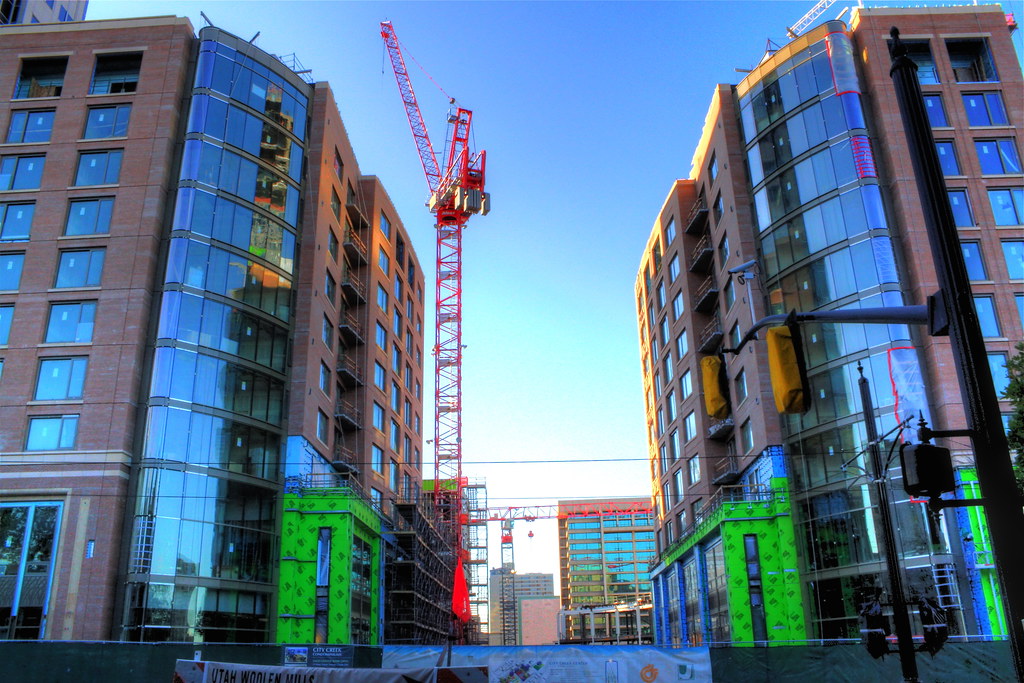
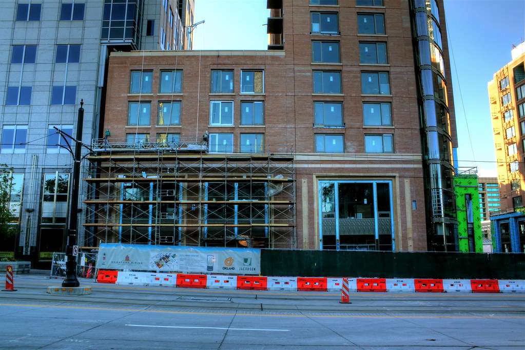
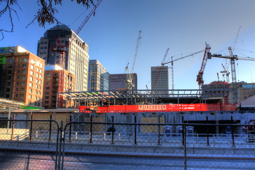
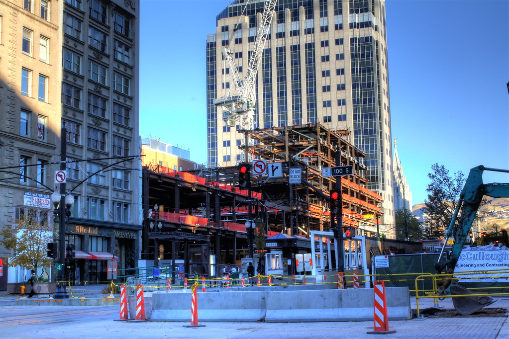
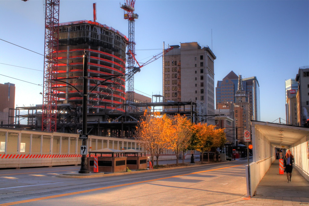
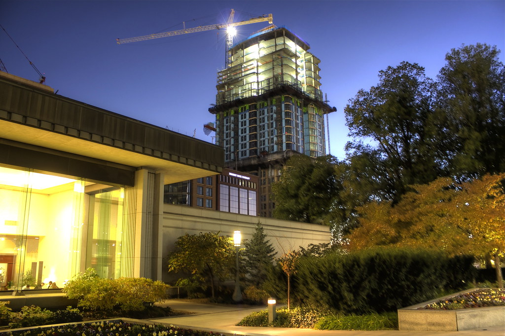
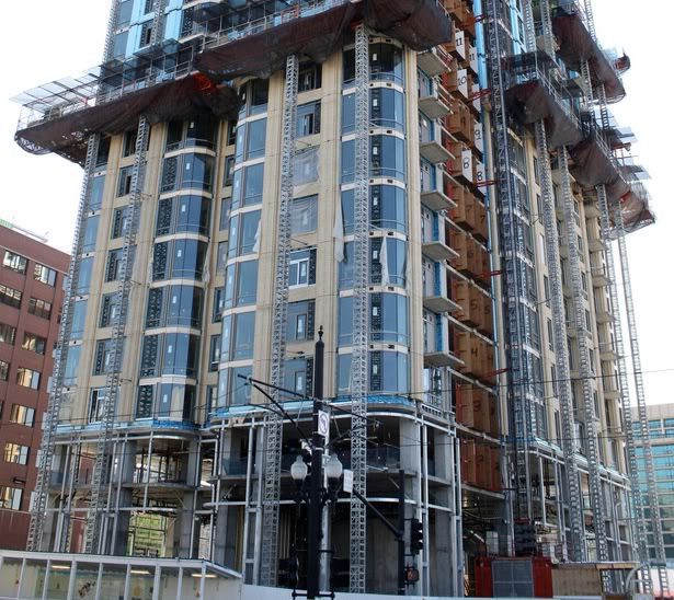
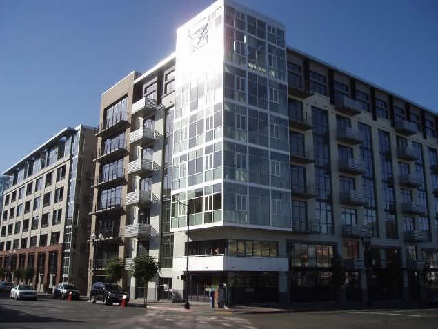
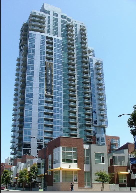
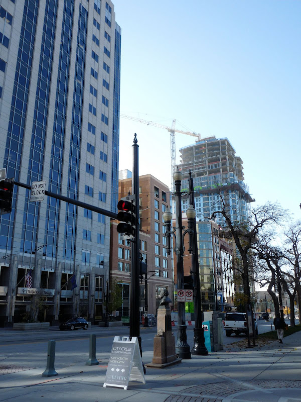
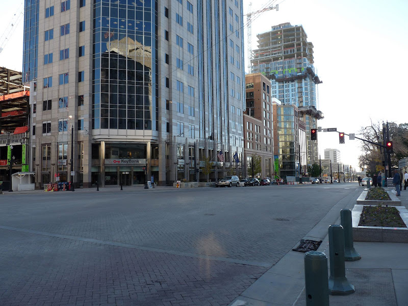
I've noticed in many of the pics, the color appears yellowish, which in reality is not the case. I think part of the problem is that the photography is often with an HDR effect, which is affecting what you would see in reality. Often the time of day or the sunlight etc. will also affect the way the color appears in both the photo, vs. the actual real life appearance. Anyway, it's certainly not orange or yellow. The actual color is a cream, which some really like and others don't. I certainly prefer the expensive brick to stucco. I don't care what the color in Calif. pics above, if it's a stucco like glaze, it's not that attractive to the naked eye.
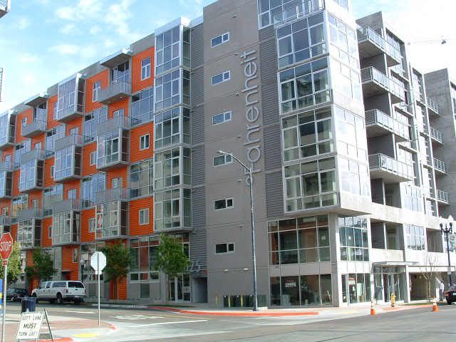
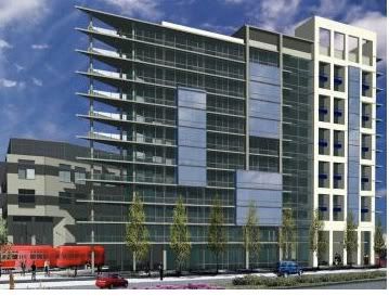
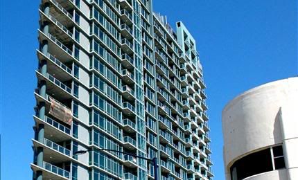
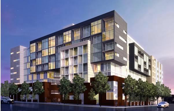
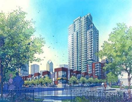
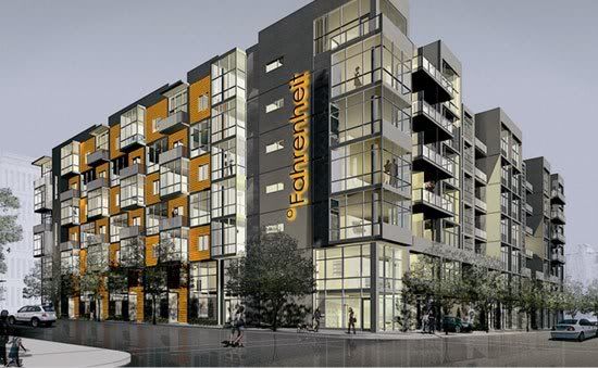
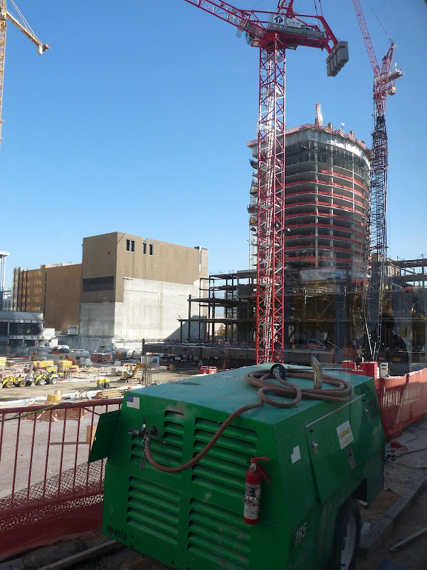
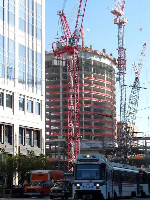
On some (not all) of the pics posted of So Cal. buildings above, either certain materials look very cheap, or the design treatment,(such as the last pic) is very mundane and boring. I think the CCC & Tower 1 is a big improvement in its use of material over what I'm seeing in some of those pics above. This is especially true, when one is going for a very upscale look as is the case with CCC. IMO, CCC is going to emerge as far more upscale in it's material use and subsequent apperarance than much of what is shown above. Also, those are hand laid, full brick, on Tower 1. There's nothing cheap or veneer about them. A fact, which is very obvious when seeing the building in person.
One thing is definately for sure. IMO, CCC will be a huge improvement in appearance and quality over something such as Horton Plaza. Thank goodness, downtown SLC will not have to endure something of that nature.


 Prev
Prev


 Linear Mode
