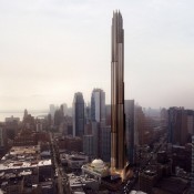
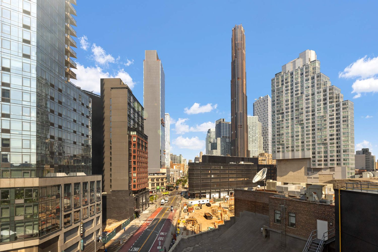
Agree this is a stunning tower, but have a few nitpicky critiques that bother me (ever-so-slightly), that in my opinion would really bring this from a 10 to an 11.
1. I wish the fins at each setback were twice as tall. This would accentuate the setbacks a bit more without making them wider, which is clearly a constraint of the footprint of the site.
2. Increase the height of the fins on the crown by 50-75% of current height from the parapet. This would accentuate that feature a bit more and make it more visible from further away. I feel like that is such an important feature of the tower's design that gets a bit lost.
3. One side of the tower is lacking some of the thicker copper mullions for about 70% of the tower's height, which causes a bit of color imbalance. I realize the thickness and color of the mullions is supposed to vary on different sides, but this imbalance throws off the overall composition from some angles, especially that last one. Now, that may very well be a factor of how the light is playing within the photo, and may not be like that in real life, so need to see this all cleaned up and in person to fully judge.
Either way, can't wait to see this all cleaned up and in person some day.
__________________
"Then each time Fleetwood would be not so much overcome by remorse as bedazzled at having been shown the secret backlands of wealth, and how sooner or later it depended on some act of murder, seldom limited to once."
Against the Day, Thomas Pynchon
|


 Prev
Prev


 Linear Mode
