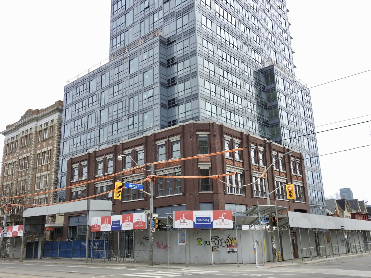
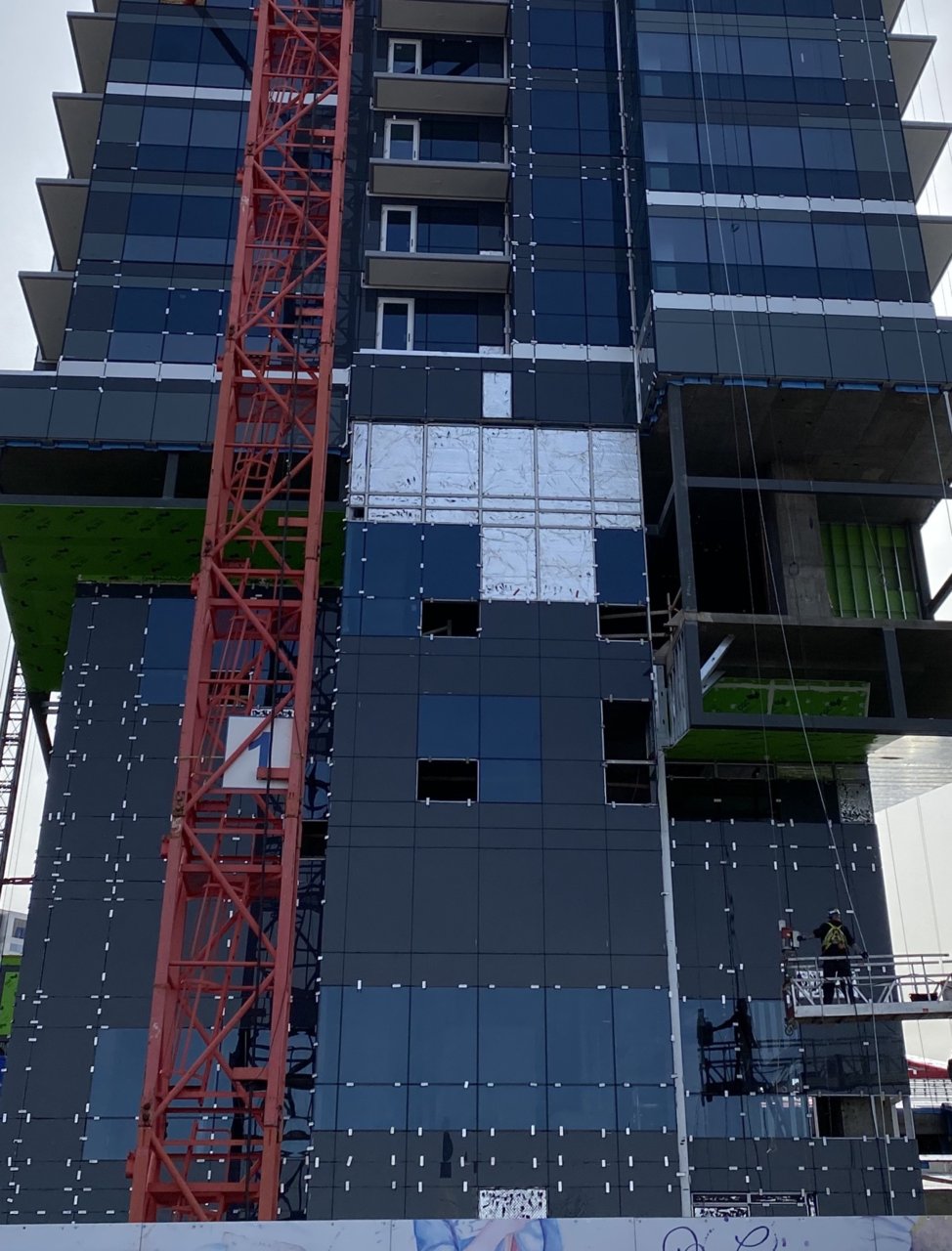
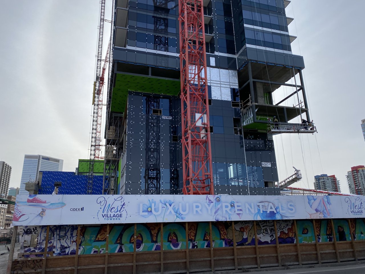
The discription by the design team on that one makes my eyes roll.
"the project team behind Shiu Pong's Design Haus came up with a new tower base designed to match the general character and materiality of the old buildings, without being required to precisely replicate what existed before."
Where does it match anything? It should have been half the height, 9 not 18 floors. Also brick or even pre-cast would have looked nice. That grey spandrel is horrible. Also is it two tone or is that just the sun setting and a shadow being cast on it by the hideous U of T res building?
source: urbantoronto.ca
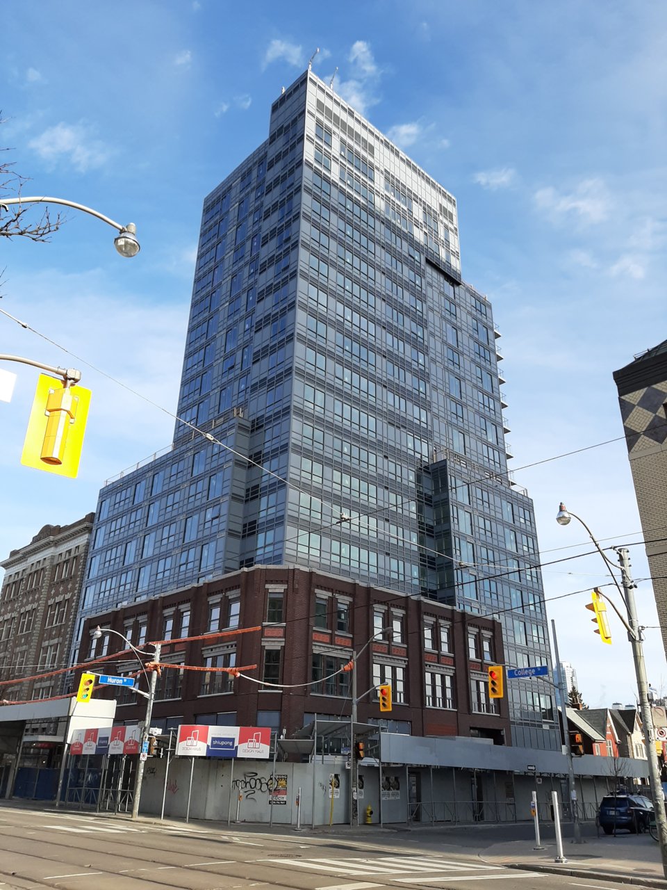
It makes this ugly beast look nice(ish).
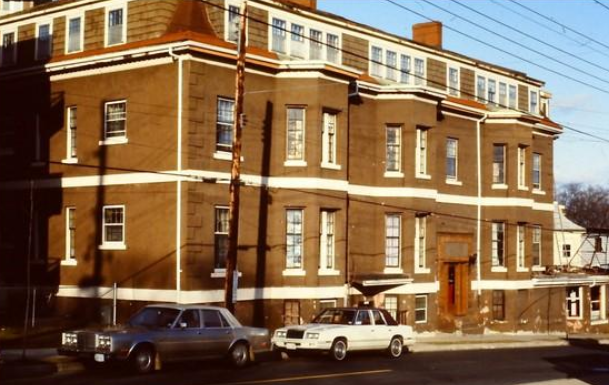
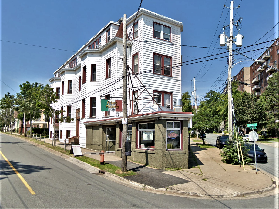
https://www.google.com/maps/@43.6723...7i16384!8i8192


 Prev
Prev


 Linear Mode
