HomeDiagramsDatabaseMapsForum About
     

Go Back   SkyscraperPage Forum > Regional Sections > Canada


Reply

 
Thread Tools Display Modes
     
     
  #661  
Old Posted Dec 2, 2020, 5:51 PM
wave46 wave46 is offline
Closed account
 
Join Date: Aug 2016
Posts: 3,875
Quote:
Originally Posted by ChildishGavino View Post
Heh, you just know if this government chose a new flag it'd be a big bright tory blue
So, something like this:


Except with a strikethrough of "Country of Scotland" and Manitoba written crudely underneath.
Reply With Quote
     
     
  #662  
Old Posted Dec 2, 2020, 6:08 PM
MolsonExport's Avatar
MolsonExport MolsonExport is offline
The Vomit Bag.
 
Join Date: Oct 2003
Location: Otisburgh
Posts: 44,848
Quote:
Originally Posted by jamincan View Post
Giant Tiger seems to be the only national discount department store left in Canada aside from Walmart.
Maybe we could use the Giant Tiger logo for a new Ontario Flag.

I think GTs are more common up in Northern Ontario than trilliums are.

logolynx

But really, if Ontario was to have a corporate logo flag, it would have to be Ri Whoreton's.


cbc
__________________
"If you can convince the lowest white man he's better than the best colored man, he won't notice you're picking his pocket. Hell, give him somebody to look down on, and he'll empty his pockets for you."-President Lyndon B. Johnson Donald Trump is a poor man's idea of a rich man, a weak man's idea of a strong man, and a stupid man's idea of a smart man. Am I an Asseau?
Reply With Quote
     
     
  #663  
Old Posted Jan 14, 2021, 6:49 PM
JHikka's Avatar
JHikka JHikka is offline
ハルウララ
 
Join Date: Jul 2009
Location: Toronto
Posts: 12,853
Reply With Quote
     
     
  #664  
Old Posted Jan 14, 2021, 6:52 PM
YOWflier's Avatar
YOWflier YOWflier is offline
Melissa: fabulous.
 
Join Date: Apr 2005
Location: YOW/CYOW/CUUP
Posts: 2,987
Not that I really care (not invested as a fan or anything), but I think the old Impact logo is about a bajillion times better than the new one.

Speaking of sports logos, the Senators have (finally) reverted back to the 2D centurion. About time.

Reply With Quote
     
     
  #665  
Old Posted Jan 14, 2021, 7:40 PM
J.OT13's Avatar
J.OT13 J.OT13 is offline
Moderator
 
Join Date: Mar 2012
Location: Ottawa
Posts: 23,983
I agree on the Impact, not just the logo but the name. Doesn't look like a sports logo, but a festival or event. Makes sense I guess because it seems to be based on Expo 67 (great logo for the time and event, not for a modern sports team).


https://en.wikipedia.org/wiki/Expo_67

Very happy the Sens went back to their (slightly modified) late 90s, early 2000s logo. Should have been done years ago.
Reply With Quote
     
     
  #666  
Old Posted Jan 14, 2021, 7:59 PM
megadude megadude is offline
Registered User
 
Join Date: Sep 2017
Location: N. York/Bram/Mark/Sauga/Burl/Oak/DT
Posts: 3,052
I agree that the Impact logo needed a little updating, but far would have preferred if they kept some core components of it.

Agree that new logo looks like it's for a festival.

And won't the fleur de lis going from the most prominent part of the logo to a tiny detail piss off some people?

I actually think they are going backwards. I would expect declining interest in the club to be further precipitated by this logo change. The name change I can't comment on.

Last edited by megadude; Jan 14, 2021 at 8:38 PM.
Reply With Quote
     
     
  #667  
Old Posted Jan 14, 2021, 7:59 PM
Acajack's Avatar
Acajack Acajack is offline
Unapologetic Occidental
 
Join Date: Aug 2006
Location: Province 2, Canadian Empire
Posts: 68,053
Quote:
Originally Posted by JHikka View Post
The art of trading an 8 for a 5.

The old logo is so much nicer. The new one seems suitable for a beer bottle cap.

Is it me or did they switch around the initially proposed FC for CF? Probably in response to the mini brouhaha over language.

Change for the sake of change... oh well.
__________________
The Last Word.
Reply With Quote
     
     
  #668  
Old Posted Jan 14, 2021, 8:22 PM
megadude megadude is offline
Registered User
 
Join Date: Sep 2017
Location: N. York/Bram/Mark/Sauga/Burl/Oak/DT
Posts: 3,052
They also used the most plain font possible. I think it would have been slightly more palatable to use a font with just the slightest bit of uniqueness to it. Regardless, I am predicting this logo gets changed and they never play a game in it. I can totally see a fan backlash.

I have large jersey collection spanning many sports. Soccer is number one. Probably over 50. Part of a jersey's appeal is the logo. The sponsor's logo is another thing, but can't really do anything about that. You do have a choice with the club logo. This logo makes a jersey worse compared to the old one. This "bottlecap" as Acajack puts it would be very uninspiring to have on my chest. And as a fan or player, seeing it around the stadium and the practice field and the dressing room would be kind of demotivating because it could easily pass as a logo for a city department like you might see on the door of a city vehicle for like a parks and rec. dept.

I think this new logo falls in the bottom 3 of the league. Beaten to the bottom by only San Jose Earthquakes and NY Red Bulls. Possibly ahead of Houston.


https://www.pinterest.ca/pin/228065168617668593/

Last edited by megadude; Jan 14, 2021 at 8:37 PM.
Reply With Quote
     
     
  #669  
Old Posted Jan 14, 2021, 10:15 PM
esquire's Avatar
esquire esquire is offline
Registered User
 
Join Date: Oct 2001
Posts: 37,483
I don't mind the new logo, but I still don't get why they'd scrap their name (and by extension their identity) if there wasn't some compelling reason to do so. I would think there is real value in a longstanding name/identity.
Reply With Quote
     
     
  #670  
Old Posted Jan 14, 2021, 10:19 PM
JHikka's Avatar
JHikka JHikka is offline
ハルウララ
 
Join Date: Jul 2009
Location: Toronto
Posts: 12,853
Quote:
Originally Posted by esquire View Post
I don't mind the new logo, but I still don't get why they'd scrap their name (and by extension their identity) if there wasn't some compelling reason to do so. I would think there is real value in a longstanding name/identity.
They're trying to attract more and better international talent. Word is they felt the Impact branding was holding them back from that.

Quote:
Originally Posted by megadude
I think this new logo falls in the bottom 3 of the league. Beaten to the bottom by only San Jose Earthquakes and NY Red Bulls. Possibly ahead of Houston.
Houston updated their crest recently.

Reply With Quote
     
     
  #671  
Old Posted Jan 14, 2021, 10:49 PM
Acajack's Avatar
Acajack Acajack is offline
Unapologetic Occidental
 
Join Date: Aug 2006
Location: Province 2, Canadian Empire
Posts: 68,053
Quote:
Originally Posted by esquire View Post
I don't mind the new logo, but I still don't get why they'd scrap their name (and by extension their identity) if there wasn't some compelling reason to do so. I would think there is real value in a longstanding name/identity.
I partly agree about the name. It at least had some history behind it, although it's also rather meaningless in the context of Montreal. What does "Impact" have to do with Montreal?

So ultimately I guess we're swapping a meaningless buzzword name with some history with a meaningless buzzword name with no history.

Not a big deal I suppose.
__________________
The Last Word.
Reply With Quote
     
     
  #672  
Old Posted Jan 14, 2021, 10:54 PM
esquire's Avatar
esquire esquire is offline
Registered User
 
Join Date: Oct 2001
Posts: 37,483
Quote:
Originally Posted by JHikka View Post
They're trying to attract more and better international talent. Word is they felt the Impact branding was holding them back from that.
Unless you have a catastrophically bad brand/logo/team name, like something patently offensive such as a racial slur, I have a hard time understanding how branding could be a turn-off to potential players.
Reply With Quote
     
     
  #673  
Old Posted Jan 15, 2021, 12:10 AM
megadude megadude is offline
Registered User
 
Join Date: Sep 2017
Location: N. York/Bram/Mark/Sauga/Burl/Oak/DT
Posts: 3,052
That Houston logo ain't the greatest but I could totally live with that and it's way better than what was there before. A few years ago in a soccer forum I discussed the use of a 80s soccer ball in a team or federation logo and gave some examples and people all agreed. Total no-no. Nothing makes a logo look cheap and amateur like a literal representation of the playing object, be it a soccer ball, basketball, baseball, whatever. It has to be like a stylized but classy or cool version of it. And those logos were using 80s soccer balls! So that's why I see Dynamo and Quakes as brutal.

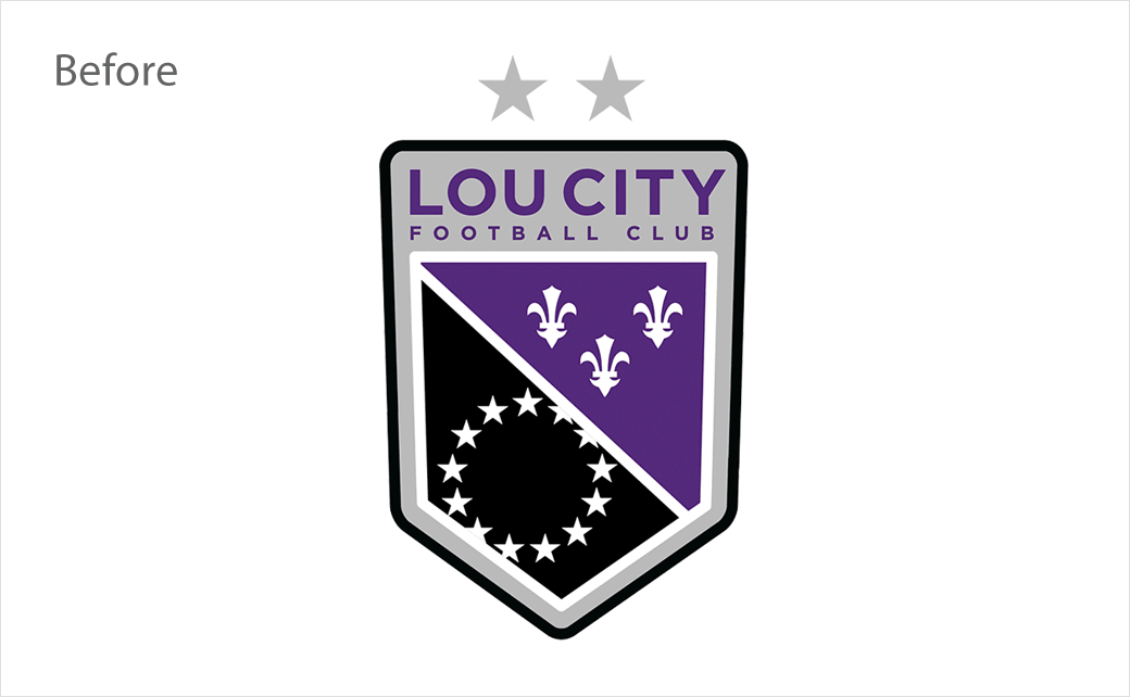
Here is what Louisville of USL did. Took all of three days before fan outcry made them change course. And they already start making merchandise.

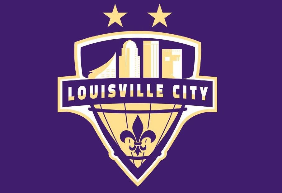
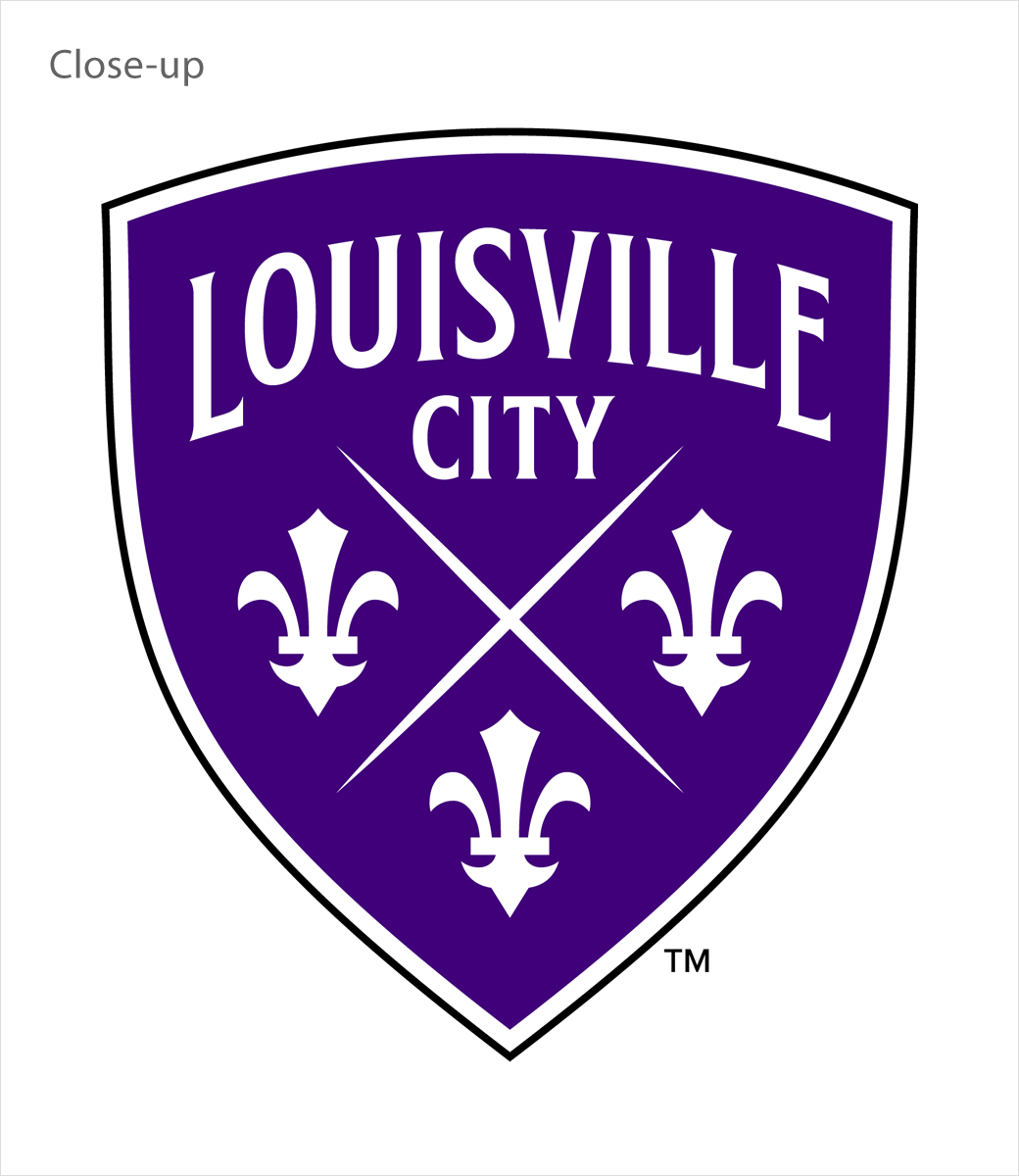
The middle was the rebrand, logo and name. Not bad in all honesty, but it could have been better. The last is the end result after getting back to the drawing board and that is better and what fans would have wanted. Pure class as far as I'm concerned.

And the fleur de lis is such a gorgeous symbol so I really don't understand why Montreal would diminish that. It is the Saints' logo. It's prominent on Louisville's logo and Montreal's former logo. It looked awesome on the Nordiques jersey on the bottom, at the time, and on the shoulders, which is where you'd keep it now.


https://www.wdrb.com/news/loucity-fc...b91ce41a9.html


http://www.logo-designer.co/louisvil...designed-logo/


http://www.logo-designer.co/louisvil...designed-logo/
Reply With Quote
     
     
  #674  
Old Posted Jan 15, 2021, 12:15 AM
JHikka's Avatar
JHikka JHikka is offline
ハルウララ
 
Join Date: Jul 2009
Location: Toronto
Posts: 12,853
Quote:
Originally Posted by esquire View Post
Unless you have a catastrophically bad brand/logo/team name, like something patently offensive such as a racial slur, I have a hard time understanding how branding could be a turn-off to potential players.
From the club's creative co-director:

Quote:
So our desire was more, ‘Do we have a platform that we feel comfortable going forward with globally and does the name we have now fulfill the ambitions of where we want to go?’ The truth is we haven’t abandoned (the Impact name). We’re not going to, it’s not going to be a word you’re not allowed to say. … It’s just that we needed to redesign and redecorate what’s on that foundation to achieve our global ambitions.
https://www.forbes.com/sites/ianquil...h=23d26ce62b3d

Some other fun quotes in there but that's the jist of it.
Reply With Quote
     
     
  #675  
Old Posted Jan 15, 2021, 12:23 AM
megadude megadude is offline
Registered User
 
Join Date: Sep 2017
Location: N. York/Bram/Mark/Sauga/Burl/Oak/DT
Posts: 3,052
I do agree that dropping the Impact name so the club sounds more European does give a slightly more serious and professional vibe to the team if you're coming from Europe or SA. It's what those players are used to.

The "impact" of that might only be marginal but I do think it helps at least slightly. But the "Club de Foot" thing I think may actually negate any gains from what I just described.

Anyway, if I'm a betting man, I say the logo gets changed. If not now, during the next offseason. Might actually be less than a 50% chance of it happening but my gut says it's going to happen.
Reply With Quote
     
     
  #676  
Old Posted Jan 15, 2021, 1:32 AM
Acajack's Avatar
Acajack Acajack is offline
Unapologetic Occidental
 
Join Date: Aug 2006
Location: Province 2, Canadian Empire
Posts: 68,053
Quote:
Originally Posted by JHikka View Post
From the club's creative co-director:


https://www.forbes.com/sites/ianquil...h=23d26ce62b3d

Some other fun quotes in there but that's the jist of it.
It's 50% barf-inducing and 50% engaging.
__________________
The Last Word.
Reply With Quote
     
     
  #677  
Old Posted Jan 15, 2021, 1:40 PM
J.OT13's Avatar
J.OT13 J.OT13 is offline
Moderator
 
Join Date: Mar 2012
Location: Ottawa
Posts: 23,983
I don't understand how renaming a team "Football Club/Club de Foot" will attract more European talent. You're just removing any identity. It's just a generic name. Nothing to distinguish it from any other. Now we just have a bunch of soccer teams named football club and football teams named football team.

What if all the NHL hockey teams were all named Hockey Club?
Reply With Quote
     
     
  #678  
Old Posted Jan 15, 2021, 1:56 PM
Acajack's Avatar
Acajack Acajack is offline
Unapologetic Occidental
 
Join Date: Aug 2006
Location: Province 2, Canadian Empire
Posts: 68,053
Quote:
Originally Posted by J.OT13 View Post
I don't understand how renaming a team "Football Club/Club de Foot" will attract more European talent. You're just removing any identity. It's just a generic name. Nothing to distinguish it from any other. Now we just have a bunch of soccer teams named football club and football teams named football team.

What if all the NHL hockey teams were all named Hockey Club?
The argument is that in the absence of a team nickname, the city itself becomes the brand.
__________________
The Last Word.
Reply With Quote
     
     
  #679  
Old Posted Jan 15, 2021, 3:38 PM
MolsonExport's Avatar
MolsonExport MolsonExport is offline
The Vomit Bag.
 
Join Date: Oct 2003
Location: Otisburgh
Posts: 44,848
Quote:
Originally Posted by JHikka View Post
/fail

Does Montreal now have a clubfoot?
__________________
"If you can convince the lowest white man he's better than the best colored man, he won't notice you're picking his pocket. Hell, give him somebody to look down on, and he'll empty his pockets for you."-President Lyndon B. Johnson Donald Trump is a poor man's idea of a rich man, a weak man's idea of a strong man, and a stupid man's idea of a smart man. Am I an Asseau?

Last edited by MolsonExport; Jan 15, 2021 at 3:54 PM.
Reply With Quote
     
     
  #680  
Old Posted Jan 15, 2021, 3:58 PM
JHikka's Avatar
JHikka JHikka is offline
ハルウララ
 
Join Date: Jul 2009
Location: Toronto
Posts: 12,853
Quote:
Originally Posted by J.OT13 View Post
I don't understand how renaming a team "Football Club/Club de Foot" will attract more European talent. You're just removing any identity. It's just a generic name. Nothing to distinguish it from any other. Now we just have a bunch of soccer teams named football club and football teams named football team.
This is how things play out in Europe. All club names are just where they're located without much differentiation. American-styled, Mickey Mouse nicknames don't hold a lot of water in the rest of the world (think of how Young Boys or Grasshoppers are ridiculed). Nobody really cares if teams are just called Chelsea FC or FC Barcelona or whatever and the only people that seem to care about this are North Americans. Let fans create nicknames for the teams rather than having corporate shove one down our throats.

Quote:
Originally Posted by J.OT13 View Post
What if all the NHL hockey teams were all named Hockey Club?
Nobody would care as long as they were winning.
Reply With Quote
     
     
This discussion thread continues

Use the page links to the lower-right to go to the next page for additional posts
 
 
Reply

Go Back   SkyscraperPage Forum > Regional Sections > Canada
Forum Jump


Thread Tools
Display Modes

Forum Jump


All times are GMT. The time now is 9:07 AM.

     
SkyscraperPage.com - Archive - Privacy Statement - Top

Powered by vBulletin® Version 3.8.7
Copyright ©2000 - 2024, vBulletin Solutions, Inc.