Quote:
Originally Posted by CoryB

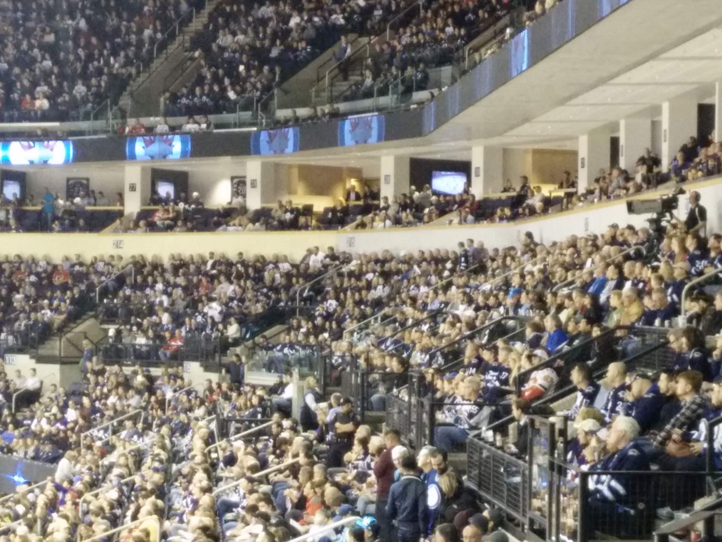
It would have looked much better if they went with a slate grey. The Bombers did a similar overall at IGF but went with a dark blue similar to their old uniform colour and the walls are much less noticeable now.
|
Agreed. Definitely looks better than beige, but they just took the panelling off — darker would make a big difference. I also think maybe next year they should put stainless steel flashing over the front of the suite ledge as now that wood edge really stands out (in a bad way) compared to the new colours, and metal trim on the railings. Glass and blue section numbers look great though.
IGF does
look better navy than gold, but it kinda drives me nuts: All of the decoration in the bowl area is now navy, but navy is no longer one of the team colours. Looks kinda weird with the blue on the field and jerseys being completely different. And at CanadInns it was opposite, royal blue and yellow everywhere (field, seats, walls) and a team that wore navy and gold. Like why can't we ever get this right?


 Prev
Prev


 Linear Mode
