CHICAGO: ORD & MDW discussion


Boeing-777-300ER-v2-916x516.jpg


Good news! Emirates is increasing it's ORD-DXB service frequency to 7x week (1x daily) in June! It originally wasn't supposed to increase to 7x week (1x daily) until November, so that could be a sign that international travel from ORD is starting to rebound!

I'm kinda surprised though that they are increasing frequency but not bringing the A380 to ORD this summer, whereas for places like Washington and San Francisco, they are bringing the A380 back there this summer but will continue to only have 4x a week frequencies for those two cities.

I really want Emirates to bring the A380 to ORD. I only say that though as I think I will be in Dubai towards the end of the year for a bit before coming back here for the holidays and want to get an A380 run in before the thing is no longer being produced.
 
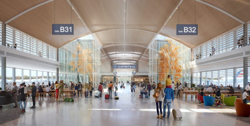
The roof of the ORD21 main terminal design is changing. For better or worse, it won't be the serrated glass segments that were shown on the competition design. The cost was way too high to have that throughout the main terminal...mind you, NOT material cost/construction cost, rather cost of engineering such a massive space that would require moving a lot of conditioned air in the summer due to solar heat gain and heating the space in the winter time with so much glass everywhere. I don't know the exact amount, but what I've heard from others in my office is that it was almost double what was budgeted. The new roof is more monolithic, which would look similar to the terminal five expansion. However on the plus side, there are numerous openings throughout, randomized to look like a starfield at night (from above). The openings provide light into the terminal, and the large, six-pointed 'Chicago' star in the middle is still included/integral to the design. The interior terminal design has been refined and I think looks very sleek, contemporary and bold, especially the structural column and trusses.

In a way, I think this type of design refinement somewhat proves that the Calatrava and Foster designs were untenable from the beginning, because they would both been even more cost prohibitive and would have been altered significantly during project design development, possibly leading to a bigger fiasco over cost overruns and extreme design dilution. The StudioORG/Gang terminal layout is maintained, it's really just the roof that has been altered. I don't know if this is the final design, it may change again, who knows?
 
The roof of the ORD21 main terminal design is changing. For better or worse, it won't be the serrated glass segments that were shown on the competition design. The cost was way too high to have that throughout the main terminal...mind you, NOT material cost/construction cost, rather cost of engineering such a massive space that would require moving a lot of conditioned air in the summer due to solar heat gain and heating the space in the winter time with so much glass everywhere. I don't know the exact amount, but what I've heard from others in my office is that it was almost double what was budgeted. The new roof is more monolithic, which would look similar to the terminal five expansion. However on the plus side, there are numerous openings throughout, randomized to look like a starfield at night (from above). The openings provide light into the terminal, and the large, six-pointed 'Chicago' star in the middle is still included/integral to the design. The interior terminal design has been refined and I think looks very sleek, contemporary and bold, especially the structural column and trusses.

In a way, I think this type of design refinement somewhat proves that the Calatrava and Foster designs were untenable from the beginning, because they would both been even more cost prohibitive and would have been altered significantly during project design development, possibly leading to a bigger fiasco over cost overruns and extreme design dilution. The StudioORG/Gang terminal layout is maintained, it's really just the roof that has been altered. I don't know if this is the final design, it may change again, who knows?

Honestly, I would be fine with them just building the Skidmore Owings and Merrill design. Sure it's the most boring out of the bunch, but it's functional, looks nice, and would be by far the least expensive to build.

Here are some pictures of the SOM design incase anyone forgot what it looks like:
ohare-t2-680x510_som_01.jpg


4juozuue59h3yt5x.jpg


SOM-reveals-design-for-New-O-Hare-Global-Terminal-in-Chicago-10.jpg


SOM-reveals-design-for-New-O-Hare-Global-Terminal-in-Chicago-05.jpg


ohare-airport-satellite-concourse-som-architecture-news-chicago-illinois-usa_dezeen_2364_col_0-852x428.jpg


51063125537_199f731d7f_c.jpg
 
SOM is involved, they are designing the two satellite extensions to terminal 1.

I know. I was saying that I would be fine if they go for SOM's design for the main terminal in addition to the satellite concourses. It would save them a lot of money and would be a functional design that works better.
 
I know. I was saying that I would be fine if they go for SOM's design for the main terminal in addition to the satellite concourses. It would save them a lot of money and would be a functional design that works better.

SOM was the runner-up, so I’m sure the judges took all that into consideration.

But ultimately, having an integrated concourse and terminal is not small potatoes and probably tilted the contest in Gang’s favor. It’s a major operational feature.

I was not expecting high energy bills to be a deal breaker at this point in the process, considering 4 of the 5 proposals were gung-ho about energy-guzzling large open spaces with lofty glass ceilings and skylights.

But I suppose it was good planning from the Gang team not to make that particular roof integral to the fundamental design if an issue like this came up.
 
The roof of the ORD21 main terminal design is changing. For better or worse, it won't be the serrated glass segments that were shown on the competition design. The cost was way too high to have that throughout the main terminal...mind you, NOT material cost/construction cost, rather cost of engineering such a massive space that would require moving a lot of conditioned air in the summer due to solar heat gain and heating the space in the winter time with so much glass everywhere. I don't know the exact amount, but what I've heard from others in my office is that it was almost double what was budgeted. The new roof is more monolithic, which would look similar to the terminal five expansion. However on the plus side, there are numerous openings throughout, randomized to look like a starfield at night (from above). The openings provide light into the terminal, and the large, six-pointed 'Chicago' star in the middle is still included/integral to the design. The interior terminal design has been refined and I think looks very sleek, contemporary and bold, especially the structural column and trusses.

In a way, I think this type of design refinement somewhat proves that the Calatrava and Foster designs were untenable from the beginning, because they would both been even more cost prohibitive and would have been altered significantly during project design development, possibly leading to a bigger fiasco over cost overruns and extreme design dilution. The StudioORG/Gang terminal layout is maintained, it's really just the roof that has been altered. I don't know if this is the final design, it may change again, who knows?

Makes me wonder how so many of the new Asian/Europe glass-sheathed terminals get around that issue. Or temperature regulation be damned do they just pay the enormous energy bills for the sake of design/light.

Excited to see the changes of the interior designs though.
 
Makes me wonder how so many of the new Asian/Europe glass-sheathed terminals get around that issue. Or temperature regulation be damned do they just pay the enormous energy bills for the sake of design/light.

Excited to see the changes of the interior designs though.

Much of Europe has a completely different climate than the U.S. and especially Chicago. I can imagine the temperature regulation calculations look very different for Chicago which has almost double the direct sunshine hours as London.

East Asia is also more comparable to Canada than the U.S. in that respect.

Energy bills might legitimately not be a huge issue for airport architecture in Europe and Asia.

Oh well. Those sorts of environmental limits can allow for organic shifts in style if done right.

https://www.reddit.com/r/Maps/comme...urce=share&utm_medium=ios_app&utm_name=iossmf


sunshine-hours-usa-europe.png
 
Much of Europe has a completely different climate than the U.S. and especially Chicago. I can imagine the temperature regulation calculations look very different for Chicago which has almost double the direct sunshine hours as London.

East Asia is also more comparable to Canada than the U.S. in that respect.

Energy bills might legitimately not be a huge issue for airport architecture in Europe and Asia.

Oh well. Those sorts of environmental limits can allow for organic shifts in style if done right.

https://www.reddit.com/r/Maps/comme...urce=share&utm_medium=ios_app&utm_name=iossmf


sunshine-hours-usa-europe.png

That map is very strange. According to that we get the same amount of sun as NYC. The US weather service says that is not accurate, showing a chart can be made to prove either side of any argument. Not really sure how they measure sunlight in both cities but I have seen perfectly clear days at ORD in Chicago called partly cloudy.
 
That map is very strange. According to that we get the same amount of sun as NYC. The US weather service says that is not accurate, showing a chart can be made to prove either side of any argument. Not really sure how they measure sunlight in both cities but I have seen perfectly clear days at ORD in Chicago called partly cloudy.

Check the maps again and notice that the colors are not based upon the same span of hours.
Black >3500 hours
Burgundy 3000 - 3500 hours (range of 500 hours)
Red (Dark Orange) 2500 - 3000 hours (range of 500 hours)
Orange (Light Orange) 2000 -2500 hours (range of 500 hours)
Yellow 1800 - 2000 hours (range of 200 hours)
Green 1600 - 1800 hours (range of 200 hours)
Light Blue 1200-1600 hours (range of 400 hours)
Dark Blue <1200 hours
Chicago and New York City might have up to 500 hours of sunlight difference masked under the same color, which could be within the range of three different colors in a less sunny location.
Why use different ranges? Because they can and also wish to confuse everybody.
 
FWIW, wikipedia says the following regarding Chicago and NYC sunshine:

- NYC gets 57% of it's possible annual sunshine for 2,535 total sunshine hours per year.

- Chicago gets 56% of it's possible annual sunshine for 2,508 total sunshine hours per year.


A fairly negligible difference in the grand scheme of things. We're not exactly comparing Vancouver to Phoenix here
 
Last edited:
I do think it closer than that. NYC official is central park I believe and Chicago is O'hare. central park has better weather than LGA and JFK most of the time. They used to take official Chicago readings at MDW until 1980 for some reason.
 
I'll trust wikipedia's weather data any day of the week over some random, never heard of it before website called "bestplaces.net".
 
Chicago and New York City might have up to 500 hours of sunlight difference masked under the same color, which could be within the range of three different colors in a less sunny location.
Why use different ranges? Because they can and also wish to confuse everybody.

Unfortunately these sorts of maps are usually published for the European audience, so they’re more interested in depicting the slight nuances between European regions rather than a precise representation of temperature in the U.S.

But it does make the point that much of Europe has a very different experience with sunshine and temperature regulation.

https://en.m.wikipedia.org/wiki/List_of_cities_by_sunshine_duration
 
The roof of the ORD21 main terminal design is changing. For better or worse, it won't be the serrated glass segments that were shown on the competition design. The cost was way too high to have that throughout the main terminal...mind you, NOT material cost/construction cost, rather cost of engineering such a massive space that would require moving a lot of conditioned air in the summer due to solar heat gain and heating the space in the winter time with so much glass everywhere. I don't know the exact amount, but what I've heard from others in my office is that it was almost double what was budgeted. The new roof is more monolithic, which would look similar to the terminal five expansion. However on the plus side, there are numerous openings throughout, randomized to look like a starfield at night (from above). The openings provide light into the terminal, and the large, six-pointed 'Chicago' star in the middle is still included/integral to the design. The interior terminal design has been refined and I think looks very sleek, contemporary and bold, especially the structural column and trusses.

In a way, I think this type of design refinement somewhat proves that the Calatrava and Foster designs were untenable from the beginning, because they would both been even more cost prohibitive and would have been altered significantly during project design development, possibly leading to a bigger fiasco over cost overruns and extreme design dilution. The StudioORG/Gang terminal layout is maintained, it's really just the roof that has been altered. I don't know if this is the final design, it may change again, who knows?

Interesting, I guess I never realized the whole roof was an elaborate sawtooth. Reminds me of what happened to Pelli's design for the Wintrust Arena.

I hope they are keeping the wood ceilings (or faux wood, assuming real wood is out for flame spread reasons).


Back
Top