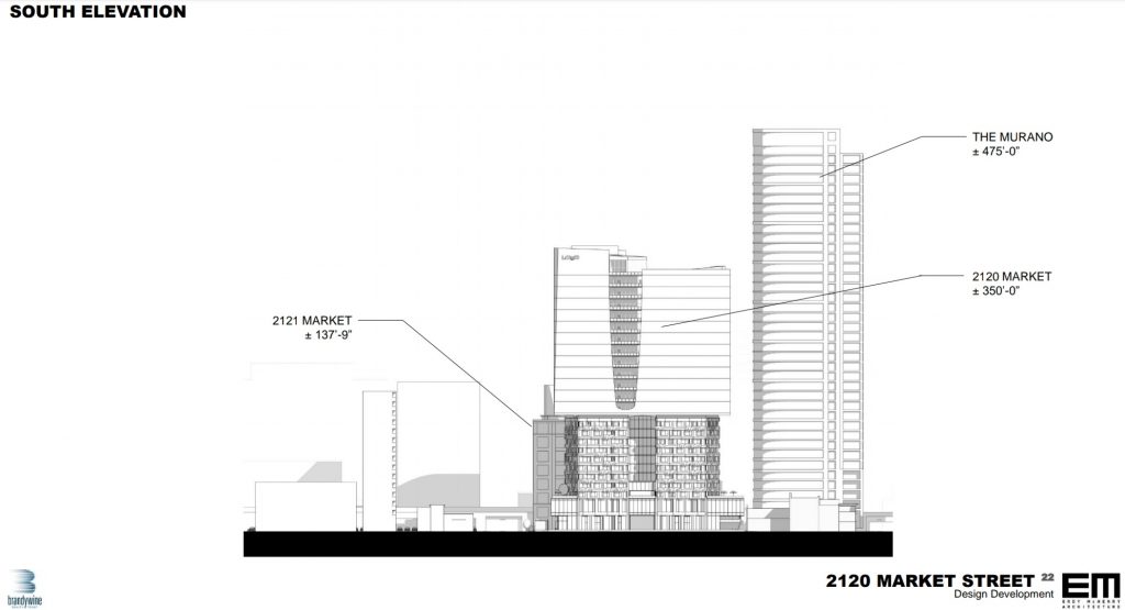
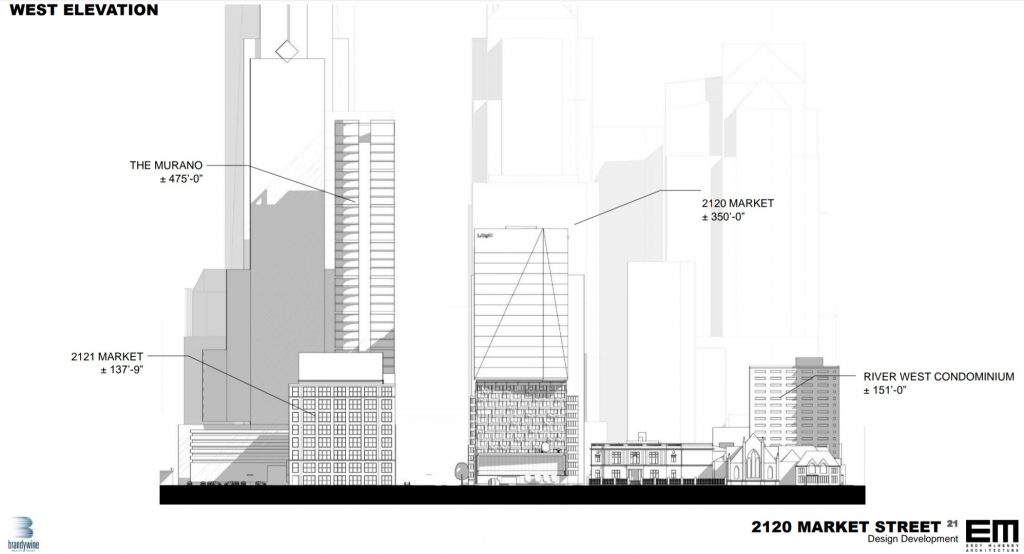
PHILADELPHIA | 21M (2120 Market) | 350 FT | 25 FLOORS


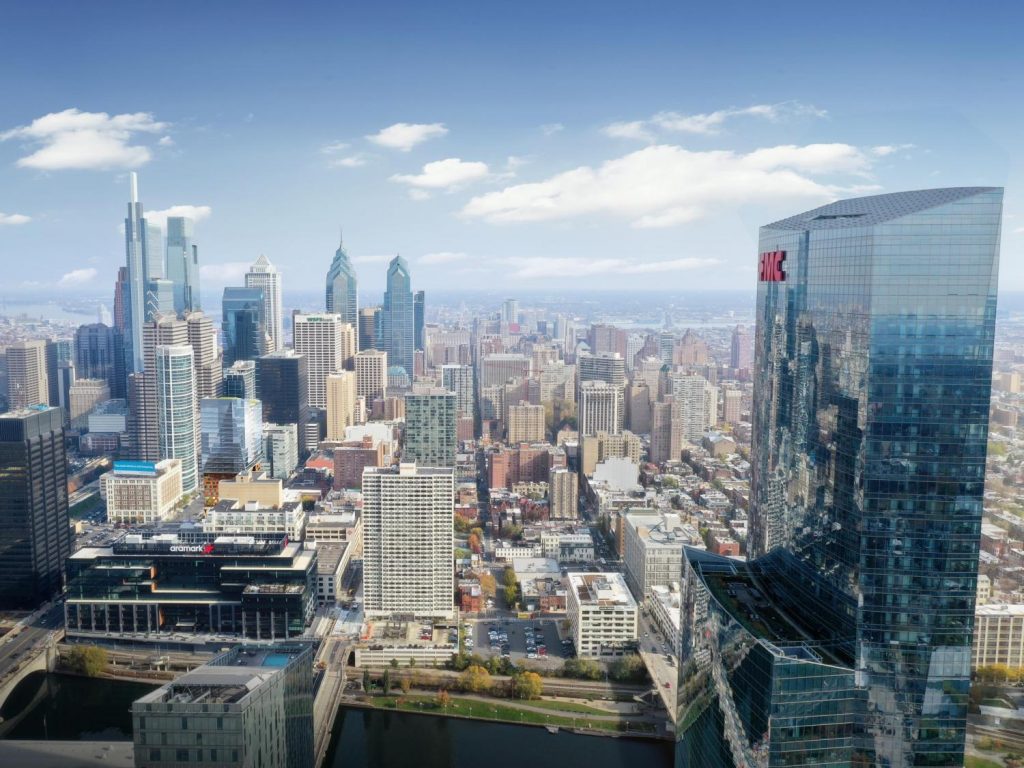
It's a party wall. That's the end of the property line. If you put windows there, you risk another building being built next door in the future, covering up the windows of the building you built.

Regardless, it's awful and there has to be a better way.
 
Regardless, it's awful and there has to be a better way.

Exactly!....at least stripe it to camouflage it a bit.

If you look at the brown pre-war high-rise in roughly center picture, They added decorative bands to the ugly/utility oriented side above the height where it could be seen above the adjacent building. I don't think it really needs it but it's somehow uplifting that the architect and the builder thought it worthy to pursue. We used to be crafts people, now we are just mercenaries.

129339015_2883968081838492_5007719228172928285_n.jpg

https://www.instagram.com/p/CIavB0eHNY0/
 
It's a party wall. That's the end of the property line. If you put windows there, you risk another building being built next door in the future, covering up the windows of the building you built.

Ah, so the neighbors could have potential overbuilds too?

This is one the few block in CC that I wish would have a no overbuild clause, its one of the few fully in tact brownstone blocks (less 2110 which was vacant land prior), and there is plenty enough room nearby to build skyscrapers.

This whole block does need some TLC though, stone repairs, power washing, etc.
 
This project is disgusting.
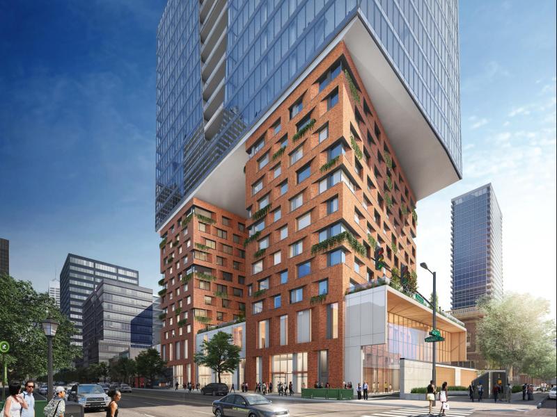
Those apartments under the overhang and center "court" will be in perpetual gloom.
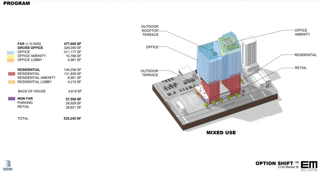
2 distinctly different buildings on top of one another.
A blind man could design a better building.

I HATE IT!
 
I guess I have to speak out as the opposition lol but I love this project. I think the area where the two halves collide needs some refining, especially the bottom and overhanging part of the upper half, but overall I find the idea more daring and interesting than anything we've seen. In a town with very conservative rectangular box contemporary architecture overall, I think this is very fun and interesting.

Re the gloom: I wouldn't like it but believe it or not some people actually like dimmer natural light (I'm not one of them but my previous roommates were). Many other buildings with courtyards have the same problem with interior apartments like the low rise broad and spring garden proposal. Many rowhomes especially those facing N/S aren't great for light either and I don't think this would be any worse
 
Last edited:
I guess I have to speak out as the opposition lol but I love this project. I think the area where the two halves collide needs some refining, especially the bottom and overhanging part of the upper half, but overall I find the idea more daring and interesting than anything we've seen. In a town with very conservative rectangular box contemporary architecture overall, I think this is very fun and interesting.

Re the gloom: I wouldn't like it but believe it or not some people actually like dimmer natural light (I'm not one of them but my previous roommates were). Many other buildings with courtyards have the same problem with interior apartments like the low rise broad and spring garden proposal. Many rowhomes especially those facing N/S aren't great for light either and I don't think this would be any worse

This is where I am at. I love this idea of this project, but this version looks so rudimentary and thrown together. If the designer refines the shapes, connectivity, color palate, etc. then this could be an A+ project.

(I wish it were 100'-200' taller though, it would help with the refinement of the massing).
 
I guess I have to speak out as the opposition lol but I love this project. I think the area where the two halves collide needs some refining, especially the bottom and overhanging part of the upper half, but overall I find the idea more daring and interesting than anything we've seen. In a town with very conservative rectangular box contemporary architecture overall, I think this is very fun and interesting.

Re the gloom: I wouldn't like it but believe it or not some people actually like dimmer natural light (I'm not one of them but my previous roommates were). Many other buildings with courtyards have the same problem with interior apartments like the low rise broad and spring garden proposal. Many rowhomes especially those facing N/S aren't great for light either and I don't think this would be any worse

I like it too, though I do think the underside of the glass portion needs to be something other than a massive white slab.
 
This design looks ridiculous! It's like they took a great design and plopped a really bland glass box on top, because that's literally what they did. They don't communicate in any way. Just make the bottom half into a 25 story tower!
 
This is where I am at. I love this idea of this project, but this version looks so rudimentary and thrown together. If the designer refines the shapes, connectivity, color palate, etc. then this could be an A+ project.

(I wish it were 100'-200' taller though, it would help with the refinement of the massing).

I think they need to make it blend together so make it kind of bow out when the two halves meet instead of the over hang, so it will look big at the hips but look much better.

Also would a design choice of two towers and then a connected top like the bridge boat 3 tower in Singapore.

It's good to do different designs with buildings tho think outside the box


Back
Top