RiverView Apartments | 138 FT | 11 FLS | 102 FT | 9 FLS | 73 FT | 5 FLS | Complete


3/30


2sM80uR.jpg


XrzclJ2.jpg


CEPFaCX.jpg

​
 
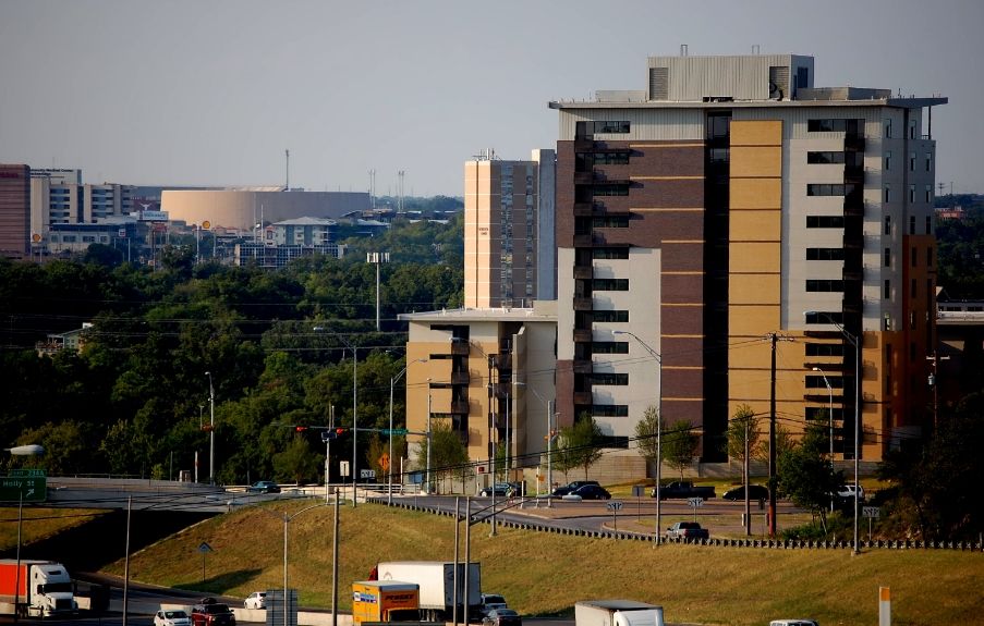
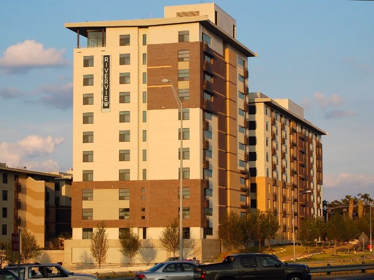
I cruised I35 from 45 in RR to Oltorf then back north so I could check out the happenings in dt today. The Riverview apartments, though a nice filler at the Riverside / 35 intersection, has a very cheap looking facade especially the lightest of the colors. And the terracotta color seems over used considering I see that exact color used a lot on refurbashing projects all over town. I'm thinking white, blue, and light green tones would look better. Skyhouse looks good so far, love the glass, the JW Marriot will have a big impact on the skyline from 35, the sheer scope of the apartment construction on the east side of 35 looks pretty cool, but the construction cranes look weird for a mostly wood constructed building. The apartments next to St David's aren't that impressive, just filler, maybe because the original plans for that area were much more exciting. The marquee in front of the Erwin Ctr looks new...is it? Last rant...the area directly east of the 800 room Hilton is an eyesore. As soon as I get another chance, I'll be back to explore dt off 35. Overall, things are looking pretty good!
 
I just heard that these were actually going to be condos. I think with the huge supply of rentals coming onto the market that this would be a good idea. No word on the pricing yet.
 
May 4, 2013


re: Apartments vs. Condos - their website is still showing that they are apartments and they are showing monthly rents for each unit. That's not to say they couldn't be turned into condos later, but as of now it appears they're apartments.
 
I cannot for the life of me figure out where you took those photos from.

Edit: Never mind. The trees are just hiding the highway very very very well.
 
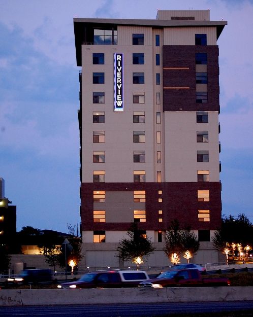
I don't know if y'all have driven by there at night, but that Riverview sign lights up blue (and I maybe red, too). It looks pretty cool.
 
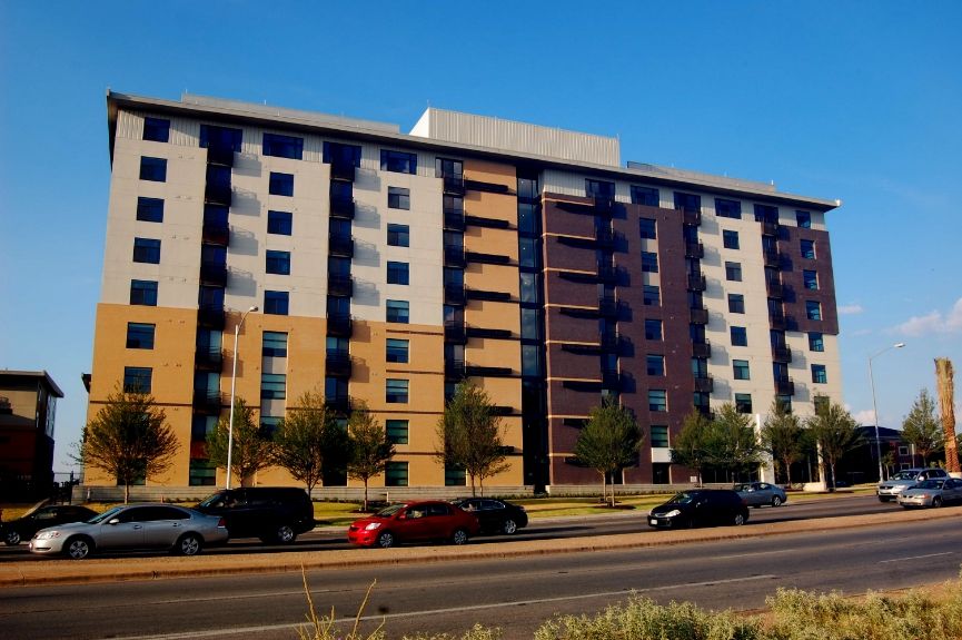
Nobody has posted a photo of this project as approached from the south on IH35. I don't know how to post pictures, or I would. Every time I see this complex (especially the tallest building) when I drive up 35 from the south, I am struck by the overall UGLINESS of the place. The Travis County Jail building by the criminal courthouse has more charm. This place would be depressing as a jail even. Part of the problem is the heavy handed color scheme. It is a huge mistake to make the top floors so dark and oppressive, but a new color scheme can't hide the cheapness and lack of taste that went into designing this structure. It is a depressing eyesore and a poor sight to behold as one sweeps around the curve and crosses the river into downtown Austin. Can somebody post a picture taken from the south on 35?
 
I actually have some pictures on my phone of it that I meant to post awhile ago, and I completely disagree with you on the aesthetics. I think the complex is pretty nice.
 
Nobody has posted a photo of this project as approached from the south on IH35. I don't know how to post pictures, or I would. Every time I see this complex (especially the tallest building) when I drive up 35 from the south, I am struck by the overall UGLINESS of the place.
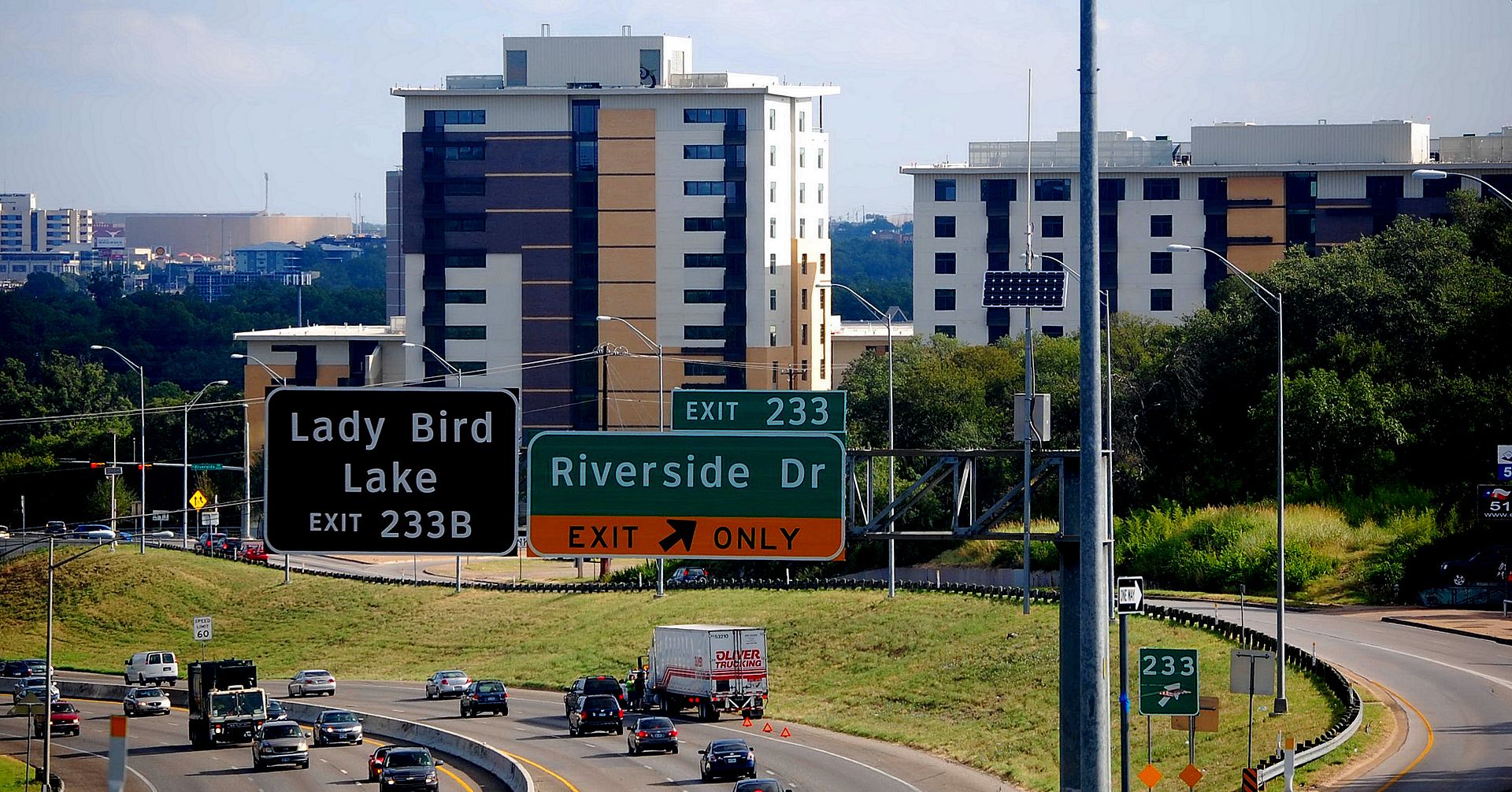
Here's a few. The first was from Saturday August 3. The rest are from Sunday, August 4th. The first three are from the south on IH35.

DSC_0014-3.jpg


DSC_0001-1.jpg


DSC_0002-2.jpg


DSC_0004-2.jpg


DSC_0020-2.jpg


DSC_0039-3.jpg


DSC_0044-3.jpg
 
Well, I guess there is no accounting for taste. I appreciate the pictures. I wish somebody could get a few of the tallest structure taken while approaching from the south on the actual northbound IH 35 roadway rather than from up above or directly adjacent. I admit that from a higher vantage point or viewed from the side, the complex is less disturbing. I think the thing that bothers me most is the dark color scheme on the south façade of the tallest structure. The 3 dark brown floors sit way too heavily in the upper left corner and the balconettes are all painted the same dark and dreary color that does not set them apart from the dark windows behind. The cheap exterior finishes and the boring roof tops are also far too visible. It is at best quite mediocre, and it will not improve with age. I guess they can perk it up over time with a better color scheme. That seemed to improve the look of the Holiday Inn and the adjacent condo tower on the other side of the river a few years back.
 
Last edited:
Meh. They look like standard suburban business hotels (like the Marriott Courtyard you see right off the highway in every suburban office park area).
 
Sometimes even things we say on these boards don't quite do justice to what we mean. Perhaps some of you have strong dislikes for certain buildings, but not me. Its not to say that I find this architecture stunning or a work of art... its just that the tone of people's opinions over this building seems a bit exaggerated. It's not that ugly. Yet no one here seems to mind that huge crappy Ashton building... or mediocre Four Seasons. People's opinions are weird. This building, at least for me, is okay considering the kind of project it is and where it is located.
 
Sometimes even things we say on these boards don't quite do justice to what we mean. Perhaps some of you have strong dislikes for certain buildings, but not me. Its not to say that I find this architecture stunning or a work of art... its just that the tone of people's opinions over this building seems a bit exaggerated. It's not that ugly. Yet no one here seems to mind that huge crappy Ashton building... or mediocre Four Seasons. People's opinions are weird. This building, at least for me, is okay considering the kind of project it is and where it is located.

I have been critical here on SSP of the Four Seasons. I think it looks like a 60's era glass office tower draped in oversized and poorly placed balconies that are meant to give the building a more up to date look. I have also taken exception to The Ashton. I think it looks out of place wedged on that riverfront parcel, and the eyebrow roofed penthouse already looks tired and dated. Maybe you should just express your opinion and let others express their opinion whether it be strong, weak, or somewhere in between. It is very much OK that forum participants might disagree about a building or other matters. That is part of what makes participation fun.
 
I have been critical here on SSP of the Four Seasons. I think it looks like a 60's era glass office tower draped in oversized and poorly placed balconies that are meant to give the building a more up to date look. I have also taken exception to The Ashton. I think it looks out of place wedged on that riverfront parcel, and the eyebrow roofed penthouse already looks tired and dated. Maybe you should just express your opinion and let others express their opinion whether it be strong, weak, or somewhere in between. It is very much OK that forum participants might disagree about a building or other matters. That is part of what makes participation fun.

Its my opinion on other people's opinions. LOL I'm not taking away anyone's right to express anything. I'm having fun on here just the same.
 
It's not horrible. This is really a building you have to study to "get it". I don't mind the roof, though I do wish they had done more to conceal/disguise the mechanical penthouse. I do like the large windows looking north and that sign is catchy.


Back
Top