Quote:
Originally Posted by Drybrain

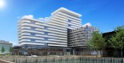
I don't think it's turned out as bad as all that--it's fine, it's just underwhelming. A background building, despite its prominent location. A big part of the problem is all that light blue and seafoam. I don't recall any of that in the earlier contrast. I mean, compare and contrast. |
The sea foam is a particularly heinous aesthetic decision here, not sure whose idea it was, but they need help.
I'm convinced that almost any other colour would work better here. Black. White. Slate Grey. Bright red, yellow, or orange. Even a richer blue, green, or teal would at least provide some visual contrast.


 Prev
Prev


 Linear Mode
