I spent some time studying your work, and I really like your style. I feel that your designs are outstanding, but the colors aren't really doing them full justice. The colors look
nice, but at a glance they don't really make your city look
real. In almost all urban environments, you usually have lots of grayscale colors, concrete-grays, and some brick-red while the main sources of other color come from shades of tinted glass window material. The moral of the story is that the more conservative your color tones are, the better. On the plus side, it also gives you the chance to make exciting statements through the selective use of bright tones. By choosing overall conservative color tones, it gives you a chance to really make a statement with the occasional brightly colored building.
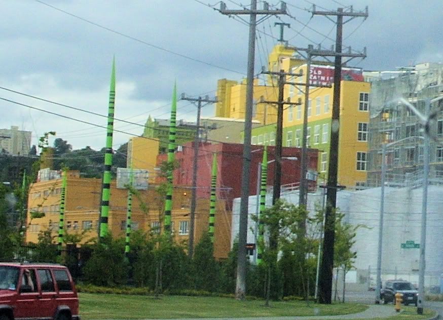
This is a picture that I took of the local HQ of Tully's Coffee. In a sea of concrete-colored buildings, it really stands out:
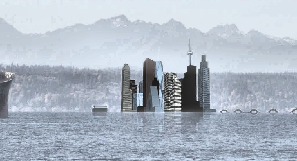
Just for the heck of it, I took the liberty of snitching one of your shots of the skyline and played with it a little to see what it would look like with modified color tones and a background. This is my supposition of what your city might look like if it was in West Seattle: :-)
I think that some simple post-production tweeking could potentially affect your renderings in a dramatically positive way. Keep up the good work!
P.S. - I'm fighting Sketchup lag on my project too. It's something that I've settled for dealing with until I finally have the spare cash necessary for a new system. In any case, if it gets really bad, remember that you can always design each building as as separate component (file), save independently, and then import your small files into the main project when they are ready.