Quote:
Originally Posted by mikevbar1

Yeah, but it might incentivize the developer to have done something better, ie upscale the project/materials. Some height variety on its own would be better than what’ll be a flat 30 storey block of buildings, though.
|
Honestly? I don't think any of these developers know how to do anything that isn't 90 degree angles lol.. all any of these designs are are siding cladded on top of concrete. It's not rocket science and you can basically template it in an autocad program. Architecture has never been so lazily designed before in history. I know because I used the very same software when I was in school for architecture.
I miss the art deco era for skyscrapers. I miss the look that an architect actually tried to make something unique and stamp his own personal style on it vs making ikea-cookie cutter bland designs. Let's not insult design aesthetic here - I also hate the excuse that "we should be happy we're getting anything" argument. No we shouldn't. We need to expect more. Don't kid yourself - these designs have nothing to do with design modern aesthetic - they are just designed to be made as cheaply as possible. It's like when people have exposed ceilings or exposed concrete walls - its disguised as modern chic but in reality it's making it so they don't have to add additional finishes - cheaply made while being marketed as "trendy" - which has to be the worst deception of all. And the worst part is you pay through the nose and you're not even getting a fully finished look or something that looks like effort was put into it - looks cheap, was made cheap, was finished cheap and priced expensive.
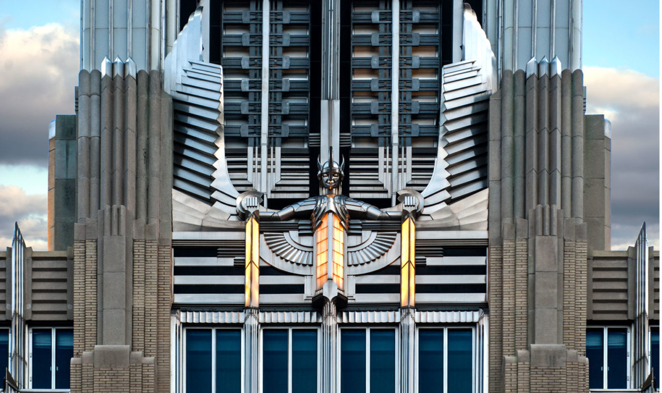
Just a couple art deco examples below. Our pigott building/sunlife building would also be art deco, at least the interior, some nice design finishes preserved inside. Kresgys was unfortunately a bad example of preserved art deco - mainly because the fountain/eagle wings motifs were stripped off it long ago. Our city appears to be obsessed with making everything bland and stripping off all examples of craftsmanship - thank god for core urban I guess..

In addition I really hate the direction finishes go these days, where it just feels like they're crammed in as an afterthought thus making them look extremely fake, vs making them look like a logical part of the design of the building. Anyone can design a building these days, but not everyone SHOULD.
This is the current design palette for buildings these days
1) curtain wall
2) rectangular jutout picture frame like elements
3) unevenly placed and sized windows placed asymmetrically
4) extemely plain cornices if any - otherwise plain siding
5) any concrete areas capped with siding, usually black, or colours like white and orange
6) randomly placed finishes like faux uneven stone or wood siding
7) windows that lack lintels or pediments leading to a brutalist look
8) exposed concrete wherever it can be gotten away with
The design above has at least half of these checked off - this isn't groundbreaking or innovative architecture. The only thing I can see of remote interest on it is the curve in the gradient balconies like on the one next to it, but in this case it doesn't lend itself to accentuate anything - like the other one accentuated the curve of the design. I am just disappointed in this one on many levels. The only thing they seem to be going for is being "big" or "bulky" looking - at least the mcmaster student building beside it has some innovative design to it.
I'll refer to my fave saying - class over glass. Remember people don't come to hamilton to film the glass skyscrapers when they film movies here.