Quote:
Originally Posted by HossC

While looking for more pictures of the Crandall Aylsworth sign, I came across this Library of Congress panorama. When I (unsuccessfully) tried to find a larger version, I found that rcarlton had already posted it nearly two years ago.
I've cropped and enlarged the right end as it shows the intersection of First and Spring. In the foreground is the Nadeau and the Wilson Block, and the
fairly new seven-story Equitable Savings Bank is across the street on the right. What caught my eye is that the circular Crandall Aylsworth sign still
appears to be in place, even though I can't read the text. I wish I could zoom this image like you can on USC, but it looks like the lettering is more
solid than the earlier pictures. Then again, the suspended sign at the bottom, which I'm guessing says "FITZGERALD ...", is also made of skinny letters.
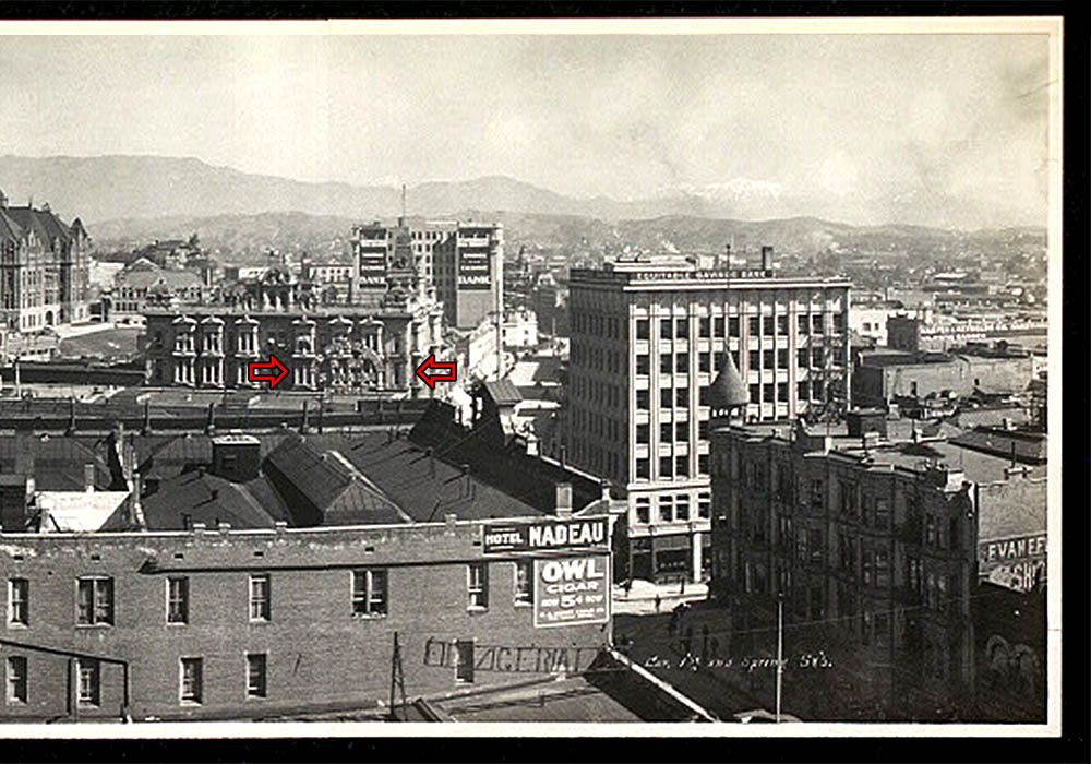
Detail of picture above.
I also found the circular sign in this circa 1910 aerial view taken from a balloon. Again, the letters are unreadable, but they look more substantial.
 USC Digital Library
 |
Excellent,
HossC! It just so happens I just found similar evidence that the sign survived at least until 1910. The store is apparently NOT called "Crandall Aylsworth" anymore, though, as you can see by the "...LTON," with a "15¢" and what looks like an "RE" below that on the straight horizontal sections. Different lettering entirely by then.
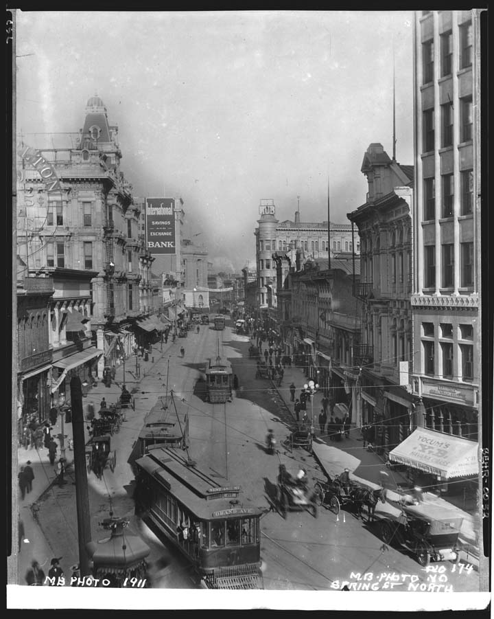
Public domain, source unknown.
Additionally, at least on the upper, curved section, the letters are clearly solid and are backed by what appears to be a thin mesh of some sort.
And although the photo is undated, I have a postcard postmarked 1910 depicting what is obviously the same image. (The photo can't be earlier than 1910 due to the presence of the brand new Post Office and Federal Building in the distance, which of course was completed in that year.)
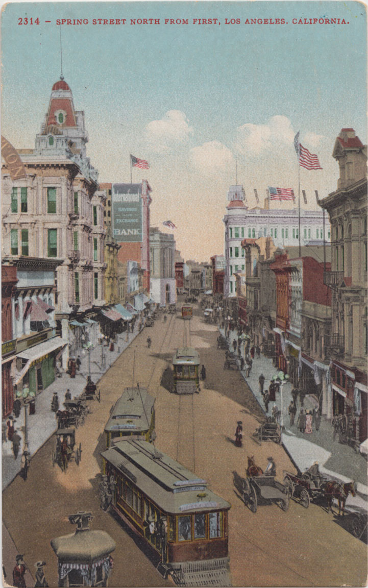

My personal collection.
I'm now more of the opinion that when it was the sign for the Crandall Aylsworth Co., the letters were always "see-through." It seems to me to stretch credulity that the sign was erected in an incomplete state. I'm also now coming to doubt that the sign was ever electrified/illuminated. Even in its "...LTON" incarnation, the letters don't look like lights, though being solid by then, they would definitely be easier to see/read than the Crandall Aylsworth letters ever were.