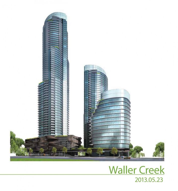
Regarding Waller Center. I actually liked the first, most simplistic design the best. The buildings would work straight off height, especially from a distance. Then the second rendering grew on me and I was pretty content with it. After being at war with the third design, I've finally grown into it. Have to say, the darker blue shade is nice. Austin's skyline is increasingly becoming blue, which is a good color. I liked the first design even after knowing it was just preliminary conceptual designing.
Anyhow, while we don't have a lot of developments being proposed these days, it's a shame to see what was one of the most active threads in City Compilation die out like this.
What design of Waller Center did you guys like best?
First one:
 http://media.cmgdigital.com/shared/l...oup_050213.jpg
Second one:
 http://i241.photobucket.com/albums/f...allercreek.jpg
Third one:
 http://i2.wp.com/downtownaustinblog....erspective.png
One thing I'll say, in my opinion while all three concepts are nice, the tower bases going from glass to lime from the first to third has repeatedly been downgraded after each rendering revision. In my opinion.