Quote:
Originally Posted by AlvaroLegido

I noticed all through the thread in the "then & nows" that besides looking "noirisher", the buildings and mansions always look bigger, sometimes taller and a lot more imposing in black & white than in colors. In the "nows" they get an obvious lack of majesty. Why ?
Is there among us a photographer who can explain that ?
|
I dunno really. Most of our "nows" are google street view. One cannot always pick the angle one would like & the color is mostly ho-hum. But also, the "thens" are often taken when the buildings were new and had the crispness that goes along with that. The pointing between the bricks on the building below has lost its definition, as has the bits of trim, and, of course, it is now covered with retrofitting bolts. The blocked-up windows, security bars and razor wire don't help either.
And don't forget scale. What once was imposing can now look shrunken and feeble compared to the larger environment. If nothing else, new streetlamps often ruin scale (plus all the other street furniture junk and signs that seems to have piled up).
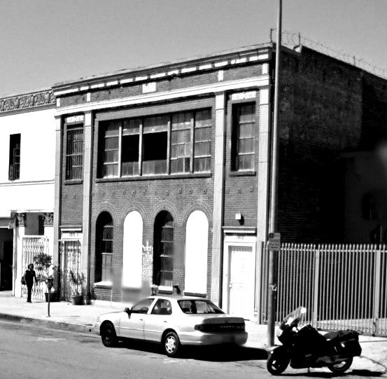
gsv
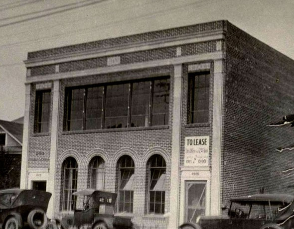 http://www.oac.cdlib.org
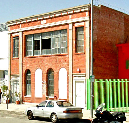
gsv
This is still a nice building though. Beautiful windows.
A view by a decent photogapher vs. google street view can make all the difference even if both are in color
(this is the Earle Anthony house in BH by Greene & Greene):

gsv ( previously posted by
GW)
VS this nice professional shot:
 http://www.you-are-here.com/building/bedford.html