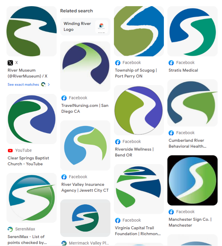
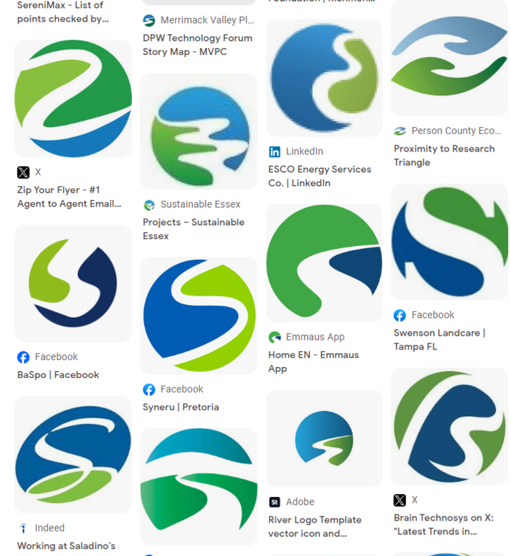
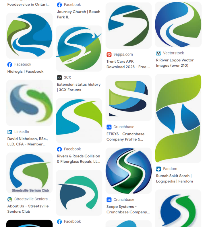
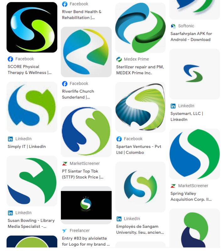
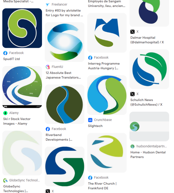
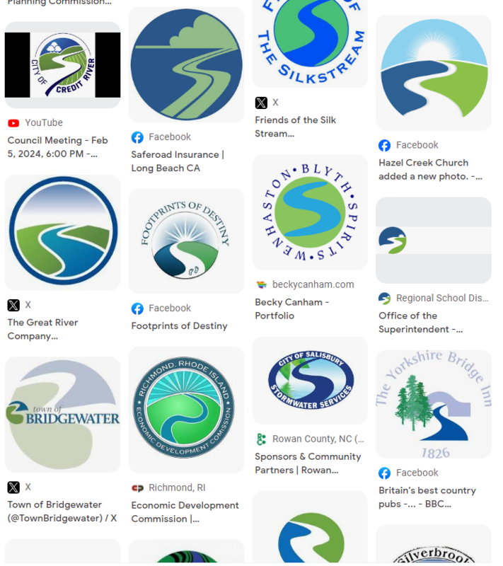
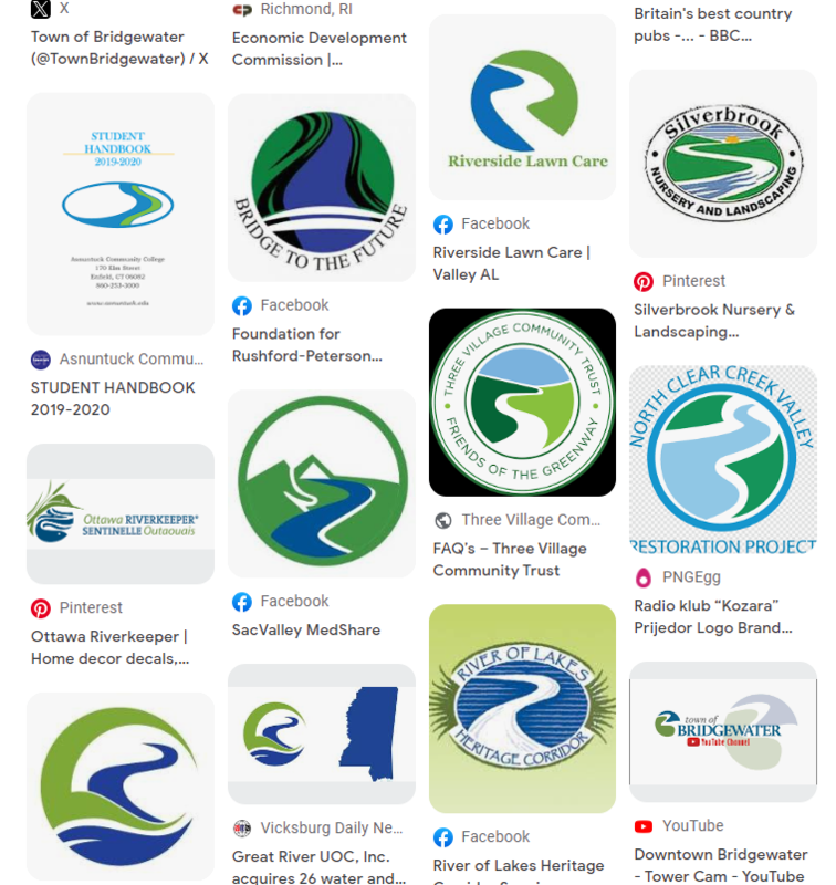
Someone on here pointed out years ago how so many town logos use blue and green. Saw a video on tik tok of the logo for Bridgewater NS and the Mississippi River Museum in Iowa. And it was pointed out that this logo basically exists everywhere in the world. A Google reverse image search very much demonstrates this. Also, instead of a B or a river, there's an S for Schulich School of Business at York U. Not sure why Schulich has a couple of leaves. You'd think it's for the department of environmental studies or something.

https://twitter.com/TownBridgewater

https://scoutingevent.com/178-Museum

https://en.wikipedia.org/wiki/Schulich_School_of_Business


https://twitter.com/TownBridgewater
https://scoutingevent.com/178-Museum
https://en.wikipedia.org/wiki/Schulich_School_of_Business