Does Doug Ford's panned Blue Ontario License Plate design belong in this thread?
cbc
The one that you can't see in the dark? Yes! I hate it, a total waste of money as well. Let's spend a lot of money on changing the plates and then change them back because we can't design for shit!
__________________
Never Half-ass Two Things, Whole-ass One Thing. - Ron Swanson
The one that you can't see in the dark? Yes! I hate it, a total waste of money as well. Let's spend a lot of money on changing the plates and then change them back because we can't design for shit!
Did they ever figure out why the plates couldn't be read at night? Never heard of such a thing anywhere eles.
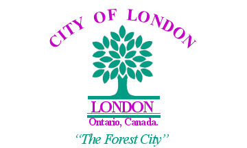
That once potential replacement of London's is grotesque.
Perhaps I'm biased due to London being my hometown, but I think London's logo is a very nice one. Clear, concise, attractive, and represents the city's reputation as the Forest City very well without the gaudiness of so many others. In many ways I think London's logo is the municiple rendition of Canada's flag.
yeah it is good in its clear message, simplicity, and understated tone.
I hate the gaudy/screamingly-loud or head-scratching logos as much as the lame-o, boilerplate/generic logos (with arrows, water, some old building, or some abstract swirling shape, or worse, a soul-sucking slogan).
yeah it is good in its clear message, simplicity, and understated tone.
I hate the gaudy/screamingly-loud or head-scratching logos as much as the lame-o, boilerplate/generic logos (with arrows, water, some old building, or some abstract swirling shape, or worse, a soul-sucking slogan).
A NUMBER OF THINGS TO DO IN OKOTOKS!
HANNA: WORTH THE DRIVE!
VAUGHAN: THE CITY ABOVE TORONTO (why does this make me want to visit Vaughan?)!
__________________
Never Half-ass Two Things, Whole-ass One Thing. - Ron Swanson


 Prev
Prev


 Linear Mode
