Quote:
Originally Posted by SignalHillHiker

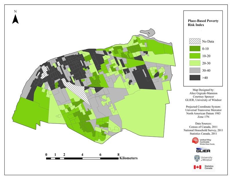
Closest thing I could find. My neighbourhood is within the second-poorest area by this measure. 
 |
That's only part of the picture though. At least in Toronto, you have big extremes in certain neighbourhoods, especially downtown, so the average income is kind of in the middle, but it's really a lot of poor people and a lot of wealthy and not much in between.
https://www12.statcan.gc.ca/nhs-enm/...-05-01-eng.pdf
Malton has a smaller low income % than Downtown, and possibly Rexdale and Malvern too. However, most of Malton's population that isn't low income is lower middle class, while Downtown has a large population that is well above the low income cut-off.
You could also look at income deciles. I started looked at income deciles for Toronto. It seems like those give a somewhat different result than looking at average individual income, which is what the maps of the OP show. I believe income deciles are based on the square root of household income, while average individual income is looking at the average income of everyone that's 16+. I think individual income penalizes large household too much.
If you look at income deciles, the geography of very low income neighbourhoods shifts closer to the core of Toronto. Census tracts in Flemingdon Park, Eglinton East, Peanut/Parkway Forest, Parkdale, Chinatown, St James Town, Regent Park, York and Amesbury shift from low to very low income. Meanwhile census tracts in Milliken, Malton, Malvern and Rexdale shift from very low income to low income. Many census tracts in the 905 shift from low to medium and medium to high.


 Prev
Prev


 Linear Mode
