Quote:
Originally Posted by Zapatan

Everyone has the right to their opinion and I actually agree with him (or her?).
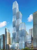
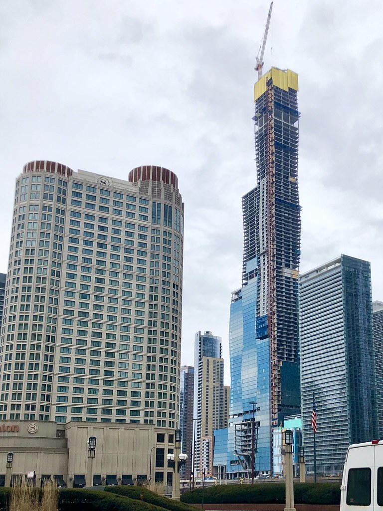
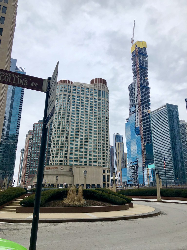
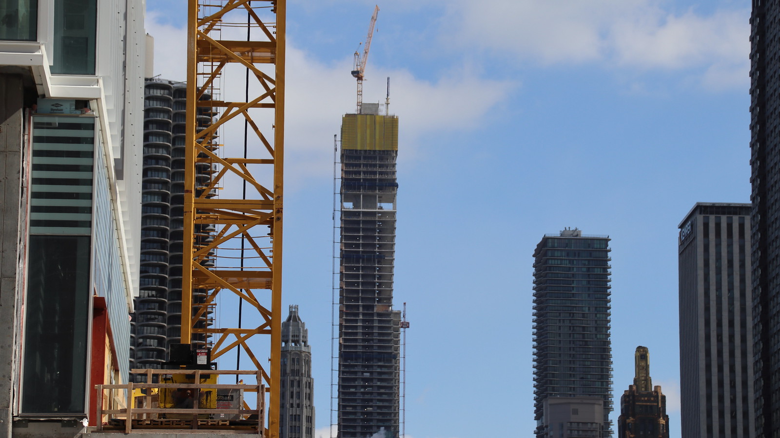
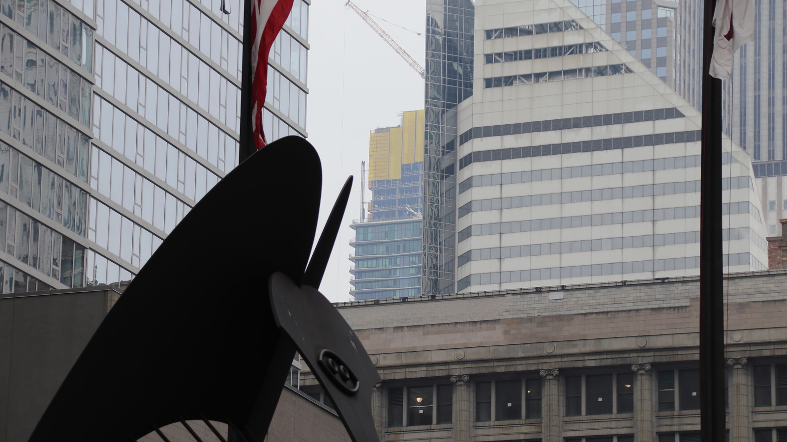
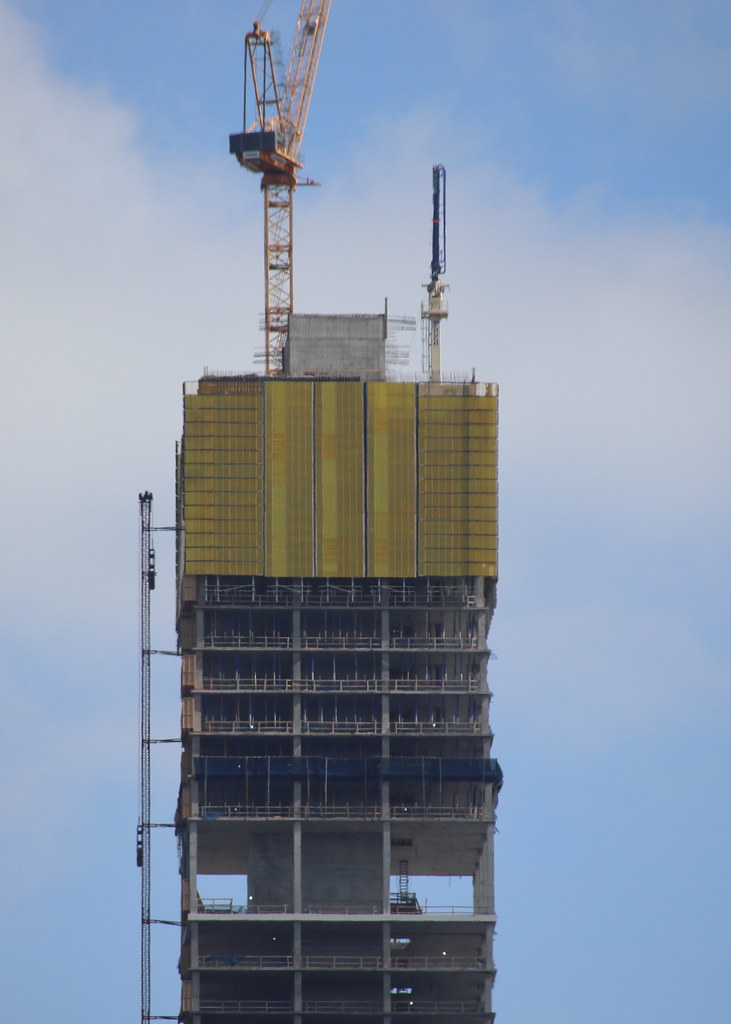
The glass would've looked better completely smooth, I don't hate it but it could've been better, I don't dig the separations/jaggedness at every floor.
The building overall is still a great addition, and very tall obviously so it's okay.
Could've been an A+ building but it's maybe a B+ or A-
|
Him. And yes, agreed on the jaggedness (of color) if you are speaking of the same thing. I get the the concept but the execution misses, imo. Probably due to costs, Gang uses the same tone for every three floors (2?) and then switches and so it looks a bit clunky to me. Maybe it will look better when finished.
Moreso for me is the color though. Absolutely brutal choice for many reasons.
1. Yeah! More sky blue...just like some of your next door neighbors even. How original.
2. Chicago has more cloudy days than not, especially in the loooong winters where everything is mostly dismal colored and grey. Looking up at the grey blue sky and seeing these colors looks terrible, imo. In fact, it is here the gradation actually looks even worse because it resembles the varied grey blue sky it rests upon.
3. My eye actually picks up an almost purpley-blue tone that gives this building a childish hue. Like a piece of candy. In other words, the color lacks sophistication, imo.
In closing...not a fan at all. Again, hope that feeling changes upon completion.
The shape is outstanding, fwiw.
As of today: B-/C+


 Prev
Prev


 Linear Mode
