Dayton is actually pretty useless when in comes to architecture. Its not that things are actively
bad. its just that things are mediocre and stupid when they could be better with a bit more in the budget for attention to detail and finishes and maybe just better thought to composition.
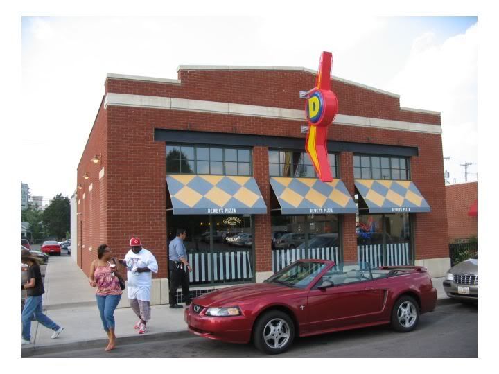
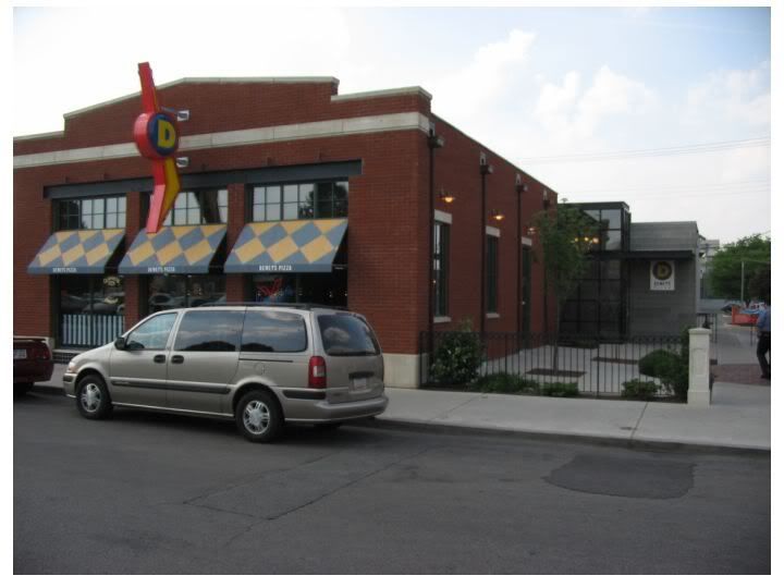
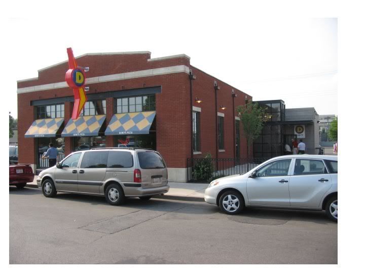
A counterexample is this pizza parlor from the Cincinnati chain called "Deweys". The site is near the University of Dayton, about a half-block off of Brown Steet, the main drag in this neighborhood. The area is undergoing residential redevelopment as a joint venture between the university and a big hospital a few blocks to the north, and there is some commercial infill going on on Brown.
This pizza parlor is designed to look like a commercial building from the 1920s or teens. Maybe like an old garage converted to a pizza parlor. But it’s the detailing that makes this building work so well.
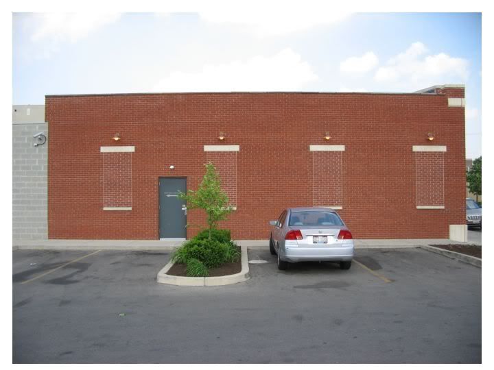
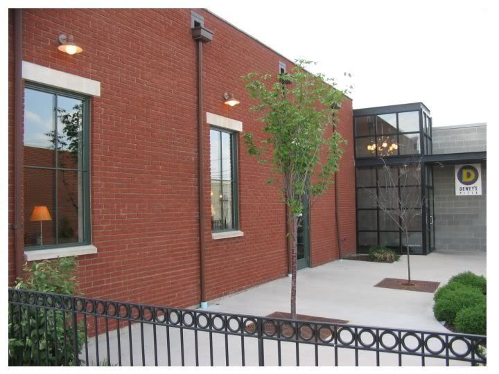
This carries over even to the sidewall facing the parking lot, which has a sidewalk along side. The architect designed this to look like a conversion, with filled-in windows and lights above the windows, to activate what would be a pretty blank wall.
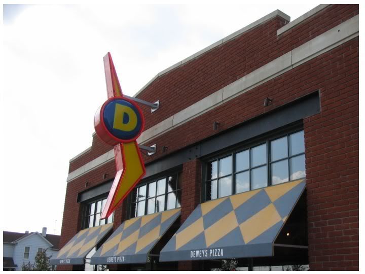
The front façade is really great. The masonry detailing (mixture of stone coping and trim with brick and the shallow pediment) is a throwback to early 20th century commercial architecture, but the use of a modern I-beam as a decorative as well as functional lintel is a great modern touch. And then there is that fun retro-neon sign, perhaps harking back to the 1950s or late 40s. The little spots above the windows work too, as they would be lighting up the canopies below, turning the façade into a nighttime advertisement.
During the day the big windows would provide lots of natural light into the interior.
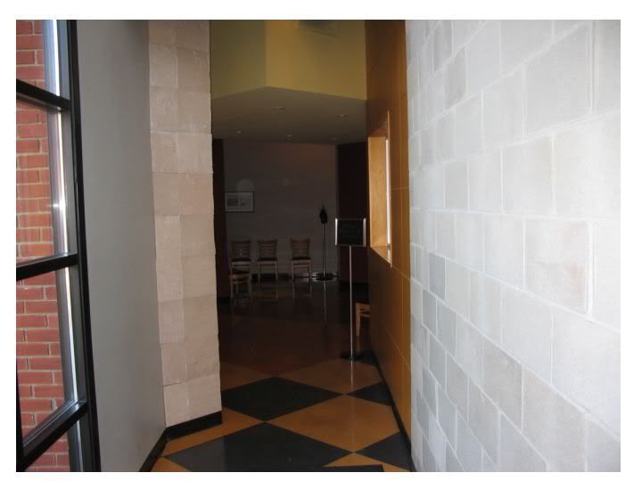
Entry is not via the front, but through a little side yard shared with another restaurant. This is a great little sequence.
The design doesn’t skimp on this façade as well. Note the stone lintels, light fixtures, and especially the way they use the windows treatment, drain pipes and scupper boxes to articulate and break up the bare wall the façade. It might have been cheaper to have less drains or roof drains rather than scuppers and leads, but they spent a bit more $$ to make this façade look better.
This is a real cool bit of detailing. Functional articulation via materials. The brick part is the dining area, and the concrete block part is the kitchen and food storage. They are pulled apart, the kitchen area pulled out a bit, and one enters between them via this glass box….with that canopy piece pulled out with circular can lights inside (which is somewhat reminiscent of the 1950s and early 60s commercial architecture.
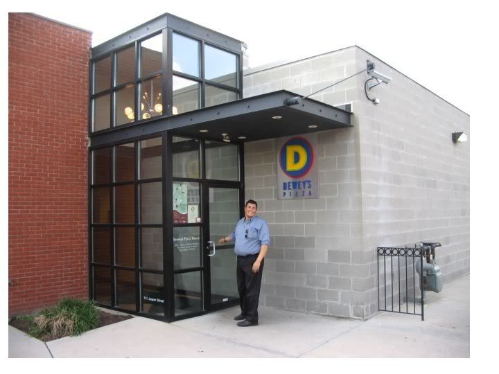
….and there is that D logo as an accent, and the little metal fence by the gas meter, too. Like I was saying, lots of attention to detail here….
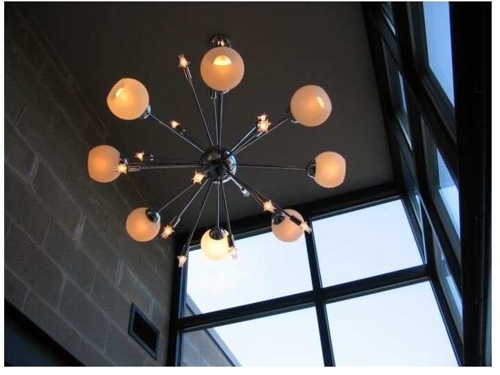
Inside the glass box entry (and this would be really noticeable at night) is this fab MCM light fixture, globe lights mixed with small “afterburner” tailfin lamps, done up in chrome.
Walking into the restaurant, kitchen area on the right, with a window where you can watch them make pizza while waiting to be seated.. The space is compressed here….
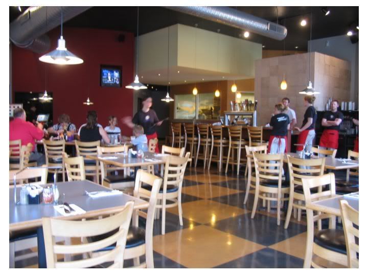
…but really opens up in the dining area. Sitting at the window, one can see the box treatment on the roof, by the entrance, and the bar set at an angle to activate the space a bit, with the line of the bar leading your eye to the kitchen window to the rear. Mix of light fixtures is fun, including those pendant lamps over the bar. Diamond or harlequin motif carried in from the awning to the floor.
.And the outside again. I don’t know if Dewey’s has an in-house architect or if they contract with a Cincinnati firm to do their designs, but they did a really,
really good job with this place, which is, after all, just a pizza parlor. Just to show you that good urban architecture can be still done, even for humble commercial uses.
@@@@@@@
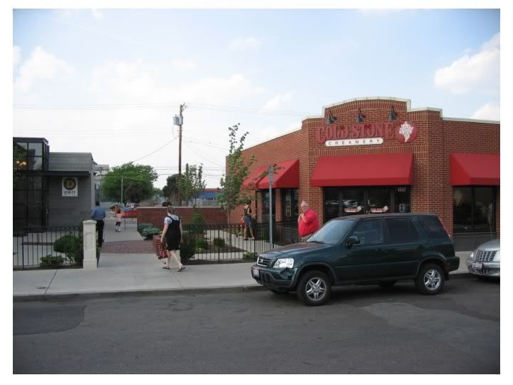
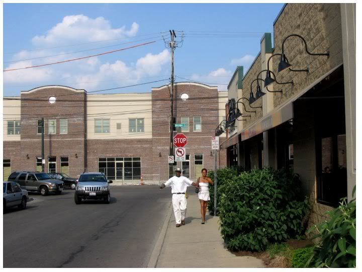
….and a bit of context…next door to Dewey’s, across a side yard, some more commercial infill.
Down the street. To the right is a Panera Bread, which is a pretty good bit of infill too. In the background is a new University of Dayton building on Brown Street, which has a mix of student housing on top and retail space below..
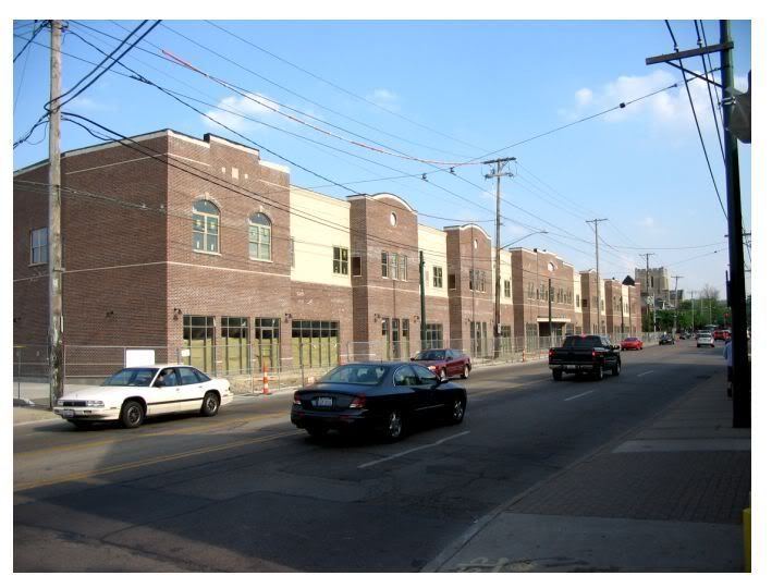
More of that UD building.
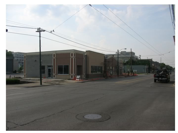
Another piece of commercial infill going up on Brown, closer to Miami Valley Hospital
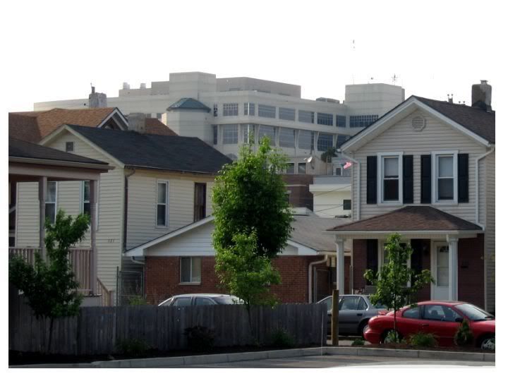
And the hospital, dominating the neighborhood skyline like a modern version of an old loft factory building.